


Imagine a friend visiting your place for the first time. How would you show them around? You'd show them all the questionable uses of your money: Heated floors, massage chair and the hot tub in your backyard. Your friend would be excited to hang out with you!
But they'd stop being excited once you admit the place is above your means and ask if they want to move in and pay rent. For visiting, you want all the fancy gadgets you don't have at home. To live in a place, you mostly care about space, location and price.
Many companies make this mistake in their onboarding: They show users what they don't need to see—and omit crucial information because it's less "cool".
To stick with the example: Showing off the hot tub instead of the washing machine is like showing a new user the 58 color themes you offer—not the core feature that makes your product useful.
When new users sign up to a PLG product, they "come over" to try a product and discover if it meets their need(s). This is the job of product-led onboarding: Show a user how the product makes their life better.
Top-tier user onboarding experiences are built by customer-obsessed teams – they know:
- The problems a user wants to solve
- The easiest and fastest ways to help a user unlock value
- The right times, places, and methods to nudge a user in the right direction.
User onboarding is crucial in developing a positive user experience, encouraging users to engage with your product, and ultimately creating customer satisfaction and customer loyalty.
In this article, we'll cover why user onboarding matters, what makes for a good onboarding experience, why many onboarding experiences fail, and 10 examples of companies with stellar user onboarding.
TL;DR
Only have a few minutes? Here's what you need to know about user onboarding:
- Why most onboarding sucks: Most onboarding falls flat for one of two reasons: It overwhelms users with long product tours or frustrates with a one-size-fits-all approach.
- How to make your onboarding great: Personalize the experience, keep it simple, and guide them through key features.
- Great PLG onboarding examples: Companies like Reclaim, Netlify, and Slack get it right by focusing on user needs, offering clear CTAs, and creating engaging, personalized journeys.
- Applying These Insights: Understand your users, focus on key features, and regularly update your onboarding strategy.
User Onboarding Can Actually Help Your Product
The primary goal of user onboarding is to convince users to stick with your product. When done well, user onboarding can be a significant driver of product success (and product metrics). It can help new users understand your product's value proposition, get them to their "aha" moment faster, and encourage them to become paying customers. A good onboarding process can also increase user engagement, reduce churn rates, and improve customer satisfaction.
Why Most Onboarding Experiences Are Not Useful
Many SaaS products fall short in their onboarding efforts and ignore many, if not all, of the best practices. Instead of providing a helpful and engaging experience, many onboarding processes overwhelm users with too much information (a common form of user friction) or offer a one-size-fits-all approach that doesn't address users' specific needs. This can lead to frustration, confusion, disappointment, and, ultimately, users abandoning your product.
How to Make Onboarding Not a Total Waste of Your User's Time
The sad reality is that most onboarding experiences are a total waste of a user's time, and don't lead to product adoption the majority of the time. To create a successful onboarding process, it's important to understand your users' needs, behavior, and goals. This means considering different user personas, identifying the stages of the typical customer journey, and tailoring your onboarding flow to meet each user's unique needs by leveraging product usage data. There will likely be some complexity in your product's internal onboarding strategy. But it is crucial to keep the individual onboarding experience simple and straightforward, avoiding overwhelming users with too much information too soon, and otherwise work towards a frictionless UX.
A successful onboarding process should be structured and use in-app guidance to move users through the product's key features in a logical sequence, providing value at each step. It should use interactive elements, such as progress bars, tooltips, product tours, and onboarding checklists, to show users their progress and encourage them to keep going. Finally, it's essential to collect user feedback and test your onboarding process regularly to ensure that it remains effective.
10 Examples of Companies With Great Onboarding Processes
Here are ten companies that are doing a great job with their onboarding processes:
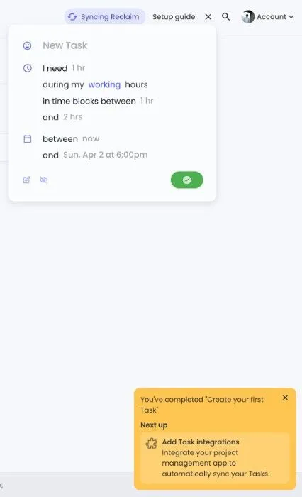
Example 1: Reclaim – the onboarding checklist at its finest
Reclaim is a time management/calendar tool that offers a personalized onboarding experience. By understanding the user's calendar and goals, Reclaim offers relevant tips and suggestions to help them manage their time more efficiently. Reclaim provides new users with onboarding tasks for their most important use cases. Their onboarding checklist displays an overall progress bar to gamify the onboarding process. The onboarding checklist is sectioned by use case and is collapsible, making it seamless for users to interact with.
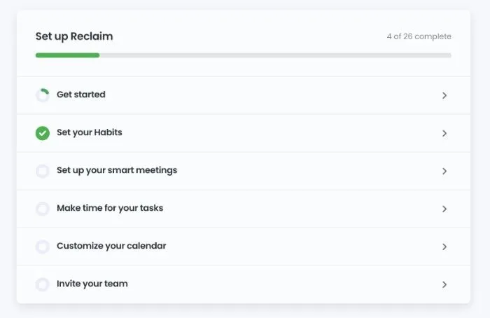
Reclaim also displays gentle reminders during the onboarding experience to both (a) congratulate users for completing an onboarding action, and (b) guide them to the next recommended action. Instant feedback loops encourage "good" user behavior and keep users engaged.
Why Reclaim's user onboarding stands out:
- Gamification is used to increase the odds that users complete their onboarding checklists and ultimately convert to paid users after the trial period.
- Users are allowed to move at their own speed, which is always a good onboarding strategy.
- The onboarding checklist is sectioned by use case. This is great for "time to value," since users can focus on the use case that is most valuable to them. Sections also make it easy to analyze which onboarding elements are working.
- New users are gently nudged to try relevant features based on where they are in the app and what they've previously set up.
Example 2: Netlify – the CTA is crystal clear
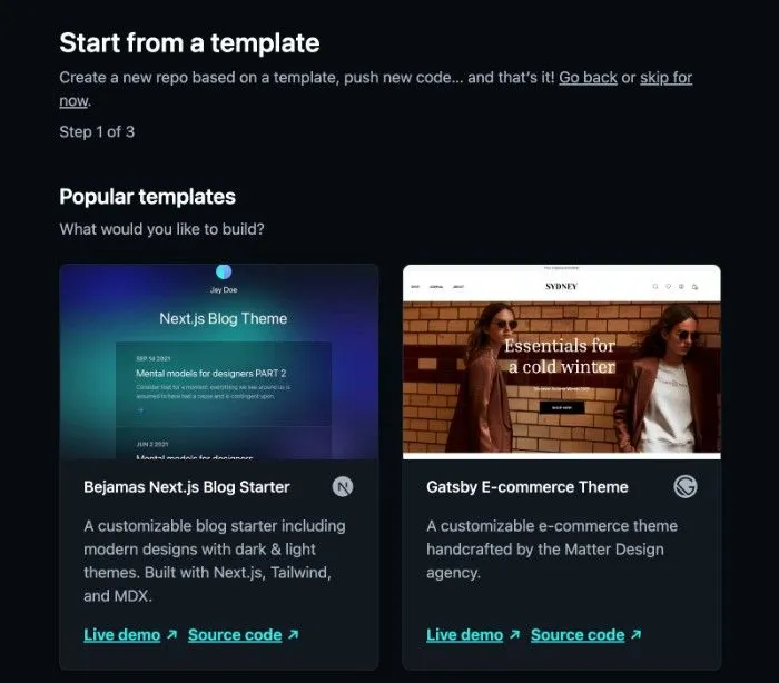
Netlify is a web development platform that provides a simple but effective onboarding experience for the new user. The primary goal is to help a user deploy their first project. The signup process centers on this goal and makes it the singular focus of their user onboarding process.
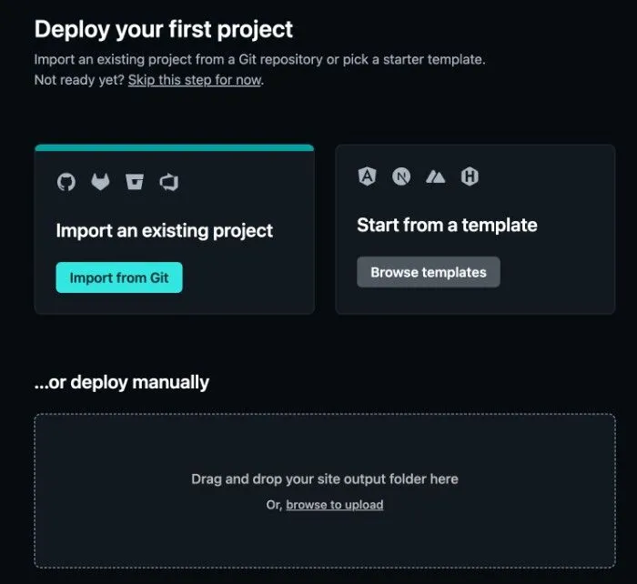
For the subset of users that do not have an existing project to import, Netlify offers a variety of templates to help users get up and running. This onboarding design reflects a clear understanding of their user base and new user journeys.
Why Netlify's user onboarding stands out:
- The call to action, "Deploy your first project", is obvious. This makes Netlify's core value obvious to users and helps them understand how/why Netlify is valuable.
- Netlify's most frequently used integrations (GitHub, GitLab) are highlighted immediately, expediting time to value for most new users. They even offer an array of backup templates for new customers that are starting from scratch.
Example 3: Slack – user onboarding across the entire user journey + intelligent use of "user friction"
Instead of taking their ubiquity and dominant market share for granted, Slack has some of the most thoughtful and impressive onboarding processes out there.
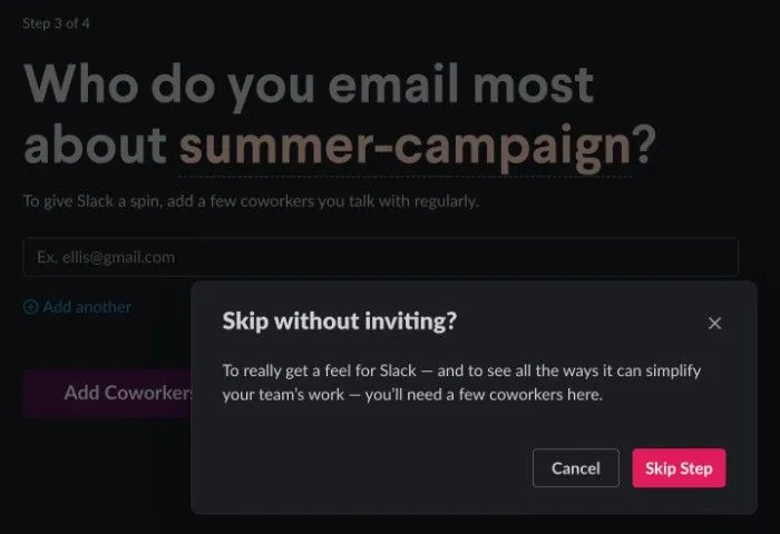
When creating a new workspace, Slack uses the signup form to perfection. Slack knows that the key to stickiness and retention is getting more coworkers in the workspace. As such, they make it as easy as possible to invite others. You can invite one teammate, you can add another (and another and another), or you can simply copy a shareable link and mass share it via an existing distribution list.
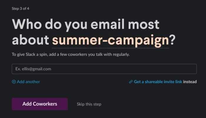
Slack does not even let you skip the above step without another click! The term "user friction" has many negative connotations, but this is "user friction" at its absolute best.
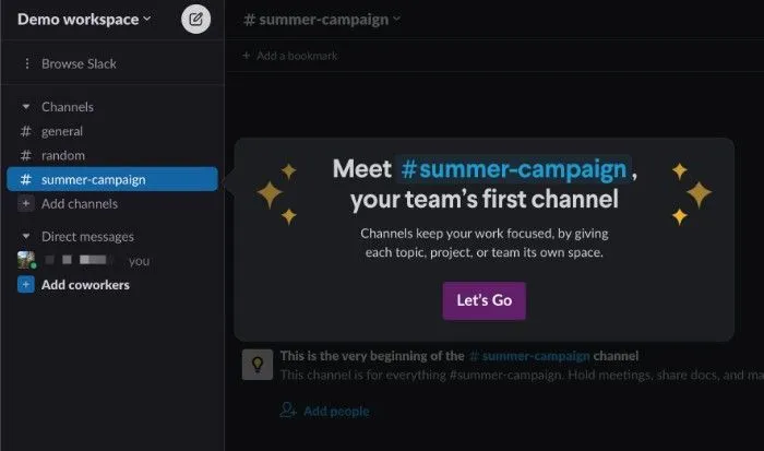
Once into a new workspace, Slack uses a massive modal to encourage users to add more channels.
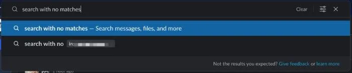
Slack also understands that user onboarding doesn't end after the first visit. They sprinkle subtle and timely ways to help educate users and solicit feedback. For example, when a user's search doesn't yield the results they'd expect, they are presented with the options to (a) provide feedback; or (b) learn about how Slack's search works. The UX design here is great -- the CTA's are unobtrusive when search is working as expected, yet within reach if a user is confused.
Why Slack's user onboarding stands out:
- While Slack pre-populates a few channels, a blank room in a new workspace is designed to feel "ugly". This encourages users to add channels, messages, and teammates, driving product adoption.
- Slack adds friction at critical junctures to help users get value out of the product, like when a user tries to skip the "invite teammate" step. Introducing user friction should be done sparingly, but this is a golden example of good user onboarding.
- Slack does not treat onboarding as a "one and done" task -- they continuously find ways to educate, empower, and engage users.
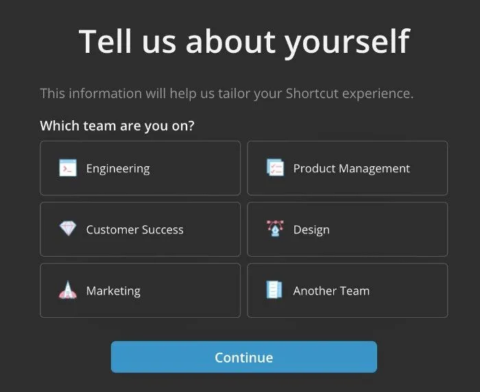
Example 4: Shortcut – a "create your own journey" user onboarding experience
Shortcut is a work/project management tool with a distinct approach to user onboarding.
Shortcut's signup form allows them to tailor the initial experience for a new user. By doing so, Shortcut increases the likelihood of converting a new user to a paying customer.
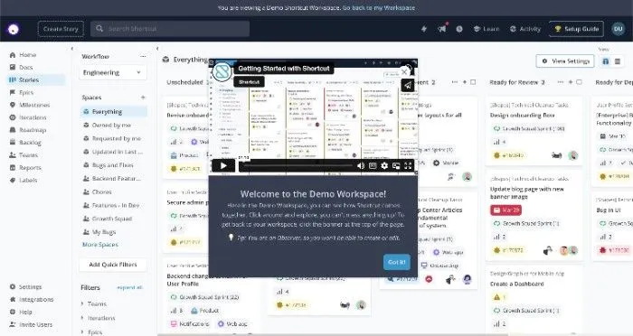
One of Shortcut's most valuable onboarding tools is their "Demo Workspace". The demo workspace allows users to "touch" and "feel" a fully-developed workspace, like playing inside a sandbox for their product. Not only does this educate users about the suite of features and functionality, but it allows users to experiment quickly and carelessly, with no strings attached and no cleanup required.
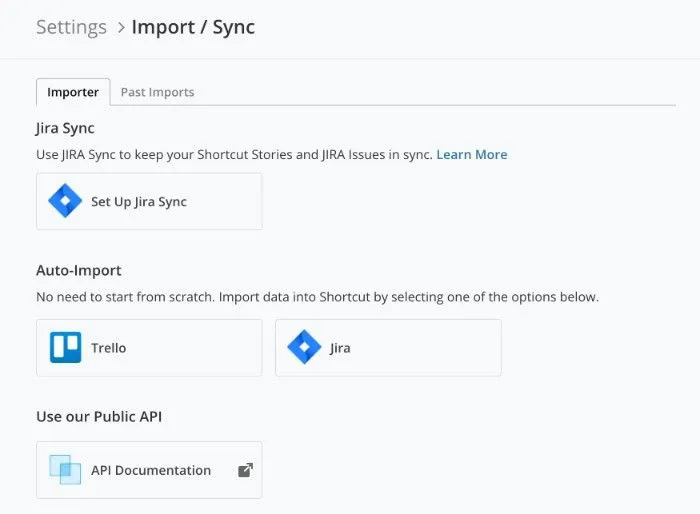
Lastly, Shortcut understands that many of their new users are in an investigative phase and are most likely using one of their competitors. Shortcut makes it effortless to migrate from these vendors with an import flow.
Why Shortcut's user onboarding stands out:
- The initial experience is automatically tailored to the customer's use case.
- The "Demo Workspace" and import functionality show they understand their new user's mentality. New users want to find value ASAP and have a quick way to see what Shortcut would look like for their use case.
Example 5: Twitch – the simple and sweet onboarding flow
Twitch is a live streaming service focused on video games. Twitch's onboarding experience is simple and straightforward, with a singular focus on getting the right content in front of the user. The user is only asked for a single piece of non-essential information: "What are you into?" Possibly inappropriate for many apps, Twitch's customer onboarding caters to their target audience: someone that wants to watch a stream for their favorite game(s). Twitch knows that the value proposition is pretty clear, and they know users already have high intent to engage, so they remove all unnecessary friction.
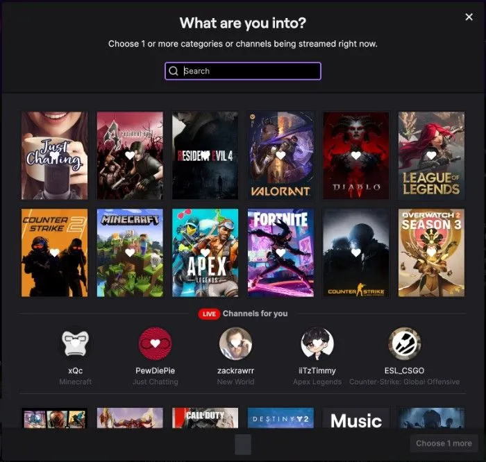
Why Twitch's user onboarding stands out:
- The onboarding flow is extremely barebones, which fits well with their user archetype.
- Time to value is prioritized above all else.
Example 6: Segment – an onboarding process informed by total understanding of the user
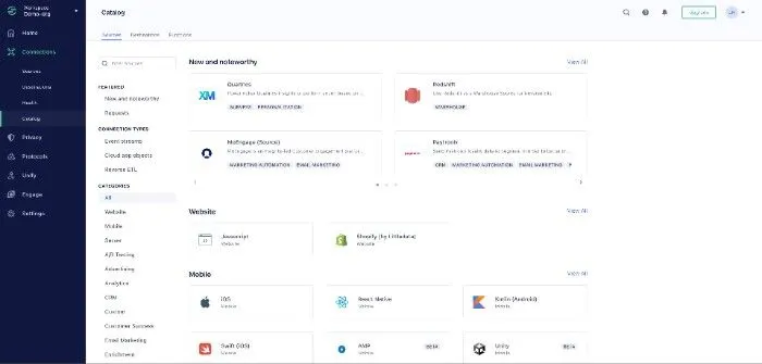
Segment is a customer data platform. Their onboarding process is tailored to each customer, based on their use case and data stack. Segment makes it straightforward and simple to get started. As soon as a new user enters the platform, they are prompted to add a data source and destination. Their vast library of integrations could easily be overwhelming, but it is made digestible via categorization, searchability, and clean visual design. Furthermore, the installation process for their integrations is well-documented and split into discrete, bite-sized chunks.
Rather than relying solely on onboarding emails to educate new users, Segment uses rich, informative modals to announce their most valuable and new features.
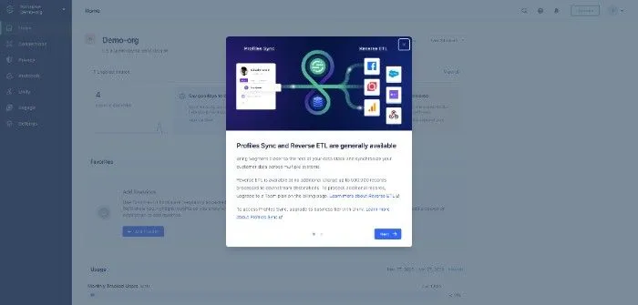
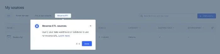
When Segment rolls out new functionality, like Reverse ETL from the screenshots above and below, they make sure to include a product tour that helps new and existing customers learn the core pieces of the product.
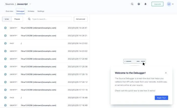
Beyond all of the above, Segment understands that its core customers are focused on data flow. Segment customers need to understand what data is coming and going from their sources and destinations. Segment clearly understands its customer and has productized the debugging process. Debugging is typically time-consuming and confusing. Segment's native debugger makes the experience pleasant and simple by exposing real-time data in an intuitive interface.
Why Segment's user onboarding stands out:
- Segment tries to onboard users with a variety of techniques. It is clear that Segment knows how to effectively steer the user journey.
- Segment's massive library of integrations is designed to ensure a smooth user journey for new customers. The easy integration installation process allows customers to achieve quick wins.
- Segment's engaging announcement modals and product tours motivate users to adopt new functionality.
- Segment's debugger UX empowers users to drive to success on their own while also signaling that Segment is a high-quality product.
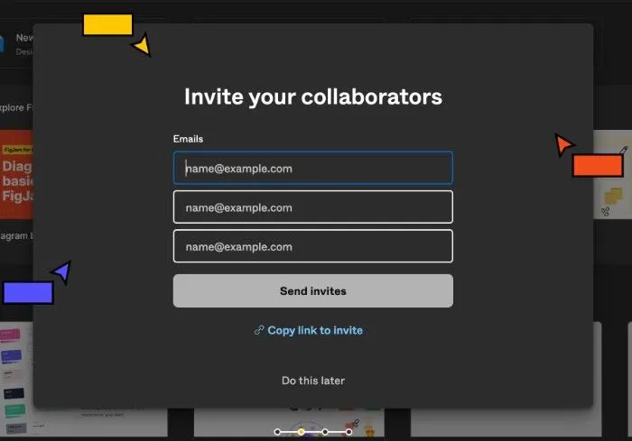
Example 7: Figma – focusing the signup flow, innovating new user templates, and upskilling new users to power users
Figma is a collaborative design app. While Figma's signup process is pretty basic, they emphasize the importance of adding teammates. As a collaborative product, Figma's customer success goes hand in hand with their ability to drive adoption within a company or team. In addition to the standard "Invite via email" option, Figma offers "Invite link" functionality. The copy and image asset are also very carefully thought through -- the combination of (a) calling teammates "collaborators"; (b) showing three invite slots; and (c) displaying a background image with three cursor-user pairs helps the new user imagine what it is like to use the Figma product with teammates.
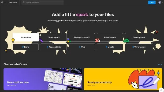
Figma points new users toward a community page, Figma Community, where they can help draw inspiration to get started faster. Going beyond static templates, Figma Community essentially empowers and mobilizes their entire user base to help onboard users. And the genius of this mechanism is that they've built a sort of onboarding-engagement flywheel where (a) existing users are incentivized to contribute by the prospect of earning upvotes and receiving positive feedback from other Figma users; (b) new users are able to derive value more quickly through community contributions that are higher quality than static templates could ever be.
Another thing Figma does really well is enable novice users to become power users. One example of this is how they have gamified keyboard shortcut adoption and education. Whenever a new keyboard shortcut is used, it is marked complete.
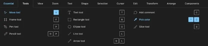
The small dopamine hit encourages users to explore other keyboard shortcuts. All the while, keyboard shortcut mastery helps users achieve more in Figma in less time, making their Figma experience more enjoyable and expediting their product adoption timeline.
Why Figma's user onboarding stands out:
- Figma makes the most important part of their signup flow (the "invite collaborator" step) engaging and educational.
- Figma Community allows new users to get value faster while also encouraging existing users to contribute high-quality files. Such a mechanism that has symbiotic drivers on both sides is special.
- New and casual users are guided to become power users via well-designed interfaces, such as their keyboard shortcut modal.
Example 8: LaunchDarkly – nudging users to take the right action based on context
LaunchDarkly is a SaaS product that provides tools to manage feature flags. Similar to some of the earlier examples, their signup flow is simple and emphasizes inviting teammates. One simple but valuable step they take is to automatically set up the account to include "Production" and "Test" environments. It is sometimes seen as bad practice to force something on users but defaults like these can help establish useful guardrails for new users. In this case, the default environments clearly indicate that LaunchDarkly enables feature experimentation.
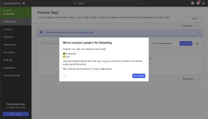
LaunchDarkly's user onboarding distinguishes itself with some intelligently-placed onboarding modals. For example, a new user that visits the "Contexts" section is shown a non-intrusive and useful product tour.
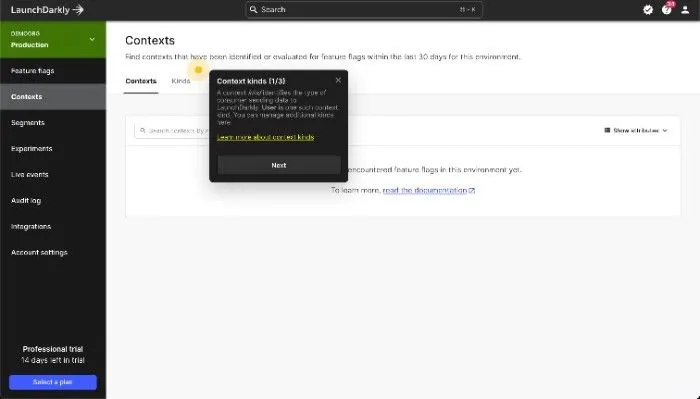
Why LaunchDarkly's user onboarding stands out:
- LaunchDarkly's default settings are not overly-opinionated and help new users understand the product's value.
- Product tours are shown to users when they are helpful and are kept simple. For example, they highlight fundamental features that users are being exposed to for the first time.
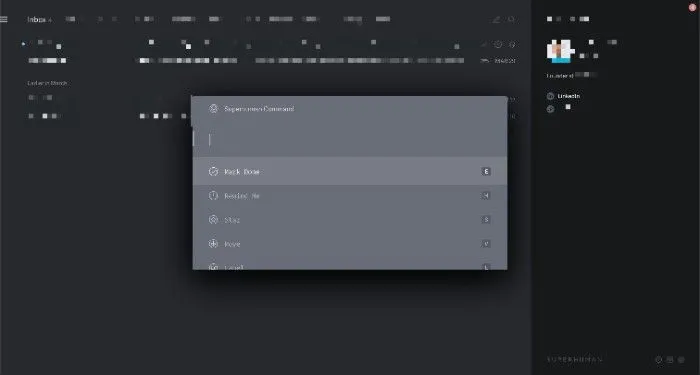
Example 9: Superhuman – 1:1 user onboarding process
Superhuman is an email app. Superhuman's approach to user onboarding falls on the extreme side of many spectrums but has proven extremely effective at driving customer retention. All new users are required to participate in a 30-minute onboarding session with an onboarding specialist from the Superhuman team.
In these sessions, the onboarding specialist (a) covers core concepts for the app (e.g., "Inbox Zero"), (b) highlights faster workflows to get to Inbox Zero, and (c) teaches the most common keyboard shortcuts. The session essentially breaks down into two pieces:
- (a) = explaining the product's core value proposition
- (b) and (c) = showing users how the product achieves its core value proposition and massively decreases the customer's learning curve
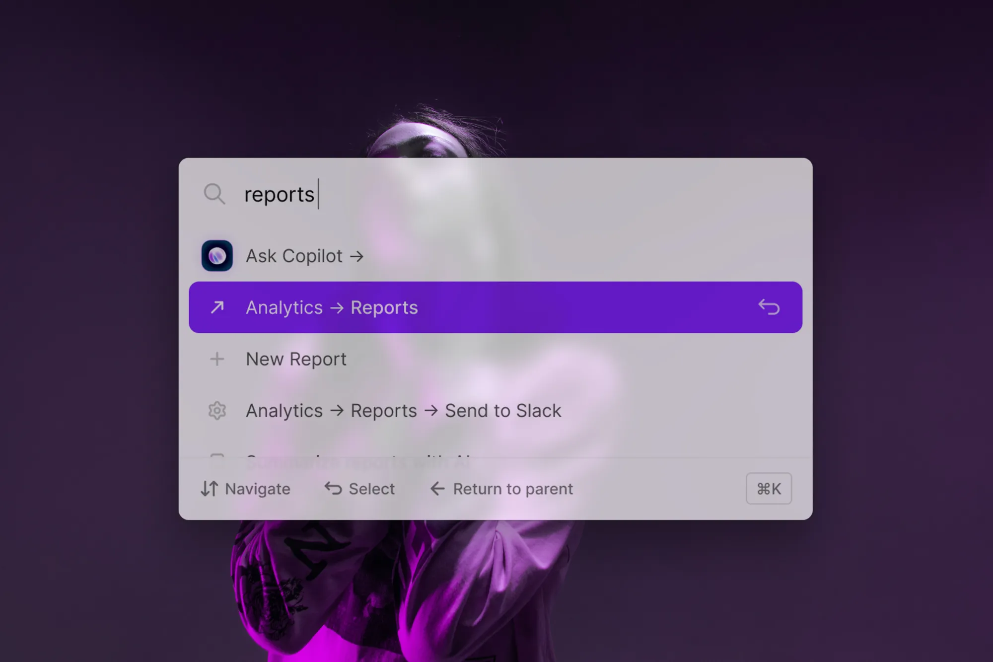
Whether Superhuman has the best user onboarding strategy or not, they very clearly have a keen sense for their users. One way that they provide customers with continuous onboarding is through their command bar or command palette. At the press of a button, Superhuman users can open up a menu that exposes all relevant actions as well as the associated keyboard shortcut (if applicable). This UI both exposes functionality and teaches users how to access it more quickly.
Why Superhuman's user onboarding stands out:
- Superhuman's 1-on-1 user onboarding session is truly one of a kind for a SaaS business. They leave as little to chance as possible on their users' onboarding journey. And for them, it works; their retention rates increased dramatically after landing on their user onboarding process.
- Superhuman's command bar interface (cmd/ctrl+k) gives users an always-available onboarding tool.
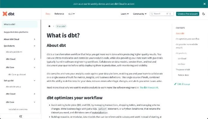
Example 10: dbt – self-service to the nth degree
dbt is a data transformation tool, and its user onboarding is different from many of the previous examples. As a developer tool, where their online app is optional, they don't have the typical surface area to introduce a product tour, an onboarding checklist, or progress bars.
So what can dbt do to onboard users? dbt differentiates itself with its "self-service" options, which allow users to essentially onboard themselves.
dbt's documentation is a worthy candidate for a separate article on "How to write great documentation". They use easy-to-understand examples and section their content into bite-size chunks. They also use their documentation to highlight additional resources – like joining their community or encouraging users to check out a demo, such as in the screenshot below.
dbt's communities, both their Slack and Discourse, are expertly managed by the dbt team. Despite having roughly 50,000 users, the Slack is warm and welcoming. Between the two communities, new users have access to a vault of Q&As, in-depth threads on the tradeoffs between possible solutions to a problem, and forums where they can post questions of their own.
Why dbt's user onboarding stands out:
- Between their stellar documentation, bi-weekly live demos, and user communities, dbt empowers users to serve themselves.
- dbt is proof that a good user onboarding experience does not require a set of guided onboarding flows and well-placed informational modals. However, onboarding users still requires deep reflection on what your users are looking for.
Bringing it Home
Now that we've gone through some real-world examples of great user onboarding experiences let's talk about how you can apply this to your own product.
First and foremost, it's important to understand the user journey and identify the areas where users might need the most guidance. This could include setting up an account, configuring settings, or understanding core features. Once you have a clear understanding of the user journey, you can start to map out your onboarding flow and identify where you can add value. If this isn't on your team's radar yet, there's no better time to take responsibility and accountability for your team's user onboarding!
Users need to understand what they can expect from your product and why it's worth their time and effort. This can be accomplished through many onboarding tools, such as product tours, instructional videos, or even a simple message that highlights the core value proposition of your product.
Whether you choose to implement user onboarding software or deploy a native solution, it is important to think of user onboarding as a continuous process. User testing with both new users and active users is the name of the game. Consider the full spectrum of the customer lifecycle and where they're at in the product adoption curve, and what is required to increase customer satisfaction.
Another important consideration is the time to value. Users need to see the value of your product as quickly as possible, or they may lose interest and abandon the onboarding process altogether. By identifying key features and creating an onboarding flow that guides users through these features, you can help them achieve their goals and see the value of your product in action.
By providing users with a checklist or progress bar, you can help them understand what steps they need to take to complete the onboarding process. This can be especially helpful for complex products or processes, where users may feel overwhelmed by the amount of information they need to process.
In conclusion, user onboarding is a critical component of any SaaS product's success. By creating a thoughtful, effective onboarding process, you can help new users understand your product and achieve their goals quickly and efficiently. By leveraging the strategies and techniques we've discussed in this article, you can create a user onboarding experience that encourages users to stay engaged and become loyal customers for years to come and boost your product adoption metrics.