What is this feature everyone is talking about?
If you want to understand why command palettes are popping up in apps everywhere right now (instead of five years ago), check out this post.
There’s a feature that users really seem to like
Almost every app I use on my laptop implements a fuzzy search via CMD+k. It's basically a core-primitive of good productivity app design at this point. Who deserves credit for pioneering it? I think it was a 1-2 punch between Quicksilver and Textmate in the early 2000s right?
— tobi lutke (@tobi) November 6, 2021
OMG @GITHUB GOT A COMMAND PALETTE
— shawn swyx wang (@swyx) October 27, 2021
PRESS CMD + K NOWhttps://t.co/uracAiYCmQ pic.twitter.com/E6WVVOXULu
Every time try a new web app - cmd+k
— akasuv.eth (@aka_suv) December 14, 2021
What is a command palette / command k / command bar? Let’s take a look at why this humble, little feature emerged and why it’s becoming a building block in modern software.
Search is so good it's boring
To start, let’s talk about a feature that is already ubiquitous: search. Searching the internet has somehow become boring, because everyone does it all the time.
Consider a question like "what is the population of Switzerland?". You probably don't know the answer, but it's very easy to figure out the answer. Just punch “population switzerland” into Google, and boom, done, now you know. This was not an interesting thing to do. You already knew how to do this.
As long as the results are good, search is an extremely efficient information retrieval pattern. To retrieve the right information, you didn't have to:
- Know anything about how data is stored.
- Use any specific words. Imagine if "population of switzerland" was a valid query but "number of people in switzerland" was rejected as invalid.
Without search, finding information is hard. Imagine Google was down and you needed to refine your understanding of central European geography before dinner with your Swiss inlaws. Go to https://wikipedia.org, then select "English," click on "Contents," click on "Geography," scroll down the list to "Europe," click on "Switzerland," and scroll to "Population."
This method works, but it (a) requires you to remember or learn Wikipedia's hierarchy and (b) requires you to transform your query ("population switzerland") into Wikipedia's vocabulary. That transformation requires effort. You had to read through each page to find the right anchor to the next place. Try doing this now.
The Wikipedia path may seem crazy and very 1990s, but you actually do the same thing many times a day when using software.
Searching in software
Instead of trying to retrieve some information about Switzerland, let's do something more fun: imagine you’re doing your taxes and need to create a new Google sheet. Let's try to get rid of the little gray lines that wrap each cell to make our sheet a little sleeker.
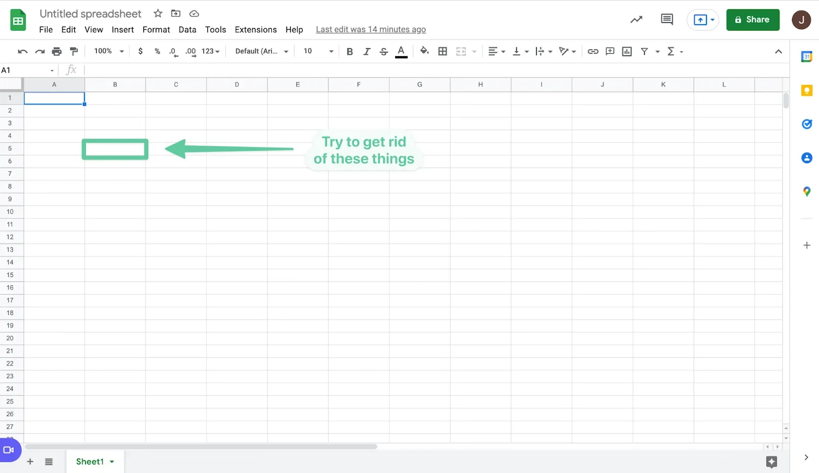
How do you do it?
You could try navigating the menus at the top of the site. To figure this out, you need to first decide what the little lines are called, and where the ability to hide them might live. Compare this to the Wikipedia example. In both cases, you have to understand a hierarchy to get the outcome you wanted. The Wikipedia graph was pages; the Google Sheets graph is buttons and menus. This is friction – a gap between intent (what you’re trying to do) and action (the software doing that thing).
If that sounds annoying or you can’t find the option, you can always use Google (search! yay!). "How to remove borders in google sheets" will help. But again, this is friction. As a user, being jettisoned out of the app I’m in to find the answer to a seemingly basic question doesn’t make me feel loved, and, worse, risks me getting distracted.
Thankfully, Google Sheets has a handy feature they call "Search the menus." You can access it by clicking "Help" or using the shortcut “option” + “/.” If you search for "grid," BOOM, you see an option to "hide gridlines." Nice job.
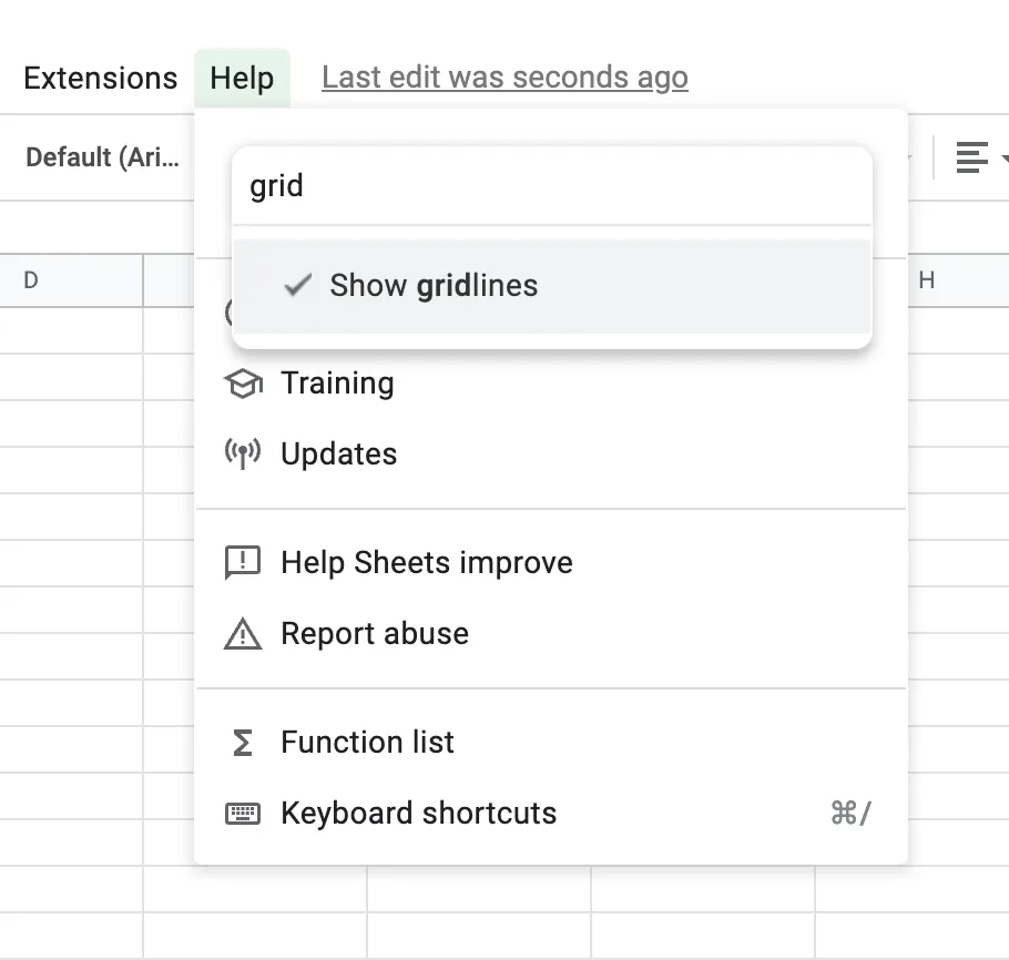
This feature is a command bar. It lets you take action in Google Sheets without needing to know where the action lives in the menus. Just search. (You'll notice it could be a lot better by being more forgiving in its vocabulary; if you search for "lines," for example, you don't see any results.) It’s also really fast. If you’re someone who creates a lot of sheets, it’s so nice to be able to take this action in a few keystrokes without having to remember anything about where it lives in the UI.
Just like information on the web can be represented as a graph where edges are hyperlinks, actions within software (this case, Google Sheets) can be represented as a graph where nodes are actions and edges represent actions that uncover other actions. One way to execute this action was to go from your sheet ➝ Show ➝ View ➝ Show Gridlines.
A command bar is just search that lets you query across the action graph, eliminating friction. As a user, you don't need to know anything about the graph; you just need to describe what you're trying to do in words.
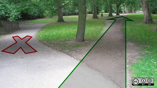
The anatomy of a command bar
We’ve been talking about software from an end user’s perspective, but now let’s think about how command bars can help software builders.
As you saw in the tweets, command bars go by many names. Command palette. Command menu. Action bar. Command k (which refers to the shortcut that's often used to invoke it).
They each look like a search bar because fundamentally that’s what a command bar is. There’s a space for the user to query, and there’s a space to show results. More advanced versions will also show default actions (before the user has started typing).
Here are a couple of examples. You can see the same basic anatomy in each:
- A place to enter the user's query
- A list of results (before the user searches, these can show smart defaults)
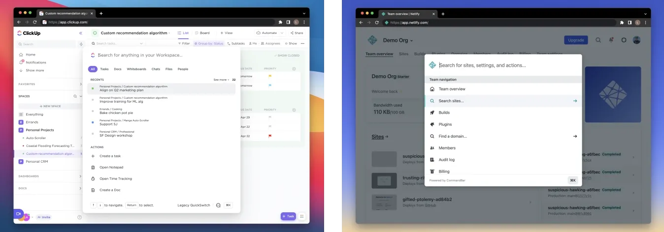
When you search, the user sees relevant results. What happens when a user selects an action?
There are two possibilities:
- Teleport the user to a place within the app that lets them continue the action. This obviously helps the user because they didn't need to figure out how to navigate to this page in the first place (remember the Wikipedia example?) and maybe there wasn't even an entry point to that page available in the GUI. With this option, a command bar is searching over the space of all possible pages. This isn't so different from search in a static site. But because most modern web apps are single-page applications, there isn't always a URL to navigate to.
- Let them take the action from the command bar. This allows the user to take action immediately, without changing the context of the GUI behind the command bar. If teleportation is like apparating, actions are like casting a spell. Can these actions totally replace a UI? Probably not. They make sense for certain actions that require either no input (like “Show gridlines”) or a handful of inputs.
Once you think about this concept of action search, you'll start to see it elsewhere.
For example, it turns out iOS search is kind of a command bar.
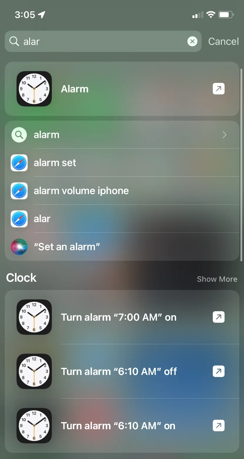
Here, you can see examples of both command types: “Alarm” at the top will just teleport you to the Alarm app, but “Turn alarm 7:00 on” will actually set an alarm without you having to do anything else. You can go from intent (setting an alarm) to action (the alarm being set) without having to navigate the Clock app at all.
Voice assistants are in some ways a form of command menu. “Hey Siri, set an alarm” → “OK, for what time” → “seven AM” is like an action command with one input.
What kind of products need a command bar?
There are so many types of software that it can be hard to generalize without thinking about some universal principles that relate to any type of software. Jeff Bezos famously said that in the retail business, users would always want lower prices and faster delivery. The software equivalent of that Bezos-ism is that users always want software that is (a) easier to use and (b) faster. No user will want to spend more time reading a manual or help center to understand how to use an app. Similarly, most of the time, no user would prefer to take the scenic route to accomplish something in a tool when they could do it in less time.
Here are some symptoms of software that could especially benefit from a command bar:
- New users have a hard time finding important features
- Users find certain actions slow
- You get a lot of "How do I do X" support requests
- You can't figure out where to put the new feature you just built
Let’s take each one of these.
New users have a hard time finding important features
New users are especially bad at navigating action graphs because their prior knowledge of the graph is zero. They might not know what actions are possible or how they are described. With a command bar, users need much less prior knowledge.
You get a lot of "How do I do X" support requests
This means your action graph is hard to understand because the relationship between the nodes is unclear. A command bar solves this problem because it turns the support request into a query. If there’s an action that satisfies the query, the command bar will show it.
You can't figure out where to put the new feature you just built
UI bloat is incredibly common, especially as an app grows and adds more features. Adding buttons for every new feature risks making the app confusing and cramped, and sometimes there isn’t a logical place for a feature. A nice property of a command bar is that it scales infinitely.
Users find certain actions slow
Slowness in software is like fatigue in the human body — it’s a common symptom with many different underlying causes. A command bar can help with a few types of slowness.
- Navigational slowness — when a user knows they want to do an action but has to click through several parts of the UI to get there. A command bar lets them jump straight there.
- Context switching — if an action can be taken directly from a command bar, it doesn’t require the user to switch away from whatever they were doing in the app.
Why doesn’t every app have a CommandBar yet?
You'd think with all these benefits and all this user love that every app would have a command bar. Why aren’t they everywhere already?
We believe that part of the reason is that it’s hard to build a command bar well. For the pattern to work, your command palette has to meet several criteria.
Easy to extend
If users can’t find an action in a command bar, they’ll probably ignore it. This is one of the strongest findings we saw in our user research when we were starting CommandBar. If users try out a command bar and it doesn’t contain the action they’re looking for, it’s unlikely they’ll try it again. If they fail 3 times, that probably drops closer to 0. Conversely, you don’t want stale or broken commands lying around.
CommandBar solves this problem with the CommandBar Editor – a configuration tool that makes it possible to add and edit commands without code – and a simple, composable SDK.
Allow natural language input
Don’t force users to use specific words; let them express their intent in the way that is most natural and fast to them as possible. That means accepting synonyms and being typo tolerant. Doing this well is critical to adoption and avoiding a scenario where a command exists in your bar but a user can’t find it because they spelled something wrong or used the wrong synonym. Even for users who are using a command bar regularly, you don’t want to require that they memorize commands like they would need to in a traditional CLI interface.
CommandBar solves this problem with out-of-the-box typo-tolerance and by making it possible to add synonyms to commands based on previous user searches.
Be super fast
Speed is kinda the point of a command bar. Everything about it needs to be fast. It needs to load fast, respond to user input fast, and take action fast. It should probably also support keyboard shortcuts for extra speed. Users should think of it as the fasttrack in your app.
Everything we ship at CommandBar adheres to the principle that if it isn’t fast, users won’t use it. We even let users define their own shortcuts through CommandBar.
Work for any user
If your command bar doesn’t work for all of your users, it isn’t fulfilling its potential: the portal to your app that every user — not just power users — can rely on to quickly go from intent to action. If you don’t do this, you’ll enter a sad cycle where only a subset of users will use the feature, and then you’ll start to optimize for those users, ignoring commands or use cases relevant to the rest.
The entire CommandBar interface accommodates different types of users: users who prefer or depend on the mouse, users who prefer and depend on the keyboard.
Be customized for every user
Showing users relevant actions before the search can turbocharge the entire pattern, and make a command bar a place a user turns to figure out what they should be searching for. Like Clippy, but not annoying.
CommandBar makes it possible to create custom defaults for different users based on who they are and what they’ve done in your app, utilizing patterns from previous users.
Be maintainable
Your command bar can be another access point for your product’s entire range of features. Maintaining this additional interface can be a time-consuming engineering task, especially when there are changes in your tech stack.
At CommandBar, our entire focus is making this interface work seamlessly for your company and your end users.
And this is why CommandBar exists. We believe that every software product that cares about its users should have a feature like this, and we want to make it an afternoon project to add a beautiful, performant command bar that all users can rely on.
If you build software, you can try us out at https://commandbar.com.
