


Sometimes, an app is annoying because it has an obvious shortcoming: It doesn't have a feature you'd like or the setting you're looking for doesn't exist. These are big reasons to be frustrated with software.
But many apps don't ruin their apps with big flaws, but with a few hundred papercuts. We've all used these apps—they do everything you want them to do, but...
- It doesn't autosave your work and you lose it on refresh.
- A setting you use frequently is hidden behind 3 submenus
- A button doesn't clarify the consequences of clicking it
- File upload only accepts specific file types (never the one you have)
- CSV import gets date inputs wrong, meaning you have to correct by hand
- etc.
These are little things—none of them would individually make you delete your account. But all of them together create an experience that's best described as urrrrrrghhhhhhhhhhhh.
That urrrrrrghhhhhhhhhhhh feeling is called friction—little sticking points that annoy users. Reducing friction means increasing user happiness. In this article, we'll explore what friction is and how to minimize it to make your users happier.
Now, if you're reading this, you're likely in tech. You work on interfaces every day, so you can navigate them well.
But remember that some of your users might not be tech savvy.
i really wonder how non-tech savvy people even survive their everyday lives in the modern day
— DCinvestor (@iamDCinvestor) December 29, 2023
basic things like a software update changing a UX flow you memorized, but never actually understood, require a call to the GeekSquad
ffs i can't even imagine
When designing user flows, it is important to consider user friction at the start. Sometimes, a high number of steps can cause friction. Sometimes friction is unintentional—an error occurs that prevents a user from completing a journey. These hiccups can add up, leading to a frustrating user experience; occasionally, a single point of friction can sabotage product adoption altogether.
What are the different types of friction?
There are various types of user friction that impact how a user interacts with your product. These different types of friction typically mandate different strategies to tackle them.
Interaction Friction
Interaction friction is any aspect of the UI that prevents the user from achieving what they want to achieve. Examples of interaction friction is a cumbersome form flow to achieve end results or far apart components mandating too much mouse movement. Interaction friction includes aspects of your product that are slow or buggy as they impair user journeys. Interaction friction is often tackled by revisiting the design principles of the product.

Cognitive Friction
Cognitive friction is any excess mental effort that a user needs to exert to accomplish a task. Cognitive friction happens when an interface is busy and difficult to decipher or simply unintuitive. The more your users need to wrack their brains to use your product, the bigger impact on the user that cognitive friction has.

Emotional Friction
Similar to cognitive friction, emotional friction is when someone develops a negative emotion while using your product, preventing them from achieving the desired outcome. Emotional friction happens when your users perceive your product as not being user-friendly. Emotional friction doesn’t need to be related to a specific feature or interface—if your users overall feel a negative attitude towards your product, even the most simple, straightforward tasks will be sabotaged by emotional friction.
While lots of cognitive friction can typically lead to emotional friction, it isn’t the only way emotional friction is created. Bugs, too, can cause emotional friction. Or mismatched perceptions over save state. If a user feels like they need to fill out a form over and over or a product isn’t responding as they expect it to, they may develop strong emotional friction. Personally, I’ve felt this way every time I open Quickbooks 😅.
How to think about friction big-picture?
Given that friction happens in different ways in different places to different types of users, tackling friction is less about following a step-by-step process to build a hypothetically frictionless experience and more about general guidelines to follow. Building a good product that people want to adopt is all about the balance of contradictions—something that is simultaneously powerful but simple, informed but not wordy.
Strategies for alleviating friction?
Let’s dive deeply into a comprehensive list of guidelines to help you create a frictionless—or at least a near-frictionless—user experience.
Break Complexity into Chunks
If you ever have a complex process like a long-form or a multi-part widget, break it up into chunks to help users process less information per step. The less focus a user needs to do, the easier it’ll be for them. However, breaking things into chunks can be frustrating if users start to perceive rather simple interactions as long, arduous processes. Don’t make users feel that they are doing homework, but try to ensure complexity is reduced into parts.
Don’t Make Users Think
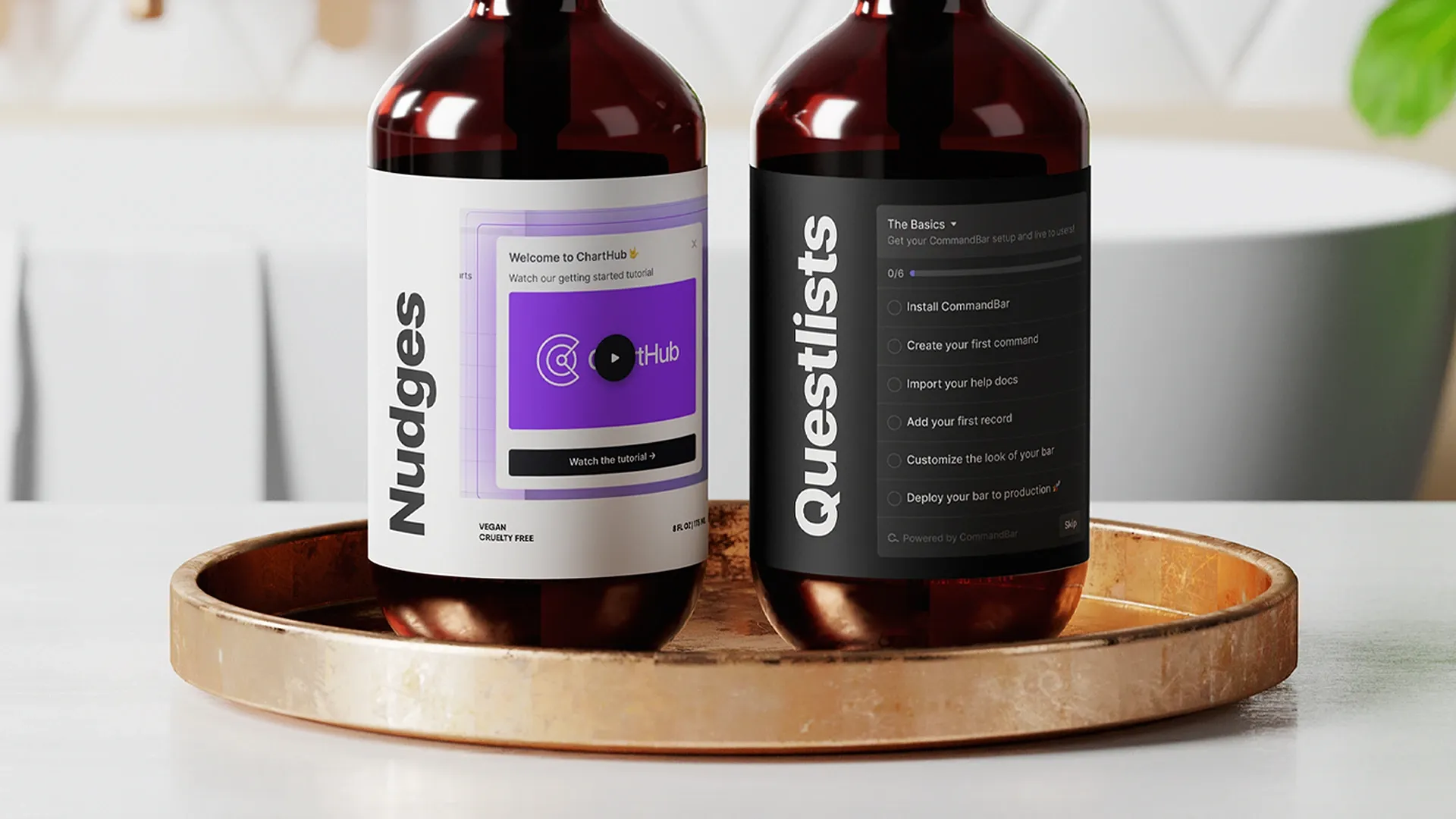
As funny as it sounds, don’t make users think. Your product or service is meant to provide some sort of value for your users, not act as an assignment. Strive to create an application that feels simple and easy to use without any mental drain. You’ll sharply reduce cognitive and emotional friction by simplifying your product and communicating what does what. Things like tooltips can dramatically reduce confusion and hand-holding users towards their destination. CommandBar customers utilize search to inform users of relevant page actions and guide them through the product.
However, it’s important not to infantilize your users. Too much instruction can again feel like homework. It’s important that whatever you do to minimize cognitive overload also doesn’t prevent users from achieving their desired outcomes in a timely manner.
Acknowledge User Interactions
Ensure your users feel like your product does and will always acknowledge interactions. Show loading states while your servers are working, confirm inputs as valid, and even use animations to indicate hover states. Acknowledgments are small and provide little impact individually, but collectively, it dramatically improves the user experience.
Guide Users to Next Steps
Ensure your users understand what is the next step while they are completing a multi-step flow with a tool like a checklist. Don’t expect users to automatically know what to do next or where to find a tucked-away button. Ensure flows feel streamlined and easy to understand the steps the user is on.
Keep Things Snappy
Optimize the performance of your application to keep things snappy. A fast, responsive experience will reduce emotional friction—even if users feel your app is tedious, they’ll feel less frustration on a step-by-step basis. Paul Buchheit, the Gmail creator, once famously stated that interactions under 100ms are seen as instantaneous to users. While 100ms isn’t a hard or fast rule, a snappy app will pay dividends by spurring happy users.
Use Established UI Patterns
Users spend more time on other applications than your own—it’s important to re-utilize UI patterns, not re-invent the wheel. Users prefer applications that are easy to use, and not necessarily flashy and fancy looking. While you can definitely create your own brand and feel, the general UI structure of your application should look like other applications; otherwise, users will spend too long understanding your app than using it.
This same lesson is held firmly at CommandBar. One of the fundamental tenets of CommandBar’s design is to extend flexibility to customize the aesthetic of the CommandBar, but keep and force the fundamental design principles that make action-based search bars familiar and powerful.
Provide Clear Labels, Iconography, and Tooltips
Use icons, labels, and tooltips to ensure users understand what features do what and where to find certain features in your application. It’s frustrating for users to do something and get a result different from what they expected. By using tooltips and labels, users will have a better understanding of how a product works from the get-go.
Consistency
Keep UI patterns across your app consistent. If users feel certain parts of your application are different from other parts of your application, they’ll start to compare the relative efficiencies of each segment. Instead, create an application that feels like a seamless, united experience throughout.
Consider Defaults Carefully
Users don’t typically change defaults. Keep defaults to be the most common or recommended action, not necessarily the neutral option. This will lead to fewer users changing their responses after realizing they selected something erroneously.
Use Error Messages Tactfully
When your application errors, give users an informative message. Help them decipher between mistakes of their own and server errors that require a patch. If the error message was a server message, give users recommendations of possible alternative ways to achieve their desired outcome. Regardless, ensure that users deeply understand that there is an error, and don’t make users guess in the dark what to do.
Conclusion
Creating friction comes with creating apps. By investigating how your product might be introducing friction and implementing remedies (like in-app guidance), you can dramatically improve your product for each user. With less and less interactive, cognitive, and emotional friction, you can expect less churn and better retention.