


You know the feeling: You walk into a store and immediately, an employee approaches you with the company-issue smile.
"Can I help you find anything today?"
"I'm fine, thanks".
That's usually where it ends. But if you've ever had some be more persistent about "helping" you, you know it gets annoying. "There's 5% off over there!". "Saw you tried that on—we also have it in white". "Would you like to add a pair of flip flops for just $5 more?"
JUST. LEAVE. ME. ALONE, you probably want to say in those situations. Many pop-ups feel the same to software users. Especially if they're part of in-app guides.
For our purposes, in-app guides are any in-app guidance or experience that is designed to help a user use your product.
Main takeaways:
- In-app guidance needs to be executed perfectly to avoid annoying your users - we arm you with actionable tips
- We take a look at the 7 types of in-app guides, their pros+cons, and an example of who is using them well
- Learn the metrics you need to track to nail your in-app user guide strategy
What in-app guidance is not
With our definition above, we can remove ambiguity and list some "outside-app" guides:
- Emails, SMS, phone calls, screen shares
- Help documents or knowledge centers
- Surveys and user feedback forms
- Blog posts
- Use case videos
- Standalone (non-embedded) YouTube videos, Looms, or other video guides
Contents
- In-app guidance isn't just there to annoy users
- A brief background on common form factors for in-app guides
- How to guide users with some tact
- Measuring success (or failure)
In-app guidance isn't just there to annoy users
Contrary to what it seems most products want you to think: in-app tutorials are not built solely for the purpose of annoying and frustrating users. As internet users and explorers of online applications, we have all been forced to click through and "x" out of countless user onboarding atrocities. The sad reality is that most products show users information that is either (a) useless for what the user is trying to accomplish; or (b) useful but presented in a way that makes the odds of user engagement close to 0.
Because the average in-app guidance is such low quality, many users are conditioned to ignore anything that feels like a pop-up. So what's the point of even trying? If done well, user onboarding stats show us that users do appreciate onboarding guidance. Moreover, 20-30% of users abandon an app after the first use if the user onboarding experience is ineffective.
A non-SaaS example of useful user guidance: barbecue "onboarding"
To take the points above further, it's important to note that the best in-app guides don't even feel like they are there. They feel like natural first steps to the product. Consider a good home tour. An expert tour guide tailors their tour based on contextual clues from the guest. What does the guest care about? Why are they at the home? What should they absolutely know about the home?
Imagine you are hosting friends for a barbecue. There are a number of things you can do to make the "user onboarding" experience seamless:
- Open a "desire path." Let new guests get straight to business. Open the side gate that leads directly to your backyard. This removes the barriers of opening the front door, shuffling around furniture, navigating through rooms, and opening/closing the screen to your backyard.
- Onboard with the essentials. Rather than walk your guests through each nook and cranny of your home, focus on what they really care about -- (1) where the nearest bathroom is; (2) where the food and drink is. You can go "brute force" and communicate this directly to each guest or use intuitive design to communicate these points. Both work just fine.
- Introduce deeper functionality further into the user journey. If you show off every single cool thing about your home the first moment a guest arrives, they might be overwhelmed and forget about what they saw. They might also prefer to initially hang outside and make small/big talk with friends. Rather than waste everyone's time (as well as your effort), it is wise to introduce your home's cool features once you get to know a bit more about what each person is looking for. Grace had a long flight a few days ago? You might want to introduce her to your new massage chair. Frank recently developed a love for cooking? It might be the perfect opportunity to show him your collection of cookbooks and offer to let him borrow a few before he leaves.

Your product is obviously not an in-person barbecue. But the same attributes that make an in-person barbecue's onboarding effective can make your app's product onboarding effective. Creating in-app tutorials can tactfully expose new users to your key features, ultimately increasing the odds of customer success and product adoption.
A brief background on common form factors for in-app guides
There are many ways to guide users. These are the most common form factors for in-app messages and guides:
- Modals
- Tooltips
- Product tours
- Checklists
- Chat widgets
- Help hub / resource centers
- Command palletes
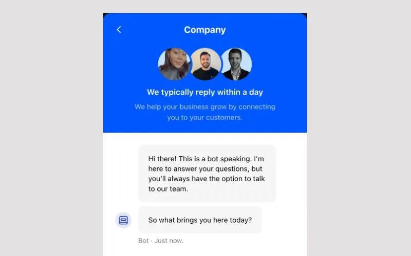
Modals: the ordinary Joe
Modals are the "vanilla" in-app guide. Two alternate names for modals are "lightbox" and "pop-up." By far the most widespread and generally the most intrusive, modals are often presented as large cards. Sometimes the rest of the screen is dimmed. SaaS products use modals to communicate important changes.
Since modals are large, it is important that they are visually appealing and visually engaging. If relevant, you should consider how your modals appear on mobile -- mobile apps can be ruined by a non-closable modal.
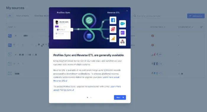
There is room for more text than most other forms of in-app guide, but you should still use concise language. Modals are usually only a single-step (no "Next" button) but can be multi-step, like in the user onboarding experience example from Segment below.
These are some common examples of modals:
- Inform users of new features and product updates
- Encourage the user to upgrade their account
- Nudge new users to take a specific action, like inviting a teammate
Tooltips: the precise in-app guide
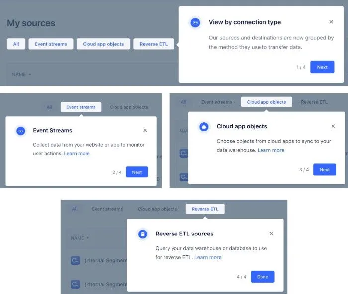
Tooltips are generally smaller and communicate more specific points to a user. Tooltips are often "pinned" or "anchored" to a specific element in a product, like a button. When that button is clicked or hovered over, the tooltip reveals itself to communicate relevant information to the user. Tooltips are a great example of contextual guides: they only display in certain parts of a product (the button the tooltip is anchored to) at specific interaction points (on click or hover).
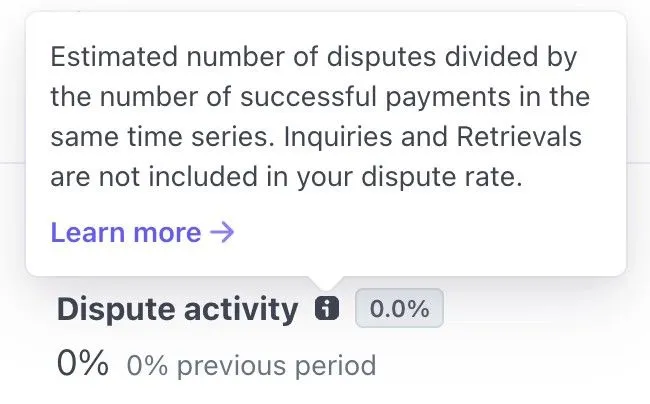
The most common use case for tooltips is the "informational hover." The informational hover explains the related feature when the user hovers over an "i" or "?" icon, like in the example from Stripe below.
In-app tutorials: artfully combining modals + tooltips to engage users
In-app tutorials, also called product tours and user guides, are a multi-step combination of modals and tooltips that prompt users to explore the core functionality of a product. In-app tutorials are most often used in new user onboarding or to introduce a new feature. At their best, in-app tutorials can make your product more accessible for new users, encourage users to learn, introduce new features, and ultimately help users get more value from your product.
In the example below, Segment uses a chain of 4 tooltip modals to explain the various options for one of their features. The in-app tutorial is only triggered when the user is the relevant part of the app and uses short, simple messages to increase the odds of user interaction.
Checklists: a gamified approach
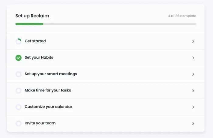
Checklists are like to-do lists for new users, except hopefully not dreadful or anxiety-inducing. Most often used for the user onboarding process, checklists are an excellent tool to drive user engagement while increasing feature adoption. They can include sections and completion indications (like progress bars and check marks), like in the example below from Reclaim. A word of caution: avoid thinking of checklists as step-by-step instructions!
Chat widgets: the reactive guide
Many apps offer chat as a customer support avenue. While extremely effective for that use case, some chat apps also allow users to open relevant content inside the application. For example, if a user types a query mentioning "401k" inside a chat widget for a financial services product, the chat widget might suggest in-app guides related to setting up a 401k or contributing to a 401k. This flow can be valuable for new users. Since the user's intent is already clear from the query text, it is possible to surface the most helpful in-app tutorial examples and in-app training modules.
Help hub / resource centers: a dedicated space for help content and onboarding resources
Help hubs and resource centers are often presented in a similar user interface as chat widgets. There is often a circular or square icon that opens a tall interface. By default, a list of relevant help articles and/or other self-serve resources are displayed. The user can then search to find the specific content they are looking for. Figma offers a minimalist resource center that both new users and more advanced users can use to easily access the content they are looking for.
Help hubs and resource centers are non-invasive self-service options, and they are great complements to the above form factors.
- Active users can access them as needed
- They do not overwhelm new users
- They deliver simple, direct user education options
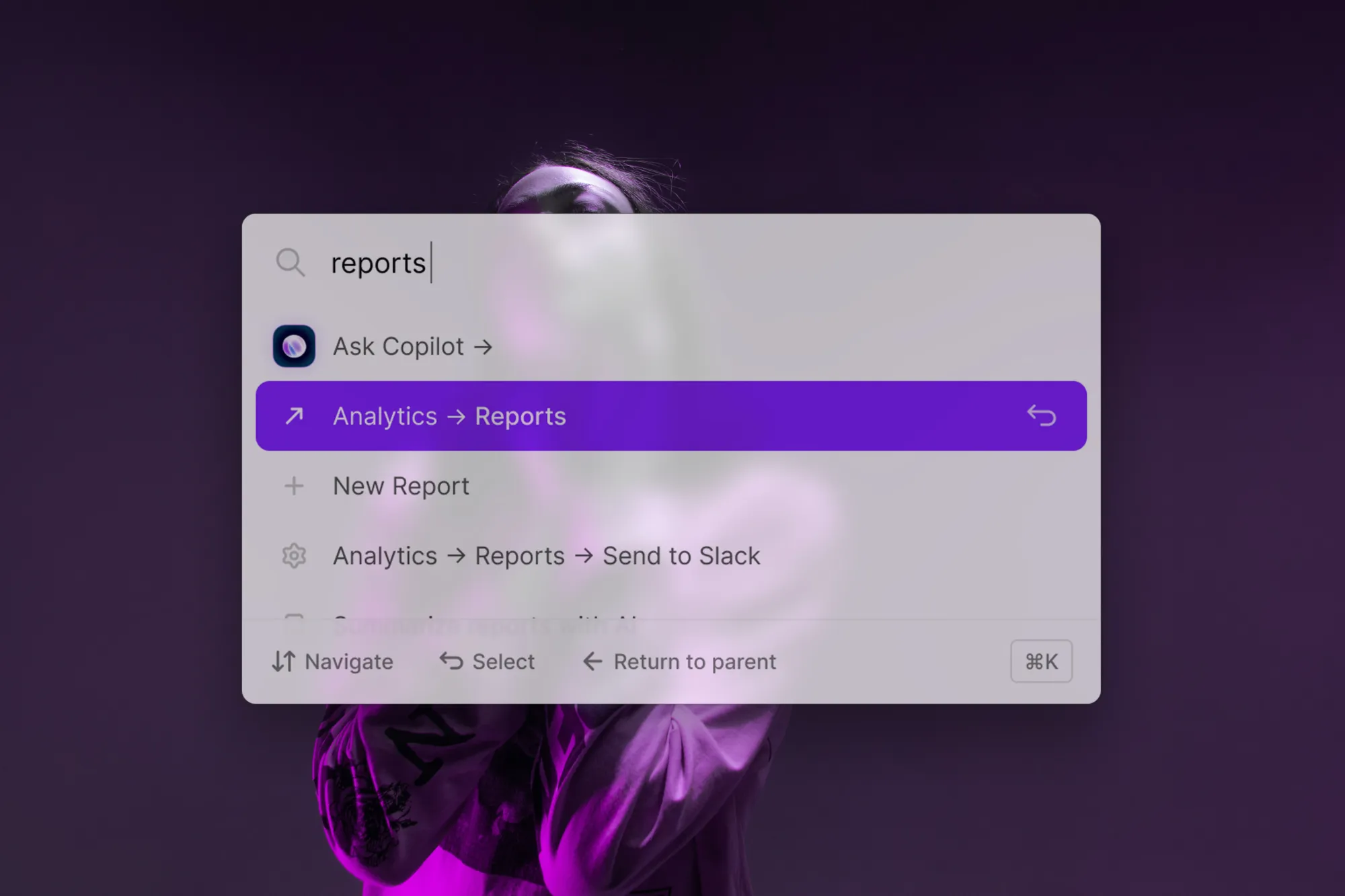
Command palettes: modern, contextual guidance
Command palettes, or command bars, are interactive, always-available modals that allow users to search content, jump to specific pages, take CRUD actions, and read through help content all from one place. In recent years, some of the most user-obsessed companies (Superhuman, Figma, Gusto to name a few) have introduced command palettes to their products. Below you can see Gusto's command palette.
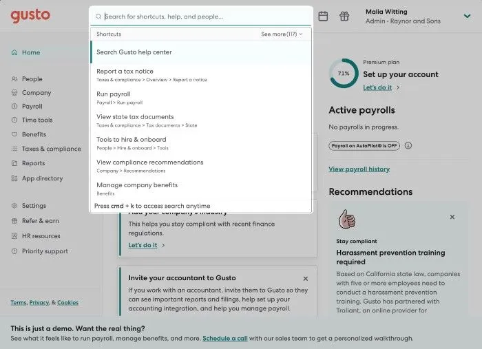
How is the command palette form factor a good fit for in-app guidance? For one, command palettes serve as an organized menu of all the actions and content a user can interact within the product. Second, apps can suggest the most relevant or useful in-app actions and results to the user based on the user's context (e.g., based on the page, recent user behavior, or user segment). Third, users can summon a command palette via a button (like the search bar for the Gusto example) or via a keyboard shortcut (most often cmd/ctrl+k) anytime and anywhere in the product.
How to guide users with some tact
We've discussed barbecues and a laundry list of form factors. "Can I get specific guidance from this blog post about guides so that I can actually guide my users?" – why, yes - yes, you can. Let's walk through three ways to guide users more tactfully.
- Surface the right content at the right time
- Reduce friction
- Respect and empower your users
#1: Surface the right content at the right time
After you create in-app guidance, you might be tempted to try to send the same content to all of your users all at once. Please do not do that. Think back to the barbecue example. Cover the essentials early on, then surface relevant content throughout the user's journey based on contextual clues. Let's look at some examples of this.
Suggest a new feature
Let's say your product has two primary features. If users visit the page for a feature they have not yet used, it is a great opportunity to surface a modal with a video guide or a feature tour. On the other hand, if a user is in focus mode (taking many actions) and hits that page, then it is probably the wrong time to nudge them to try out a new feature. You only have so many opportunities to capitalize on a user's attention, so it is best not to waste them.
Introduce a keyboard shortcut
Learning keyboard shortcuts is one of the easiest ways for a user to level up from a casual user to a power user. They allow users to more easily accomplish what they are trying to do with your product. If you see a user taking the same action(s) many times in the same session, you should consider triggering a tooltip message that explains the keyboard shortcut for that action. The important thing here is to make the tooltip visible but non-invasive.
Upgrade to a paid plan
Many SaaS products have free plans, with the hope that users will fall in love with the product and eventually convert to a paid subscription. If you don't nudge users to try a paid subscription, though, then they are unlikely to convert.
Rather than removing paid features from your application for users on your free tier, it can be more effective to do one of the following:
- [Easy] Add user interface cues on features or pages to indicate that they are only available on paid plans
- [Easy] Surface modals on pages for paid features to make your pitch to the user for why a user should upgrade to a paid plan
- [Hard] Offer a free trial of a paid plan to a user based on their account activity. Once the free trial is activated, launch a product tour of the main perks.
The first two bullets are easy to implement but might not be as effective. The third bullet is more difficult to implement but also more likely to improve user adoption.
#2: Reduce friction
Regardless of what your in-app messaging strategy is, you should try to reduce user friction as much as possible. What exactly this means depends on your application. Consider your product's "aha" moments. What can you do to make it as easy as possible for new customers to reach the criteria for an "aha" moment?
Here are some real-world examples to explain this.
Facebook: add 7 friends in 10 days
Facebook's "aha" moment is when users add 7 friends in their first 10 days. Users that accomplish this task are much more likely to convert. Facebook was able to productize numerous flows to make it easy and engaging for new users to add friends: There is a full screen in the onboarding flow purely to add friends.
Facebook added friend suggestion cards to the main app, based on mutual friends and other user information. While permanent UI elements might not be thought of as guides, in this case, they absolutely are. The cards are essentially embedded reminders to use their "add friend" functionality.
Slack: send 2000 messages in a workspace
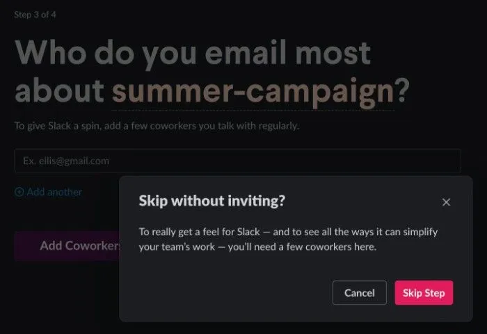
Slack's "aha" moment is when a workspace has sent 2000 messages in total. To help customers reach this milestone, Slack uses interactive walkthroughs for adding channels and teammates.
Also, with a touch of UI/UX beauty, Slack actually introduces some user friction to reduce friction down the road. Let's unpack that. In the new admin onboarding process, Slack highly encourages admins to invite teammates. If an admin tries to skip this step, Slack tries again to get the admin to invite teammates. By introducing this friction, Slack increases the odds of an admin inviting a user, which ultimately helps them get more value out of the product more easily.
#3: Respect and empower your users
There's a fine line between guiding users and treating them like infants. Users do not want to be treated like they are stupid. Of course, you should assume that they are new to your product, but they are not new to online applications or user interfaces. 99% of the time, you do not need a new user product tour to explain your side menu or navigation bar.
Instead, try adding self-service tools like a command palette, help hub, or resource center. These features allow users to onboard themselves at their own pace and eventually work their way into advanced features.
Measuring success (or failure)
Now that you've deployed, or are thinking about deploying, in-app guides, you wonder how you can tell if the guides are working or not. Kudos, you are a smart cookie! Many companies set and forget user onboarding guides.
There are two general paths for measuring success:
- Build your in-app guide(s) and then decide how you want to measure success
- Decide how you want to measure success and then build your in-app guide(s)
Regardless of which path you take, the process should be iterative. You should consider the following on a continuous basis: (a) whether the success criteria are helping and driving value; (b) how you can modify your guides to improve outcomes.
Product usage data or product adoption metrics are a great starting point for measuring success/failure. There isn't a correct answer for which metrics to pick since in-app guides can be used for many different use cases. As a side note: simply going through the process of considering which metrics your team should care about can be extremely valuable.
Here are some of the most common ones:
Active users
Active users are typically measured by day or month. Daily active users (DAUs) and monthly active users (MAUs) are the number of users that use your product during a given day/month. When active users increase, your product is doing well (or you're just dumping more money into marketing). When active users decrease, something is likely going wrong (or it's just a holiday lull). Useful for a higher-level pulse check, active user analysis does not yield targeted conclusions; the figure is often influenced by a variety of other factors (e.g., customer retention, marketing spending, product/feature launches).
Churn rate / retention rate
Churn and retention are two sides of the same coin. Churn rate is the percentage of users that stop using your product during a given time period (e.g., during the user's first week/month). Retention rate is the percentage of users that continue to use your product after a given time period. High churn and low retention are signs that you need to help new users understand your product's value proposition faster.
Feature adoption rate
The percent of customers that used the target feature during a given time period. Feature adoption rate can help your team pinpoint which features need more love and which are thriving. Your guides should play a major role in driving feature usage. If feature adoption is low, but you're seeing that more users are engaging with the feature, then it's possible that core functionality is missing. From here, you might turn to user session playbacks, user analytics, or other onboarding tools to discover the appropriate antidote.