


PostHog’s sign-up process is filled with informational tidbits to guide inexperienced users while providing the necessary options for more seasoned sign-ups.
Rating: 9/10
Intro
As part of our unboxing series, we'll dive deep into PostHog’s onboarding. If you aren’t familiar with PostHog, they are a leading open-source analytics platform for tracking website events, orchestrating session recording, powering feature flags, and providing other product team needs.
With major competitors like Amplitude, Mixpanel, and Heap in their space, PostHog appears to have committed to a self-service-first philosophy to drive user growth. For this article, I’ll be signing up for a new PostHog account, tracking every step I encounter, and documenting any friction or frustration I experience.
Please remember that any criticism in this teardown is not a review of the core PostHog product. I am a PostHog user and love their product; it only follows that the PostHog app deserves a stellar onboarding experience to enable newer users. While criticizing some app friction can come off as whiny (“Oh no, they made me click a button!”), it comes from an undeniable fact: today’s business professionals are heavily distracted by internet doo-dahs. As a result, all SaaS apps should strive to perfect their set-up processes.
Step 1: The homepage
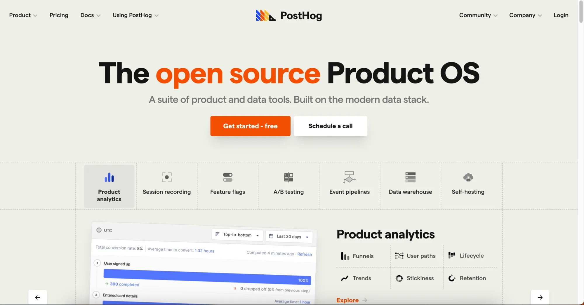
Like all products, I’ll be starting on the homepage to sign-up.
What there is to love:
- The call to action to get started is sufficiently called out in orange.
- PostHog clarifies from the get-go that they have a free tier—that suppresses any paywall fears.
Step 2: The get started form
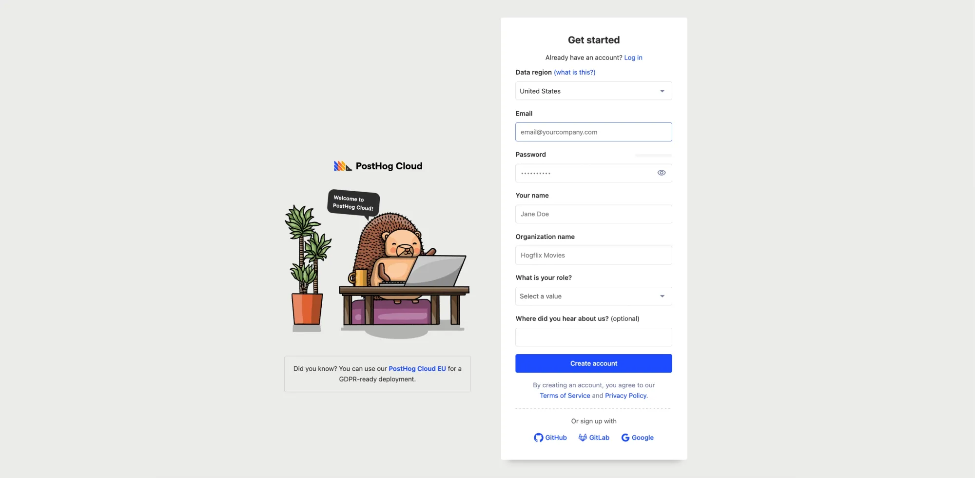
After signing up, I encountered a get started form.
What there is to worry about:
- The form is a bit longer than a typical sign-up form—I had to zoom out to capture the whole form without scrolling.
- The OAuth sign-in options, located below the Create Account button, aren’t easy to discover either.
A long Get Started form can create some friction, especially cognitive friction (for more info on other types of friction, check out our piece on crafting a frictionless UX experience).
The Caveat
There is, however, something notable about this. By requesting more information upfront, PostHog is able to shorten the number of steps between signing up and using the product.
Step 3: Welcome to PostHog
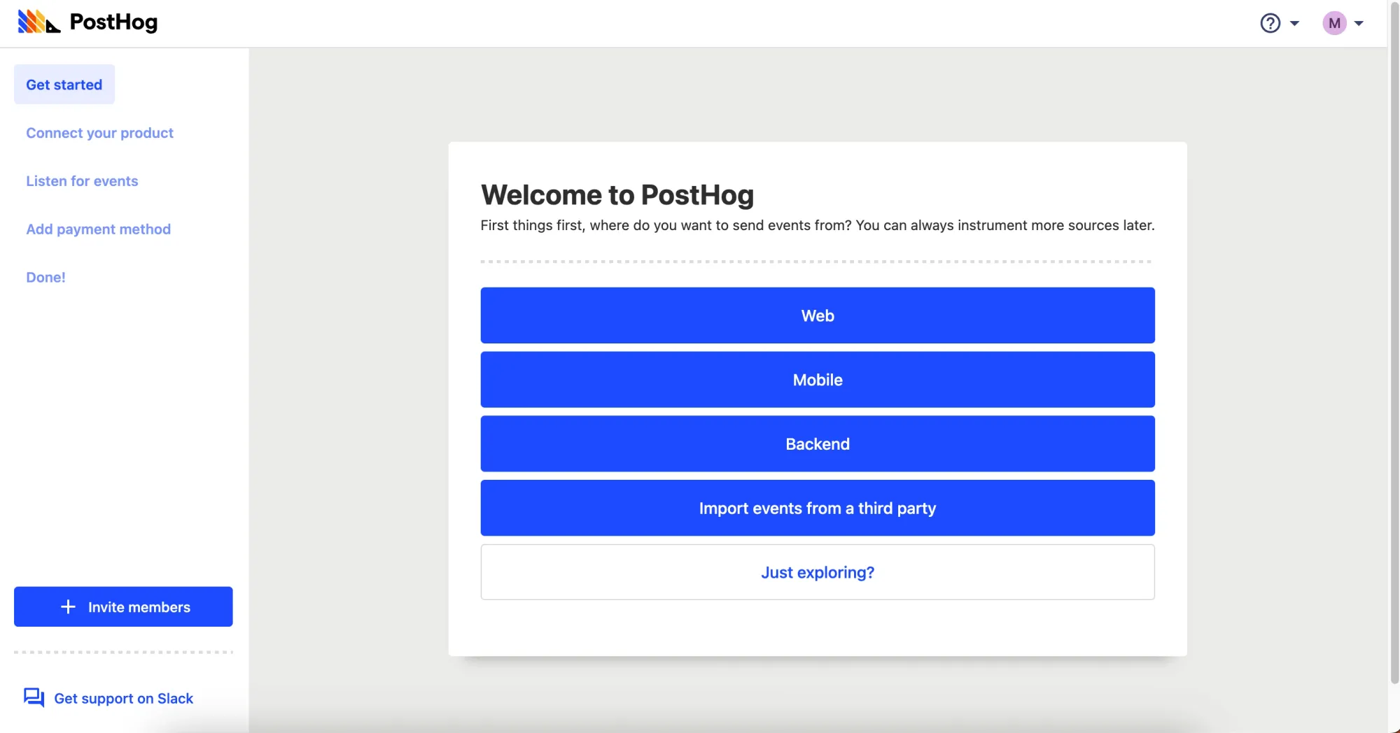
After filling out the form, I’m greeted with a choice of what to do.
What there is to love:
- Because PostHog’s users are segmented by platform type, this is a fantastic way to personalize the user onboarding to a user’s specific needs.
- A sidebar that makes it immediately clear how many steps are ahead.
What there is to worry about:
- When I signed up, I was informed PostHog would be free. The Add payment method implies a free trial is ahead, not a free tier.
I decide to click on Web since it’s what I’m most familiar with.
Step 4: Code snippet
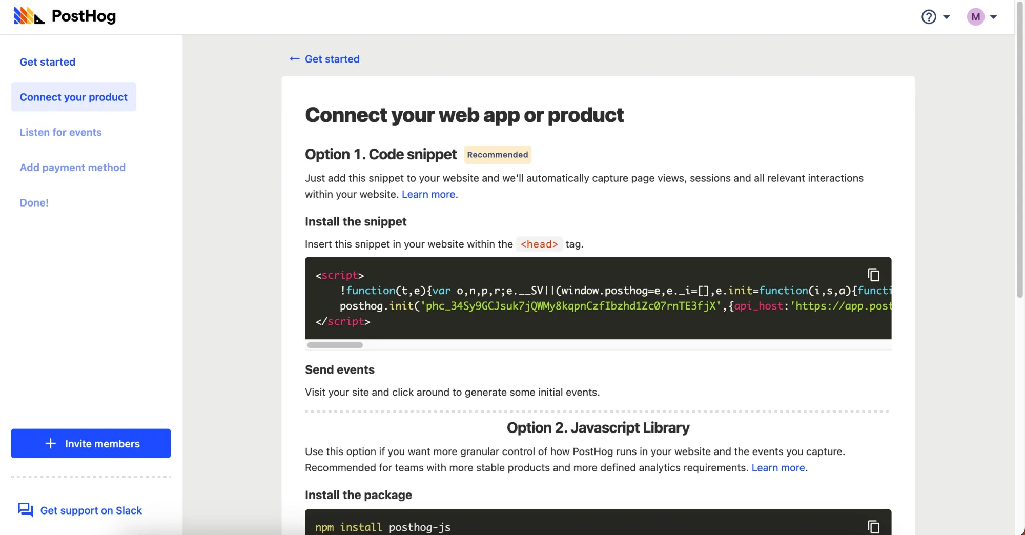
One of the biggest sources of onboarding friction is requiring users to leave the application to fulfill a step elsewhere (even things like 2FA). With a product like PostHog, this step is necessary for the product to function. I appreciate that PostHog doesn’t expect me to navigate to another documentation page to learn how to install it; I can discover the various ways to integrate their code snippet from within the product itself.
Step 5: Listening to events
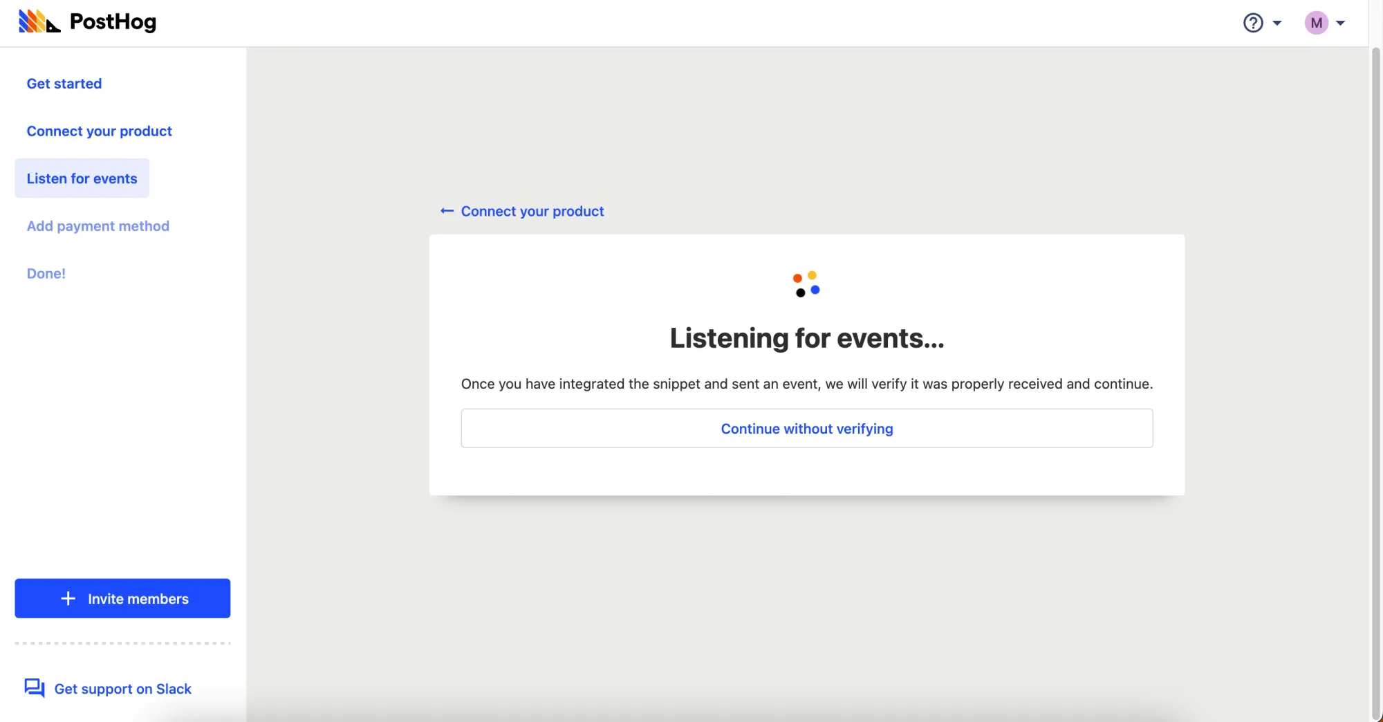
PostHog greets you with an intermediate step monitoring whether the code snippet has successfully reported an event.
What there is to love:
- Users can skip ahead without verifying if they’re more curious to see what’s ahead.
- This step provides a clear binary if the installation was successful or not.
- A back button if the user needs to revisit the documentation in case of a mistake.
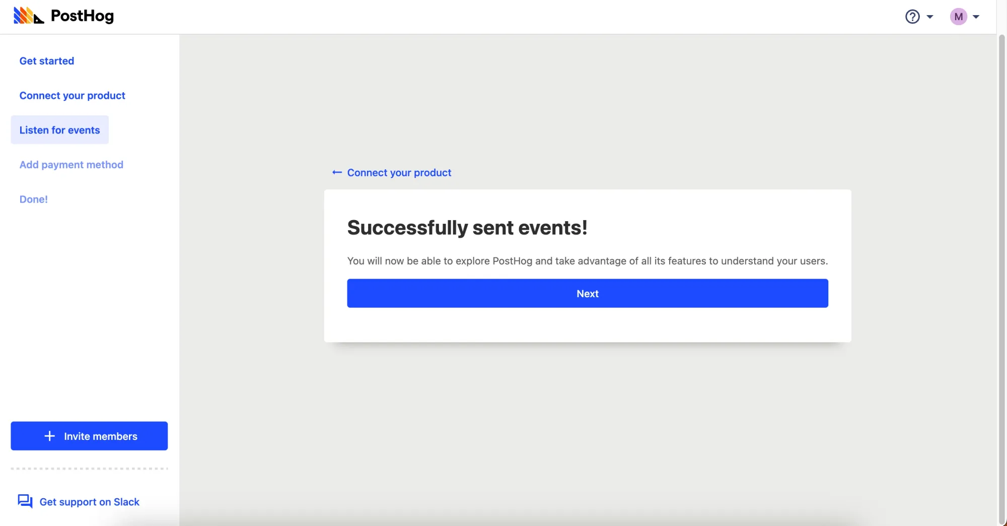
After installing the script, I am conveniently greeted with a success message. No page refresh was needed. Seamless.
Step 6: Add payment method
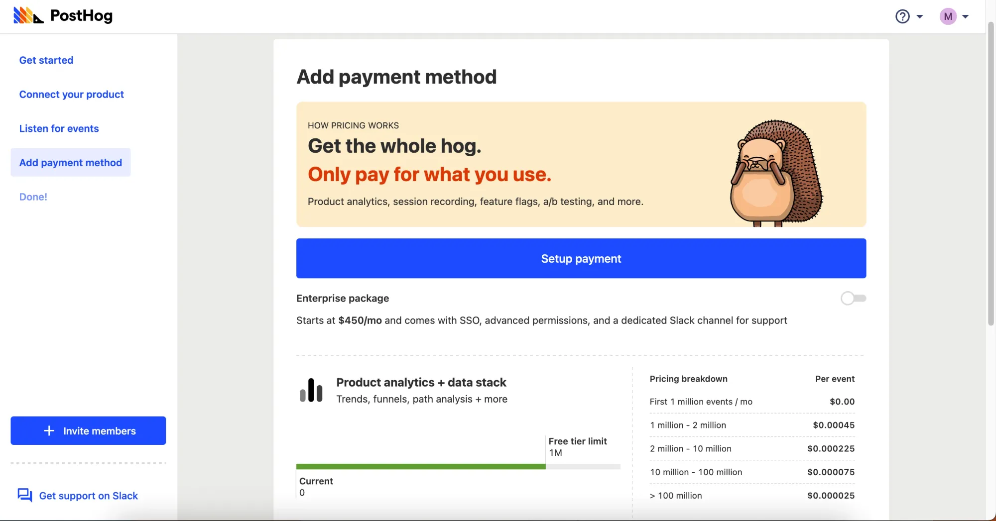
Now I encounter the feared paywall. Thankfully, it becomes clear that payment is optional.
Once I scroll down, I can continue with the free tier:
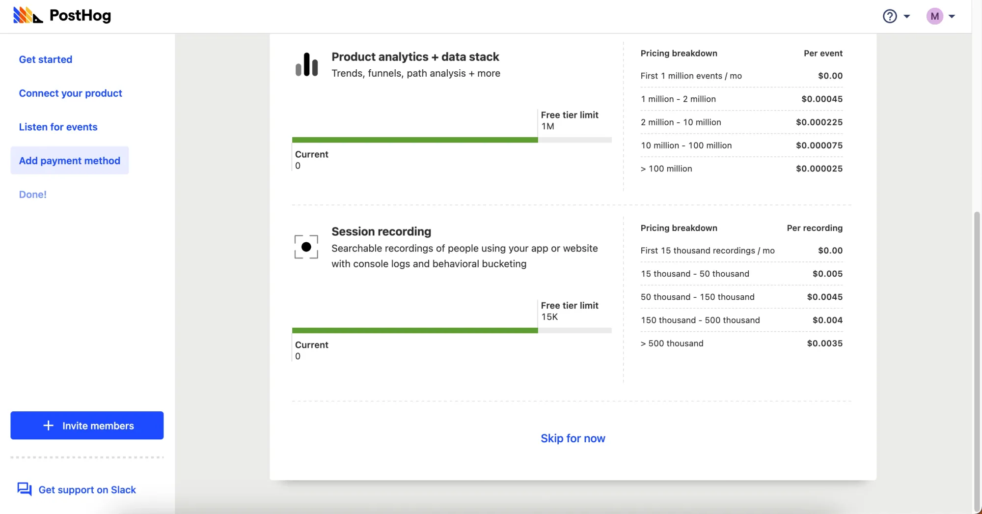
While not exactly frictionless, in PostHog’s defense, this step does encourage users toward their (presumed) internal goal of increasing paid user growth. Not all friction is necessarily bad—sometimes friction to steer users toward preferred behaviors (such as entering a credit card) is good.
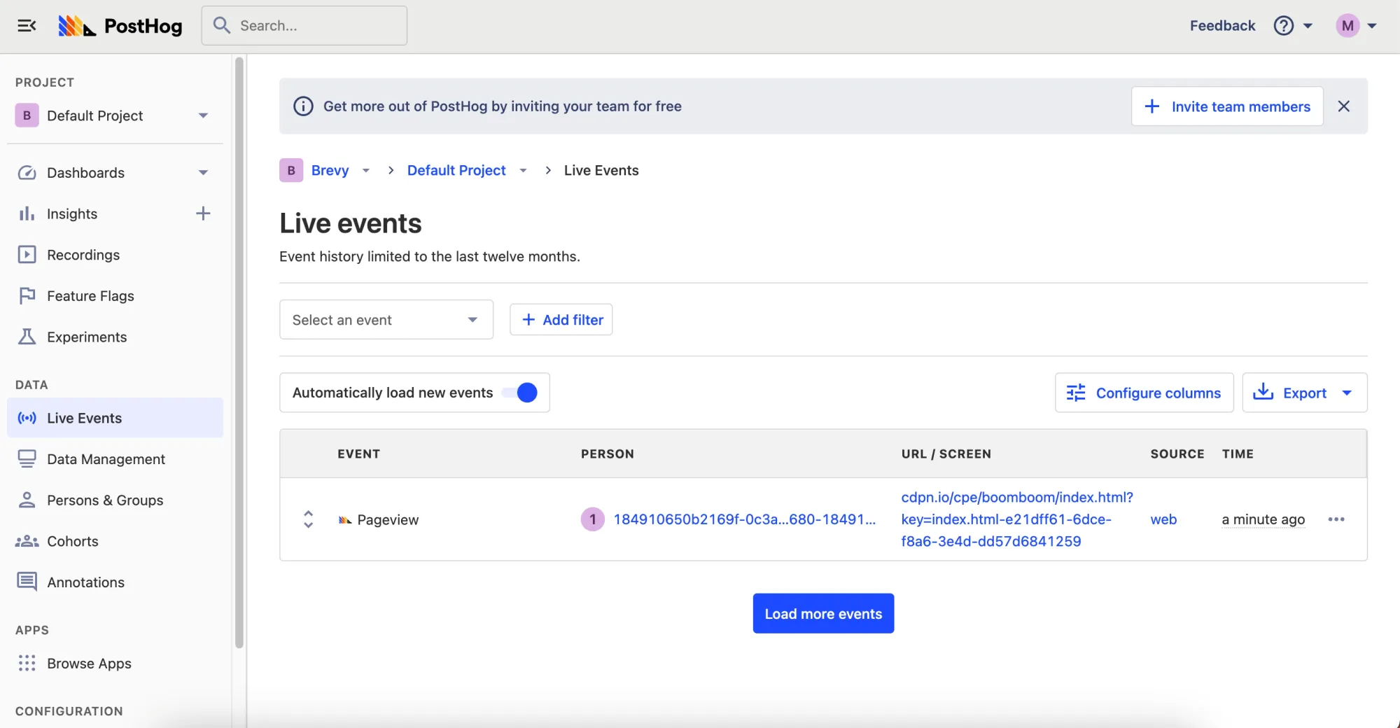
Step 7: Live events page
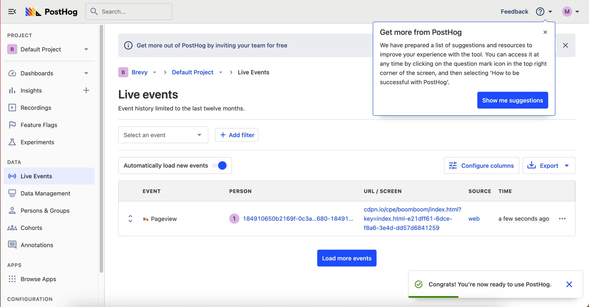
Now having exited the handheld onboarding sequence, I reach PostHog’s actual app.
What there is to love:
- An onboarding tour tooltip appears, signposting the evergreen help icon.
- I am given the option to dismiss the tooltip or take its offer of guidance. This optionality is ideal—some users abhor app tours, and it’s important to allow them to truly self-service their way through the application if that’s their goal. Although, the advice here is a little wordy - I can’t see most folks reading all the copy, but instead hitting next or close. The option to opt out of tours altogether rather than per page would probably be a better experience for some.
I, however, decide to request the suggestions. I’m greeted with a multi-stage series of tooltips with clickable external links to explore more in-depth documentation on each topic.
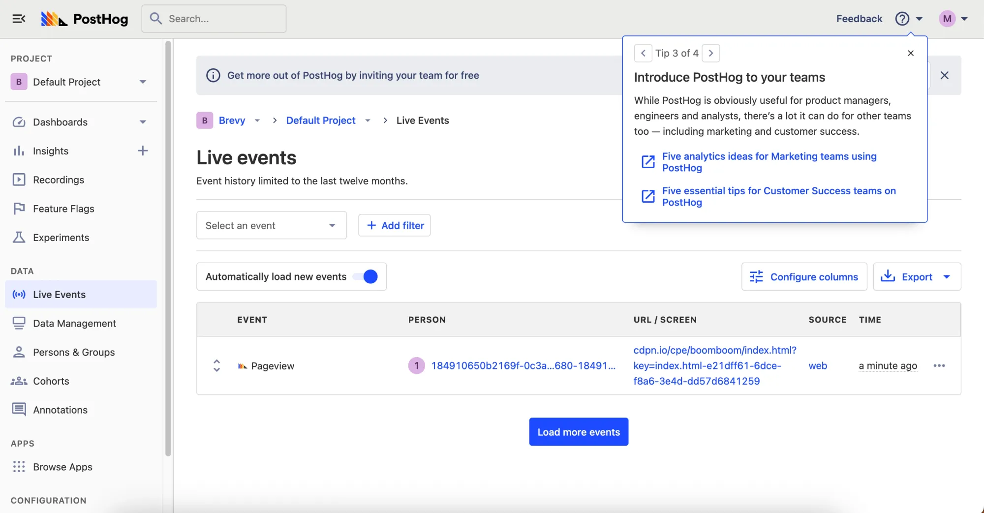
When I click on an external documentation link, I am routed to a new tab with the respective article. I appreciate that PostHog opens the content in a new tab, as that simplifies returning to where you were.
After dismissing the tooltip, I can visibly see the dismissible banner tooltip for adding new team members. While banner ads can make interfaces appear busy at times, this is a nice touch because new users often need to invite their teammates.
An impressive touch: the call to action does not redirect me to the team management page. Instead, it opens a small light-box pop-up enabling me to invite my team without leaving the page.
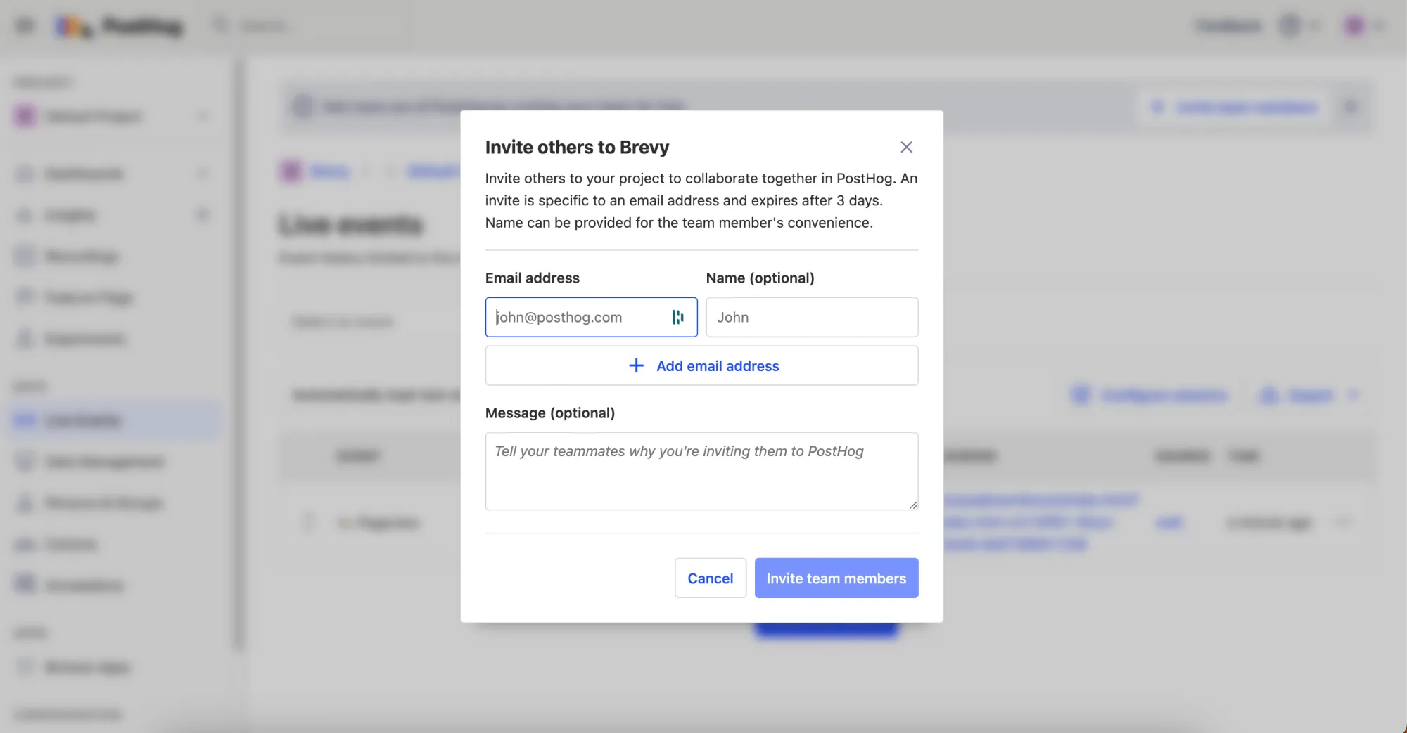
This keeps the user journey straightforward, not a collection of detours.
Step 8: Exploring the App
I start clicking around the application. More stuff to love—I am greeted with tooltips throughout, but the page isn’t obfuscated.
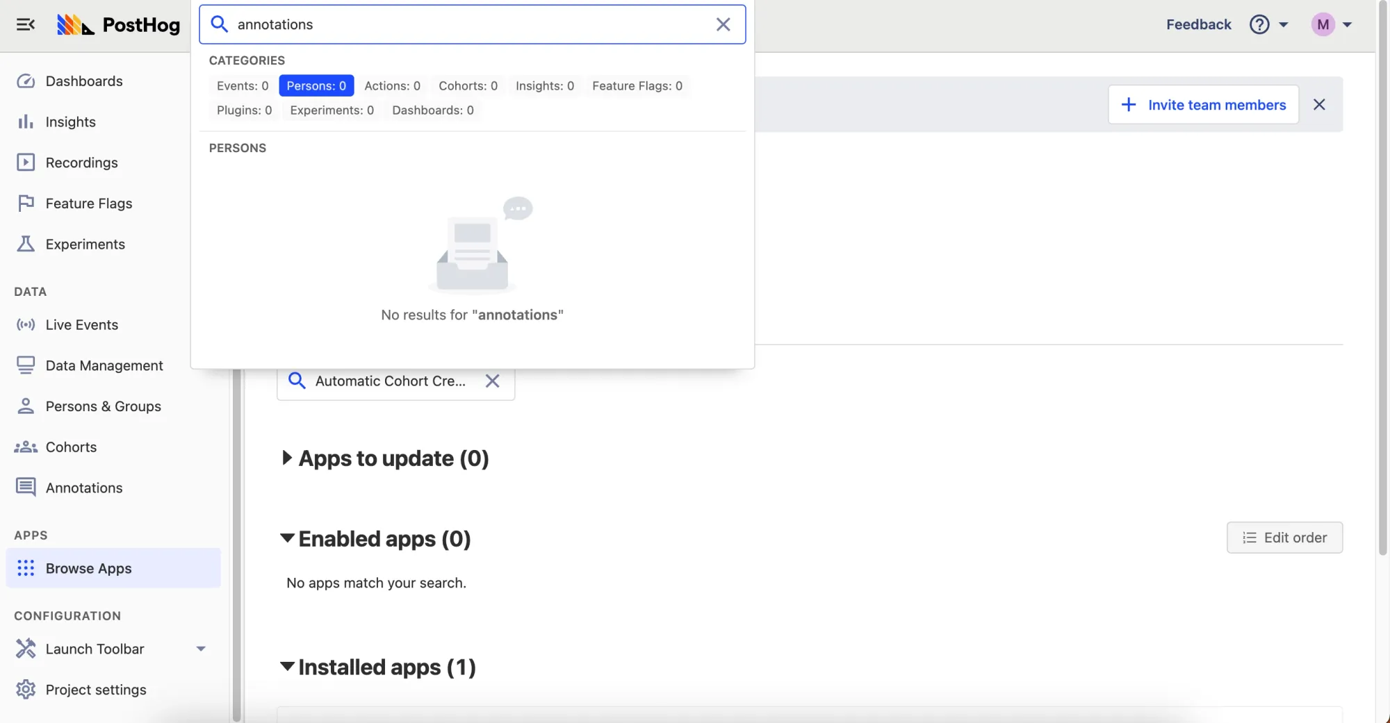
A Nitpick
While the on-page tooltips are nice, I wish the page search could do more. I am able to search account data through the search bar, but I cannot navigate across the product with it. For instance, I searched Annotations—one of the pages listed on the side-bar—and was greeted with an empty result:
One of the reasons CommandBar supports navigation out of the box is that users, particularly new users, are always trying to understand what an app can do after signing up. It’s easier to explore using search. By accounting for synonyms, CommandBar helps users locate the features relevant to them without depending on structured page navigation.
Highlights
There were several highlights where PostHog’s onboarding process shined. These include:
- Being able to invite a team without leaving the page
- Offering a personalized choice of what onboarding experience is best
- Detailing tooltips that were fundamentally optional
Lowlights
There were a few minor negative moments
- A brief fear that the user would need to enter a credit card
- A lengthy sign-up form prior to onboarding
- An inability to navigate the site via the search bar
Verdict: 9/10
PostHog’s onboarding process is easy to follow with minimal emotional or cognitive friction. Exploring the product is easy. Their tooltips helped me understand what the various components of the product do. The hand-holding installation experience made setting-up PostHog’s code snippet easy.
While there is some room for improvement, the PostHog onboarding experience streamlines, not hinders, access to the PostHog product.
For more examples, check out these actually useful user onboarding experiences, or take a look at unboxings of Algolia and Vercel.