


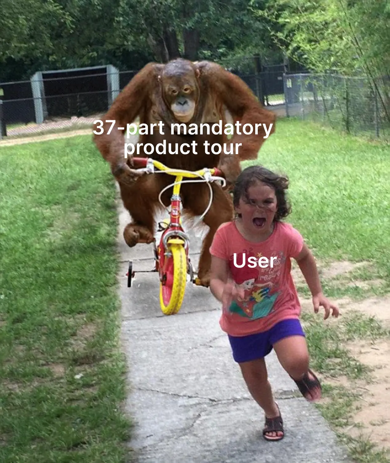
Imagine you’re excited about visiting a friend’s house for the first time. You arrive, ring the doorbell and enter. “Welcome” he says, “Let me show you around”.
He walks you into the living room, shows off the view from the balcony, offers a glass of water in the kitchen. Your friend shows the kids’ bedroom—you’ve seen enough, but don’t want to be rude. After a gander at the utility closet and a military crawl in the attic, you muster up the courage to say that you’ve seen enough. But your friend looks at his clipboard and insists: You haven’t even seen the freezer in the basement yet! Against your will, you complete the house tour and vow to never return.
Many product tours feel just like that: Users feel forced to see everything in a product, even if it doesn’t serve them.
To the product team, it’s a helpful walkthrough. To them, it’s a pop-up hunt.
Product tours in SaaS are designed to increase engagement, but instead often increase frustration. But the other option is no better: You don’t want to drop users into your product like a paratrooper behind enemy lines.
Users need some guidance. So the problem isn’t product tours—it’s bad product tours. That’s why we created this guide: To help you create product tours that turn new signups into happy users. In this guide, you’ll find out which mistakes make product tours annoying, how to create engaging product tours and a step-by-step tutorial on building them with CommandBar:
How to think about onboarding: Product tour best practices
If you’re a product manager, your goal is to show a green engagement chart in the next all hands. And a product tour that forces users to click every feature turns that chart green. But unless users wanted to use that feature, they’ll desert the product soon after.
Users don’t care about your charts. They want to accomplish something. As in any design process, the starting point is user empathy.
Always ask yourself:
“If I’ve just signed up and my goal is X, what’s the fastest way to accomplish that?”
Another aspect that carries over from good design is that it fades into the background. The best product tour isn’t the one users remember for its cute animations, but the one users forget because it helped them use the app in 38 seconds.
This principle holds everywhere, but it’s the starting point for every part of a good product tour. But there are a few mistakes that can void your efforts of better user onboarding:
How NOT to create a product tour
If you’ve onboarded to more than 3 software products, you know how annoying product tours can be. When it launches, you speed through it and find yourself on some obscure settings page—far from the feature you wanted to use.
You can avoid creating that experience for your users by not making a few simple (yet common) mistakes. Here they are:
Long product tours
No matter how great your product tour—keep it short. Even excited users don’t want to complete a 12-item to-do list before they can use your product. They might complete the 12 steps over a few weeks.
You don’t discuss who picks up the kids from soccer practice on a first date. And you don’t need to show first-time users how to can change the corner radius on CTA buttons.
There are three common ways to fix this:
- Shorten (duh!): Figure out what users actually need to see. This requires digging into your sign-up flow and analytics to see which steps are strictly necessary.
- Break it up: Many product teams now have multiple tours for different parts of the product. The first time you click on a new feature/settings page, you get a brief tour of that specific part.
- Create a checklist: A 12-item product tour feels long. But if you break it up into multiple steps users can complete separately, it feels shorter.
All at the beginning
If your user’s first interaction with your product sucks, it might be the last. They saw flattering marketing materials and have high expectations. Expectations the first session needs to meet.
If the first session is a 24-part product tour where they spelunk the depths of your settings pages, you’ve missed that expectation.
Instead, give your users product tours when the context is right: Launch a tour about collaboration features when they click “invite”. Walk users through integrations when they lack a data source.
This makes product tours more relevant because they show up when users need them—and reduces initial onboarding friction.
“Check out what’s new”
I go weeks without opening my stock broker’s app because I passively buy an index every month. Recently, I opened the app for a 10-second balance check.
Instead, I was bombarded with feature announcements, a redesign walkthrough and their latest crypto coin listings. It took multiple minutes to look at a single number.
Those pop-ups aren’t created in bad faith: The most engaged users want to see what’s new. But blasting these at everyone creates bad UX.
If you avoid these 3 mistakes, you’re already creating a better product tour than many. But there are also things you should do:
How to create a great product tour in CommandBar
Effortless-looking design is often the most laborious to create. This is true for in-app user assistance as well. A brief, effective product tour that engages users usually relies on a few principles that help users get value quickly.
Time to value is one of the most important onboarding metrics. It asks: How soon can a user get something out of your product?
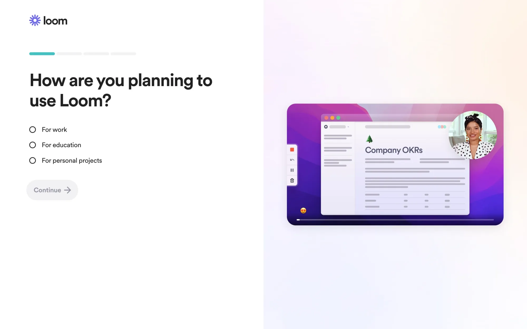
But value means different things to different people. That’s why the first characteristic of a good product tour is that it’s personalized.
Best product tour examples
Why personalization matters
Few products are so specific that one tour would serve all users. As software companies grow, one (or more) of these usually happens:
- They expand up-market with an enterprise offering
- Their product is used by a market segment it wasn’t intended for
- They develop new features and products that broaden the scope of use cases
Once this happens (and often before), user segments have different expectations, needs and wants. The buyer at a Fortune 500 enterprise cares about compliance, access restrictions and single sign-on. A startup founder doesn’t need to see these as her first intro to your product. Giving the same tour to both doesn’t make sense.
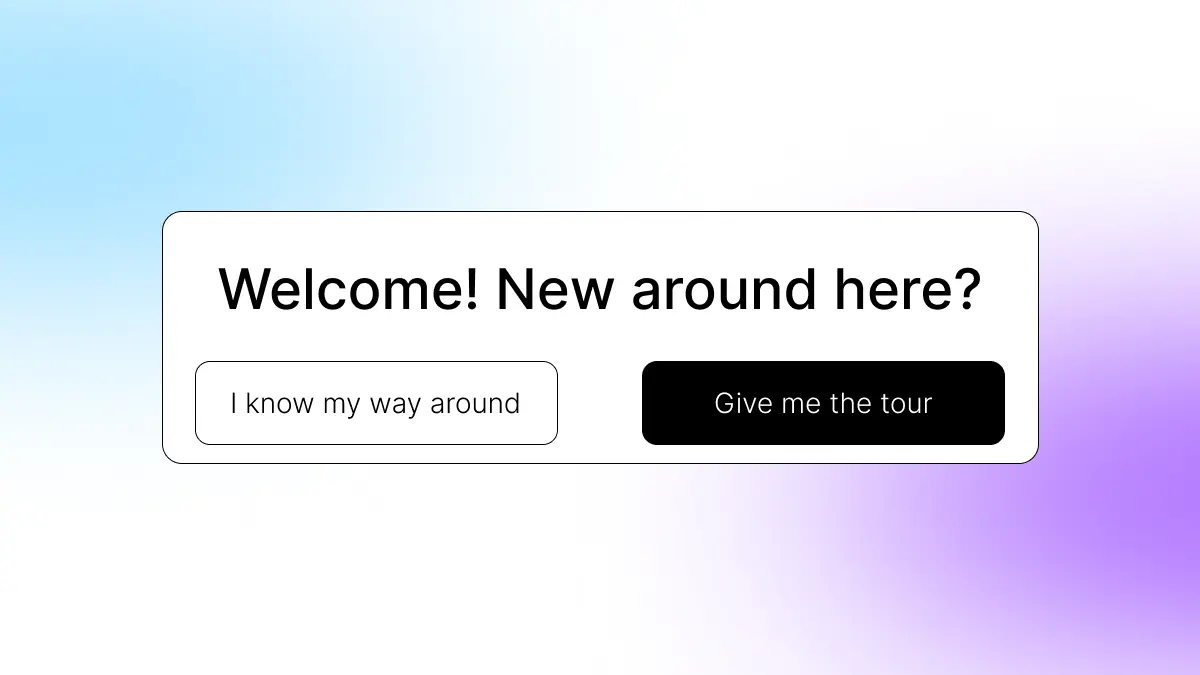
That’s why the best product tours are personalized. This can be hard with self-serve users because you don’t know much about them. That’s why many companies now use a screen/modal where users self-select into a user segment so they can then receive the appropriate product tour:
Serve tours when users want them
People may want to leverage all your features, but not right away. Others might create a second account (e.g. work and private) and already know your app.
That’s why it’s important to let users self-select if they want a tour. Here’s what that might look like:
The solution is obvious: Ask users if they want a tour.
Another way we mentioned earlier is to make tours intent-based—only offer/launch tours of features when a user actually clicks on those features (we’ll show you how to build this in CommandBar later).
But this can also become a problem: Let’s say your user clicks into the appearance settings for the first time. If they reject a tour (because they want to change a small setting), they might not find a setting later.
That’s why the next part is important:
No more lost tours
Once rejected, product tours are usually gone forever. It’s like buying a new coffee maker and burning the owner’s manual instead of setting it aside.
But users might reject tours for any reason: Maybe they know the basic features and only use those for the first 3 weeks. Once they get to more advanced features (where they need the instruction), the tour is gone and they struggle with the product.
A good product tour should be available when needed, even if previously rejected.
Make them interactive
You speak better Spanish after 2 months in Mexico than from 2 years of high school classes.
That’s because you learn more when you interact with what you want to learn (and because the rewards aren’t grades, but tacos).
That’s why an interactive product tour are the best onboarding: Instead of showing users how, great product tears make the user interact with the features and settings they’re showing.
An example of this is an appearance setting. A simplistic product tour might tell the user “here’s where to change a button color”. A great product tour would summon the color picker and start the next step when the user has changed the button color.
How to build great product tours in CommandBar
We just went through some dos and don’ts of building great product tours. Now let’s get into practice and build a great product tour.
How to map out your product tour
Before creating the tour, you need to know what steps you want users to take. There are two main categories:
- Necessary: These explain core product features. If you have an analytics product, users need to know how to create a report.
- Optional: These are nice-to-haves. If you have a design product, users might benefit from collaborating with team mates, but they can also get value in single player mode.
The best way to map out your product tour is to reverse-engineer it: Start with your user’s goal (the a-ha moment) and figure out the fastest way for a user to get there. It’s important to make this useful for your users. Some product tours show off (locked) paid features in hopes of inspiring upgrades. But dangling paid features is frustrating when those users haven’t gotten value yet. After exploring these tips on effective product tours, consider how the right tour operator software can streamline the process, enabling a personalized and engaging experience for users.
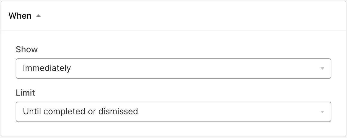
Targeting your product tour
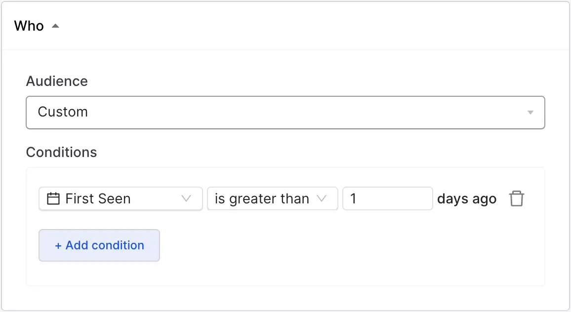
Before you build tour, figure out when it should show up. You can do this under “targeting”. Let’s explore the options:
Under who, you can select any audience you’ve already created in CommandBar or create a custom one based on conditions like browser, operating system or sign-up date:
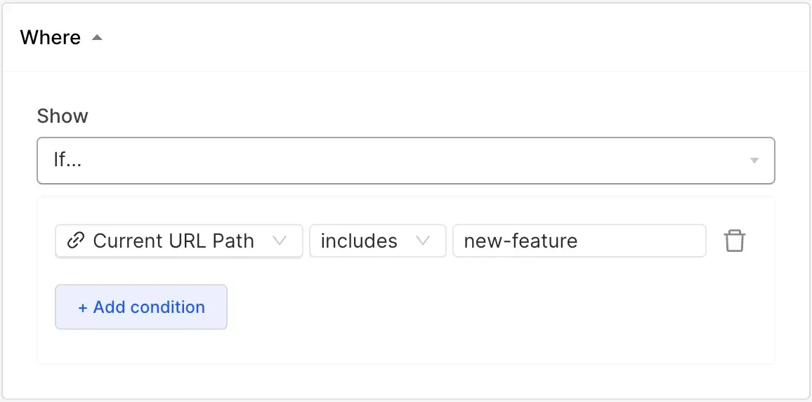
Under where, you can customize on which URL paths and DOM elements your tour should show up. This lets you create product tours for specific features.
Under when, you can decide the timing of your tour. This could be immediately, based on specific events or on behavioral triggers like rage click and user confusion.
Once you have all those sorted, let’s get to building:
Building your product tour
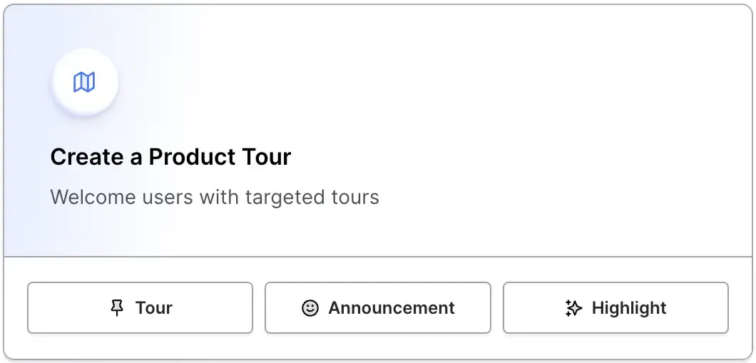
Let’s get to designing. In your CommandBar dashboard, click create a product tour.
A new user signs up to your app. To stick with our own rules, let’s make sure the user wants a tour. So we might start with this:
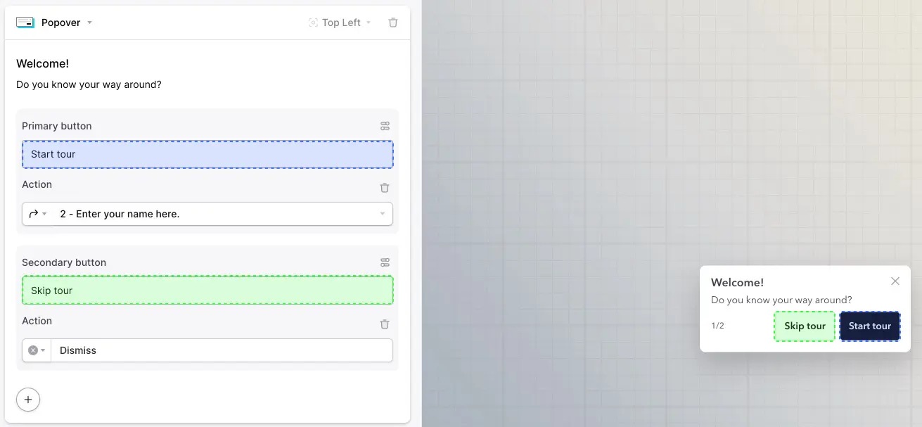
Here, the user can then decide if they want a tour. If they click Start tour, this launches the product tour. If they click Skip tour, it closes and nothing launches. CommandBar also lets you make a tour “snoozable”. Like the snooze button on your alarm (that you never use, right? Right?). That means it’ll show up again after 3 days if it’s triggered again.
Tip: To maximize the chances of your user starting the tour, use copy that makes it appealing to them. Put their benefit ahead. Instead of “get to know [PRODUCT]”, say “Save hours learning [PRODUCT]”.
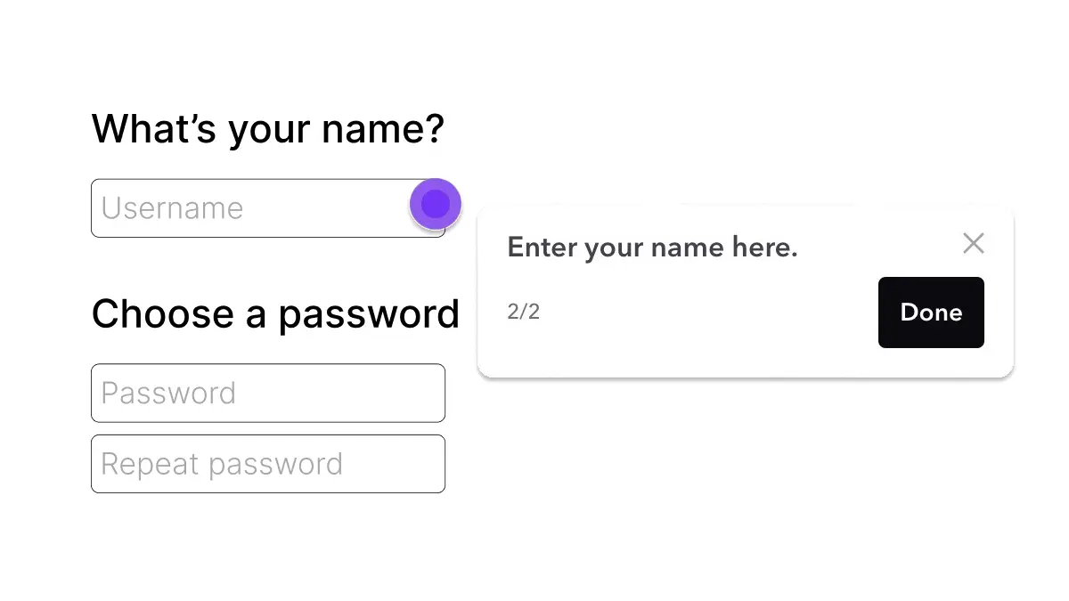
Let’s assume your user starts the tour. If they click “start” you can show them the first feature. Some features are simple enough, like “type a name for xyz here”. But others can be more complicated. That’s why you can assign the button to do various things, including launching other user assistance.
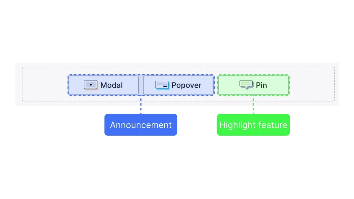
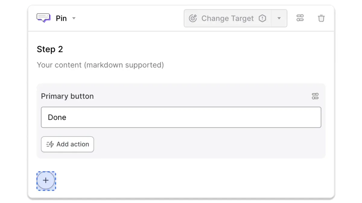
With each step you add, you can decide between pins, modals and popovers:
- Pins highlight specific features or buttons to click.
- Popovers are short messages you can display that aren’t anchored to a specific area of the screen.
- Modals usually block the content they cover. They’re best for options when the user has to make a choice.
If you use a pin, there are two ways to place it:
- Use the click recorder if you have CommandBar installed. This lets you click inside your product and automatically place the pins there.
- Add a CSS or XPath selector.
For popovers and modals, you can choose their location in the dropdown menu.
By default, each step in your product tour will have a “done” CTA—but you can customize each step: You can add up to two CTA buttons and change their functionality.
If you press the “+” button, you can also add text input fields, images, videos or other things:
Publishing your product tour
Once you’ve created all the steps in your tour, you can hit the “play” button to test it. If you’re working in CommandBar with colleagues, you can also click the link icon to share it with them and ask for feedback.
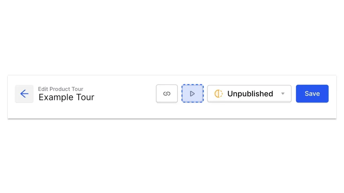
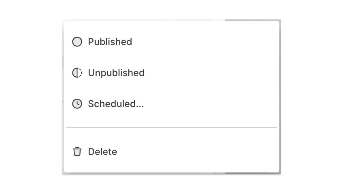
If you click “unpublished”, you can publish your product tour or schedule it. Scheduling might come in handy if you’re creating a tour that walks users through a new feature you’re releasing in a few days.
And just like that, you’ll now have a tour that creates new power users!
Product Tour FAQ
Which product tour software should I use?
You can build product tours in-house or use software solutions. But many of them are engineering-heavy. Product tour tools can be hard to use, but we’ve built one that makes it easy. Try CommandBar if you want a product tour software you can use as a product manager without needing to bug your eng team.
What are good product tour examples?
If you’re looking for examples of good product tours, check out some CommandBar customers like Rho, LaunchDarkly or ContentStack.
How do you create a guided product tour?
The best product tours guide the user through your product instead of merely showing off features. You can use CommandBar’s click recorder to make this easy.