


Vercel’s sign-up process could be augmented to better match the app’s clean, straightforward, and powerful deployed-on-the-edge offering.
Rating: 6/10
Intro
As part of our unboxing series, I’ll be taking a close look at the onboarding for Vercel. If you aren’t familiar with Vercel, they are a major player in the edge deployment space. Arguably, they are most famous for inventing a leading React framework, NextJS.
With explosive growth amongst hobbyists, Vercel must create a straightforward onboarding experience for diverse users, ideally without compromising its sleek, shiny aesthetic. For this article, I’ll be signing up for a new Vercel account, tracking every step I encounter, and documenting any friction or frustration I experience.
Please remember that any criticism in this teardown is not a review of the core Vercel product. I am a Vercel user and love their product; it only follows that the Vercel app deserves a stellar onboarding experience to enable newer users. While criticizing some app friction can come off as whiny (”Oh no, they made me click a button!”), it comes from an undeniable fact: today’s business professionals are heavily distracted by internet doo-dahs. As a result, all SaaS apps should strive to perfect their set-up processes.
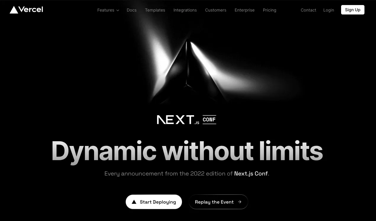
Step 1: The homepage
Like all products, I’ll be starting on the homepage.
What there is to love:
- The call to action to get started is sufficiently called out in white. Although, if you didn’t know what their product did already, the hero for their event is pretty confusing.
- While not exactly UX/onboarding related, I appreciate that Vercel utilizes its pyramid logo to beautify its buttons.
Step 2: Reaching a Get Started page
Like most products, Vercel has a separate page to get started. I would consider this the official start of the Vercel onboarding experience. On the left, I am presented with various selling points for adopting Vercel alongside some customer proof. On the right, I have four call-to-actions—three OAuth solutions and an email option.
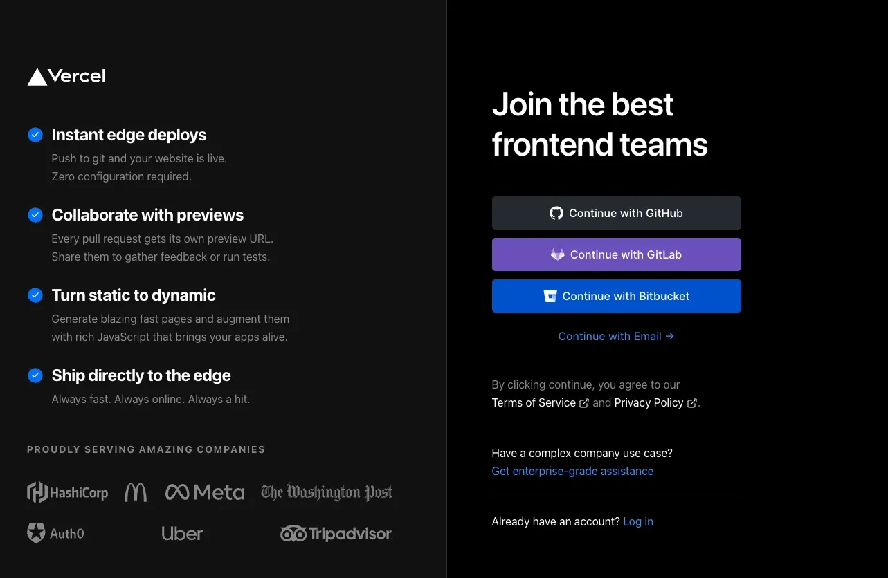
Below, there is an implicit Terms of Service and Privacy Policy agreement policy (no checkbox). I wouldn’t consider actively clicking a checkbox a form of serious friction, but the absence of a separate checkbox hints that Vercel cares about smoothing out the onboarding process.
While obviously the least recommended choice, I decided to continue with email.
Step 3: Email Confirmation
Perhaps one of the reasons that Vercel doesn’t highlight signing up with email is that you need to independently verify your email before using Vercel. Recently, some apps have started to skip the email verification step as a mandatory step during onboarding (instead, requiring it later on when a user is more committed).
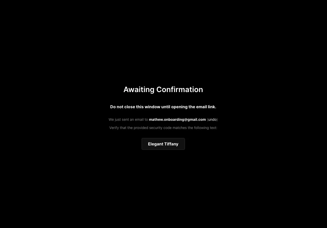
Verifying your email is a real point of friction. I must navigate from Vercel to my email client and look out for their message. If I hadn’t had my email easily accessible, that could add some emotional frustration.
Remember—I’m not saying that email verification is a bad thing. Email verification is a critical security feature. However, it’s also important to be cognizant that this is friction—arguably necessary friction—and the steps that follow it need to feel seamless. Else, you’ll get annoyed users.
Navigating to my inbox, I get the following email:
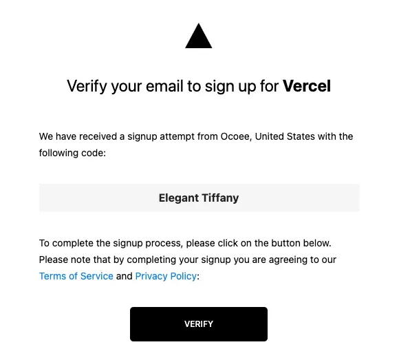
After clicking Verify, Vercel opens a new tab in my browser with a message stating success:
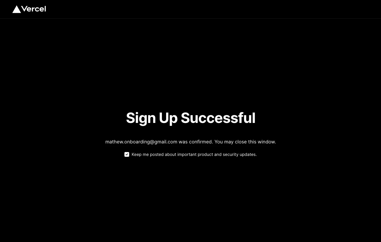
Because Vercel opened a new (dead) tab, this creates more friction. I need to close the tab to return to the onboarding experience—that is a great opportunity for a user to get distracted and detour from the onboarding flow.
So what should happen? The experience should be flipped. The earlier tab should be considered the dead tab, and this current tab should enable me to continue the onboarding flow. For me, the friction is minimized because my email is on Superhuman, an external email client, not a website like Gmail. However, some users might’ve navigated to Gmail on the prior tab—yes, Vercel tells you not to do that, but users stray from directions all the time. Hypothetically, both tabs could enable me to finish the onboarding flow. That would be the most ideal solution.
The point is, compared to other apps, this email confirmation experience feels clunky.
Step 4: Phone Number Confirmation
Next, I am greeted with instructions to verify my phone number.
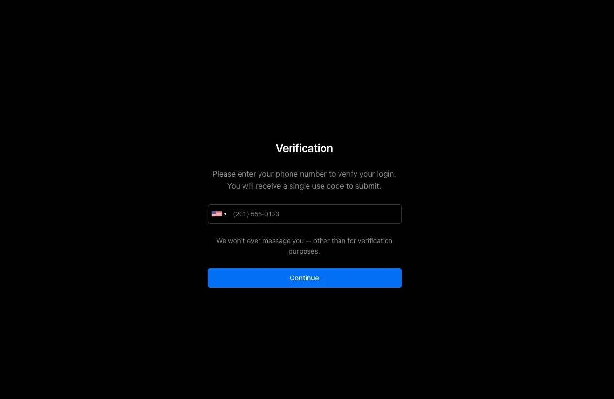
What there is to worry about:
- While 2FA + phone login is important, this does create some emotional frustration. Worse, the sign-up process is dragging on.
- I have no progress bar to inform me how long this will take. Ideally, Vercel creates a sidebar or banner that communicates how many steps are left in the onboarding flow.
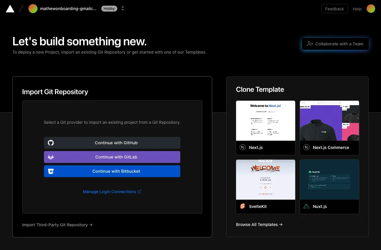
Step 5:
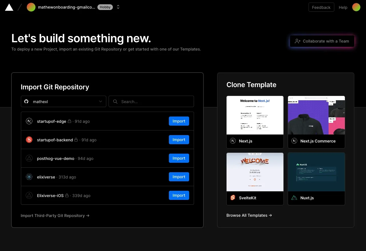
Finally! We’re in. I am offered a few options on how I should import my Git Repository. I am also provided some templates. There is a button to invite my email, but the copy is a bit confusing.
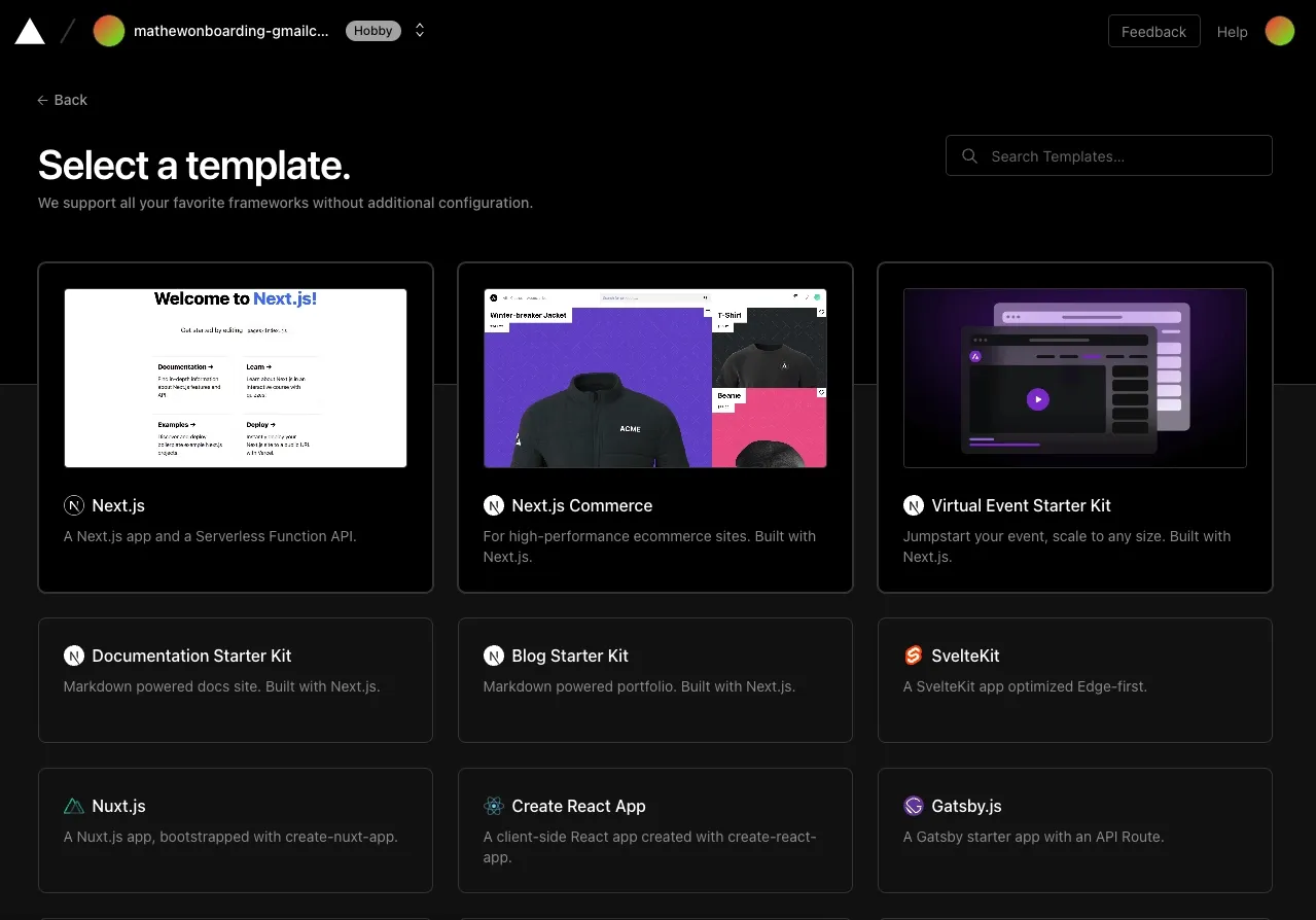
When I click on Clone Templates, I am offered a lot of options:
After selecting a template, I am able to create a Git repository to bring it to life. This overall feels like a smooth process that matches expectations:
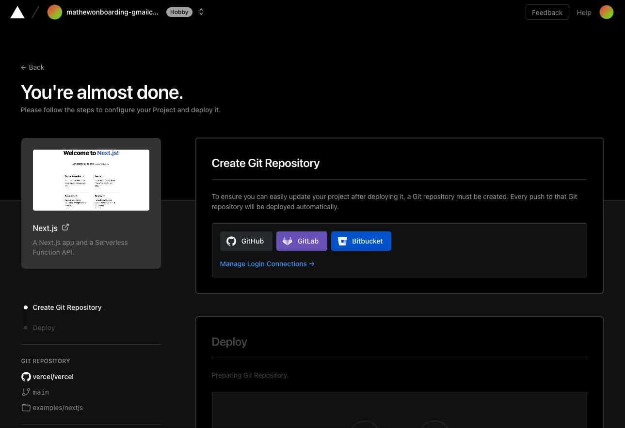
However, I decided to integrate my GitHub instead. After all, that’s what users come to Vercel for—to deploy their code. After going through GitHub’s pop-up app flow, which thankfully happens on the tab, I’m greeted with my repositories:
After clicking import on one of my repositories, I’m in the thick of the app, now able to configure my deployment project:
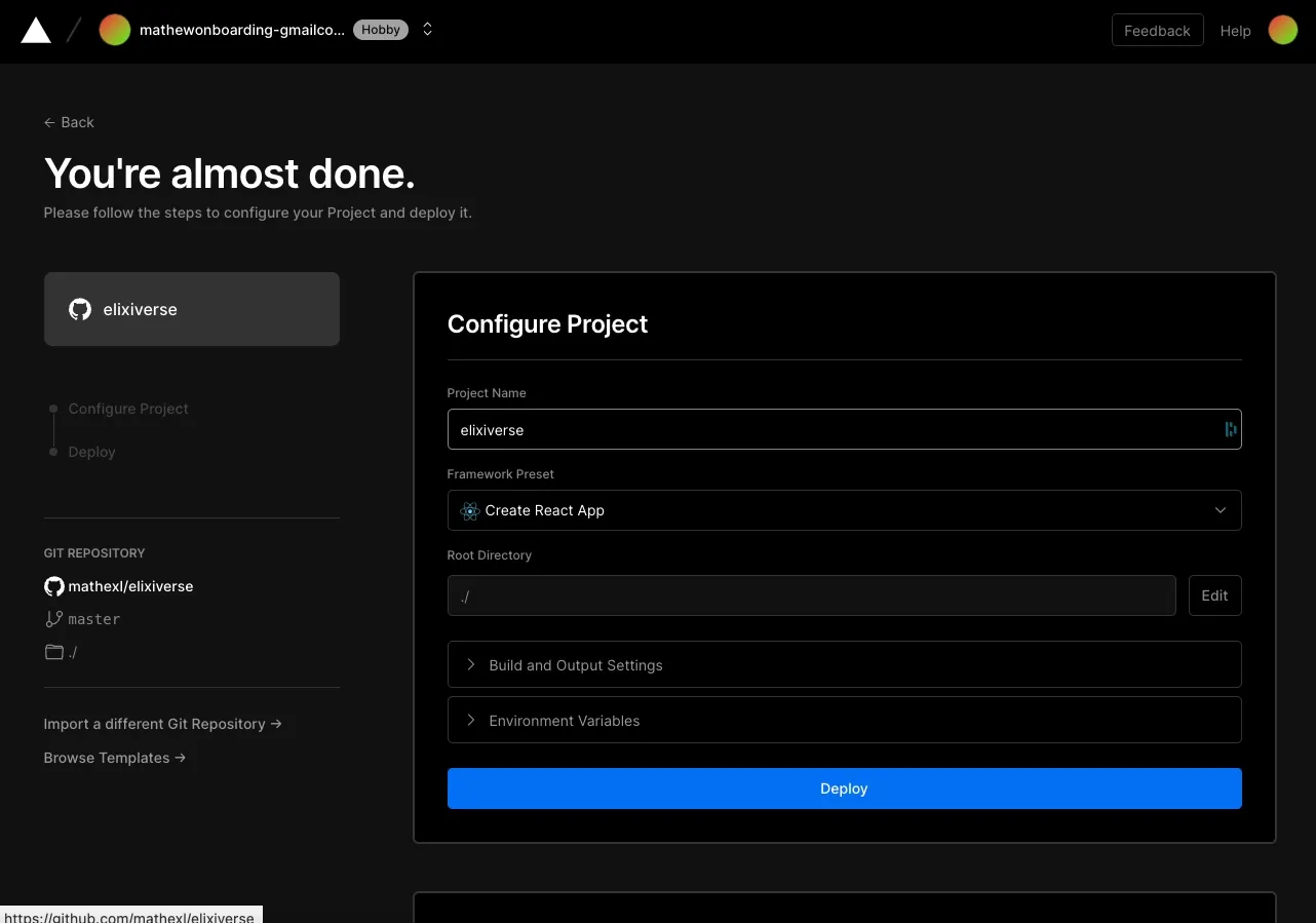
Here, Vercel showcases a nice progress sidebar.
I am a bit torn if Vercel should offer tooltips. My gut says it should, but tooltips shouldn’t surface if a user indicates they don’t want them. Vercel is making an assumption that users who sign up for Vercel understand how deployments work. I think this is a fair assumption, but tooltips can help clarify Vercel’s vocabulary on what exactly is going on.
Thankfully, there is a help center linked. If I click on the Help icon in the top right, I am navigated to the Help Center:
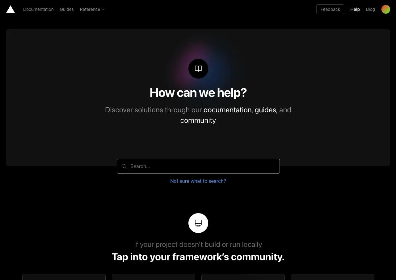
The help center has a preview-equipped search bar:
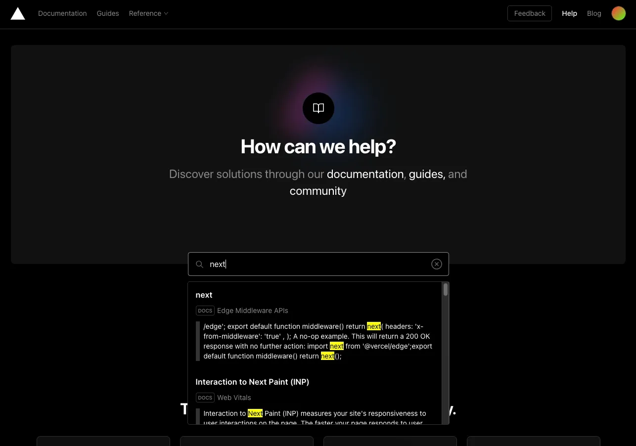
However, I wish I could access this search bar from within the Vercel app. One of the reasons CommandBar supports help center integrations is that users don’t like switching between an application and help content. It’s easier to explore documentation while using the app. Vercel could achieve this if their search bar supported help document previews.
Highlights
There were some highlights where Vercel’s onboarding process shined. These include:
- A simple, clean UI
- Various options to sign in
- Optionality to integrate your stack or deploy sample code
Lowlights
There were a number of places where Vercel could improve its onboarding flow
- Progress bar indicating the sign-up process
- Minimize window/app switches when setting up your email
- Making it easier to search for help content in-app.
Verdict: 6/10
Vercel is a fantastic product that could be bolstered by a better onboarding process. While the onboarding process isn’t terrible, it leads to some emotional and cognitive friction that can frustrate new users who just want to check out the product. However, with a few tweaks, such as progress bars and a re-organized sign-up flow, Vercel can deliver a cleaner in-app onboarding experience.
For more examples, check out these actually useful user onboarding experiences, or take a look at unboxings of Algolia and PostHog.