


Imagine you time-travelled to 1850 and met your great-great-great-great-great grandfather. After some introductory drinks at the saloon, he shows you his office at the local railroad, where he’s the bookkeeper.
While you’re trying to decipher his cryptic handwriting, he taps you on the shoulder: “Hey, I’m stuck on this calculation. Can you help me?”
You: “Actually no. In my time in 2024, we just use a machine called a computer that automatically does this while cross-referencing your bank account, so I have no idea how to do it, sorry. It’s the same machine we use to get food sent to our doorstep, talk to people from Dublin to Delhi instantly, play games, etc”
“So it’s an accounts book that comes with a long-range telegraph and a set of cornhole?”
“Not quite, it’s all one thing and it does a million other things. People make this stuff called software that lets it to almost anything.”
Grandpa: “Literally, mind blown. Where is this device? The line to use it must be endless!”
You: “Everyone has a few and at least one in their pocket, so there’s never a line.”
Grandpa: “Wow, the future is amazing, you must love this thing for everything it does!”
You: “No, tbh it’s pretty annoying most of the time. Hard to get it to do what you want and you end up just clicking around.”
Grandpa: “Wtf dude”
“Time’s up”, a voice halls booms from the sky, “The time machine will now send you back to 2024”. Sure, Most people would’ve used this opportunity to change the course of history, but you gained valuable perspective: You’re frustrated with a ubiquitous technology that people of previous centuries would’ve worshipped. That technology is called software.
We wanted hovercrafts. They gave us pop-ups.
Today, Ethan Zuckerman writes books like “Mistrust: Why Losing Faith in Institutions Provides the Tools to Transform Them”. In the 1990s, he created a monster.
Tripod.com, where he worked as VP of R&D, changed revenue models like pairs of socks: Webhosting, social network, subscription service, mutual fund affiliate, textbooks, t-shirts. All duds.
Runway got shorter and shorter, but takeoff was imminent: The next business model would lead to a $58 million acquisition (a great outcome now, but stellar in 1998). That business model was advertising—with a key invention:
“[…] we ended up creating one of the most hated tools in the advertiser’s toolkit: the pop-up ad. It was a way to associate an ad with a user’s page without putting it directly on the page, which advertisers worried would imply an association between their brand and the page’s content.”*
That’s the pop-up’s regretful inventor in an Atlantic article in which he calls advertising the internet’s original sin.
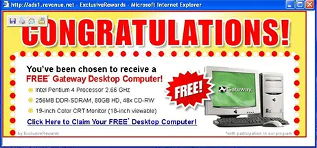
But advertising was a business model that worked—and pop-ups were great for advertisers. As New York Times Magazine reported: “Banner ads did well at first, but by the late 1990s, their clickthrough rates had dropped to 1 or 2 percent. More intrusive pop-up ads were brilliant in comparison: They pulled in from 3 to 5 percent of users.”
Pop-ups proliferated and users soon despised the intrusive ads. Today, most browsers block pop-up ads. But pop-ups aren’t dead. They litter the products we pay for to “help us”.
Today, product builders “help users” with pop-up modals to show them new features, alert them of downtime, show them around the product. Sign-up to any SaaS product and you’ll hear the product manager squeak in your ear:
- WELCOME! Want to take a tour of our product?
- WE JUST RELEASED THIS NEW FEATURE? Check out how it works?
- HOW LIKELY ARE YOU TO RECOMMEND OUR VERTICAL NICHE B2B SAAS PRODUCT TO YOUR THIRD COUSIN?
How often do you click these?
If you’re like most users, never. In fact, you probably instinctively close pop-ups. Like most software users, you have popup fatigue or full popup blindness. Popups are supposed to help users, but usually annoy them.
Users hate modals (another name for popups) even more than autoplay videos, making them the most hated form of advertising.
Pop-ups were invented for advertisers. Interruptions we had to endure to enjoy the internet for free. That makes pop-ups even more annoying when they clutter software we pay for.
Yet, pop-ups somehow remain the go-to of digital adoption software: Software products dedicated to helping software companies make their products easier to use.
The siren song of the chatbot
It’s must’ve been obvious quickly that pop-ups were annoying. An annoying formfactor that could get sugar-high results? Yes. But annoying.
Around 2007, a marvelous invention started appearing in the bottom-right corner of websites. A little chat bubble that connects you with a human to help you (A lot of those initial use cases were for ecommerce sites — connecting you with a product support specialist.)
Website chat was a magical combination of several internet trends:
- More users were spending more time online. This meant less opportunity for helpful human interactions in physical stores.
- Synchronous, peer-to-peer chat had blossomed with AOL Instant Messenger (which I remember logging into every night after school to talk to friends)
Website chat combined these two forces. It took a pattern with growing product-market-fit (chat) and used it to bring a personalized human touch to the digital spaces where people increasingly spent time.
But when you make it easy for users to ask questions, they ask a lot of them - and most users ask similar questions. When humans spend all day answering the same questions, they get bored. So Someone had an idea: automating the chat. It was promising: Automate the easy questions so humans focus on the challenging stuff.
Solutions were built, but the technology wasn’t there. Giving users personalized answers was basically impossible prior to large language models. So we ended up with experiences like this:
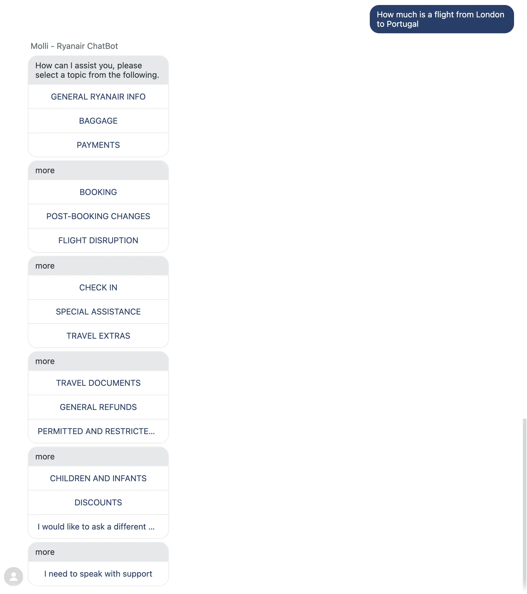
This had the same effect as the popup barrage: Chatbots trained users to ignore them because they assumed the bot would be useless.
Chatbots were supposed to be a universal interface that let users express their question/problem in words to get an answer. But without current AI technology, chatbots weren’t as flexible as the humans asking them questions. They relied on canned responses to pre-formed questions.
But for anything the bot had no canned response for, the most helpful thing chatbots could do was collect your email and tell you when a human would be available.
The end of web design
Given pop-up fatigue and annoying chatbots, those intrusions should’ve stopped working a long time ago. Why are they still around? We see 3 core reasons:
First, they still work (kinda): Even with tiny click-through rates, pop-ups generate engagement with whatever the company promotes — a feature, an event. Even a few clicks from a pop-up are better than zero. But the spike in the dashboard is usually a sugar high because they erode user trust. Chatbots are annoying, but more cost-effective than a human to answer a common, simple question.
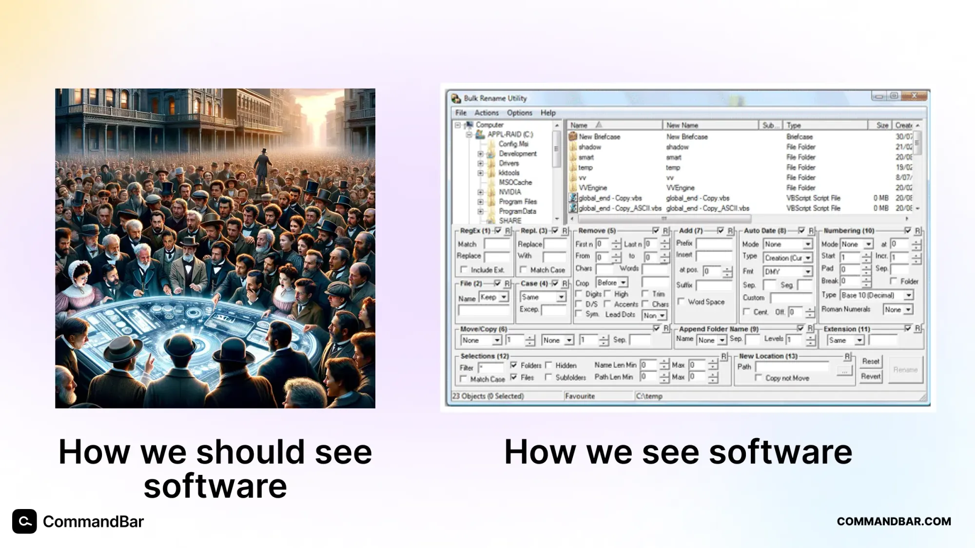
Second, the physics of software design: A famous blog post called “The End of Web Design” states: Users spend most of their time in other apps, so your UI should use the same building blocks as those other apps — buttons, menus, tables, etc. Software companies are great at rearranging these building blocks to create great user experiences.
Third, the ascent of PLG: Product-led growth requires products to win over customers without sales teams assisting users. New users know less than ever about products, which requires the products to educate more. Since users now do so much inside the product themselves, they also know support can happen in the product.
That creates a strong pull to the status quo — chatbots and popups deployed indiscriminately to solve problems at the expense of building good software.
But the software market will force changes on these companies: Expectations are rising: The “consumerization of enterprise” raises UX expectations. The days where UX didn’t matter because users lacked options are over. Annoying-to-use products will have weaker brands, lower engagement and ultimately higher churn. Users have more and better choices than ever.
That’s why we feel like we’re taking crazy pills. We talk to many product teams who litter their product with pop-ups and plop a bulging, low IQ chatbot in their bottom right.
- Us: “Do you like these kinds of experiences in other sites you use?”
- Them: “No — does anyone?”
- Us: “Ok…so why do you maintain them in your product?”
- Them: “Well we need to help users and they’re the best tools we’ve got.
This is the load-bearing observation behind CommandBar.
It’s time for a, non-annoying approach to helping users use software — an approach that follows the golden rule: “Give our users an experience we’d like to have”.
What does that look like? The core insight comes from a reflection Ethan Zuckerman shared with New York Magazine in 2018: “We didn’t take advantage of the ways in which the internet makes it possible to state your intentions. That, to me, just feels like a much healthier way to do this than trying to intuit your intentions based on who we think you are.”
Let’s make that happen.
Hello, user assistance
First, a name for what we do. Popups and chatbots live in their own unique markets today. We believe they fall under the same type of technology — technology that first and foremosts exists to help users.
So, we call it User Assistance Software.
This intentionally puts the user front and center. We believe to actually help users, you need to put their interests first. Hence, user assistance.

To define what that looks like, imagine a human user assistant whose helps users use software — a kind of software butler. The assistant sits behind the user (without breathing down their neck), watching them use the product. Here’s what the user assistant would do:
- Listen to the user’s intent: Most users know what they’re trying to do — or have some intent or job to be done they want to realize in the UI. 99% of this user intent never gets captured. Imagine watching a user session and seeing a confused user click around without getting anything done. Any PM worth her salt would feel the desire to reach through the screen, ring the user by the neck, and demand “just tell me what you’re trying to do!”. A user assistant can listen. At the beginning of a session, they’d offer: “Whenever you’re lost, tell me what you’re trying to do and I’ll point you in the right direction”. If the user doesn’t respond, the user assistant might probe them — “What are you trying to do now?”
- They intervene at the right moments: The user assistant can’t rely on the user to narrate all problems. Inevitably, the user will err. They might click around confused or click a button 12 times in anger. A user assistant would offer help: “Were you trying to do X?” “You seem confused, see this guide that explains more!”
- They adjust to every user: Instead of rattling off the same few lines to everyone, the assistant would personalize their services. They’d let a curious user new explore by themselves, but offer detailed help to someone clearly lost.
At CommandBar, we sell the work of user assistance. As of today, we don’t offer human-powered user assistance (maybe we should though? stay tuned). Instead, we build software that enables software teams to give their users the same style of assistance they could expect from a human like the one described above.
User assistance in practice
How do we embody a human user assistant in software? We package it into two products.
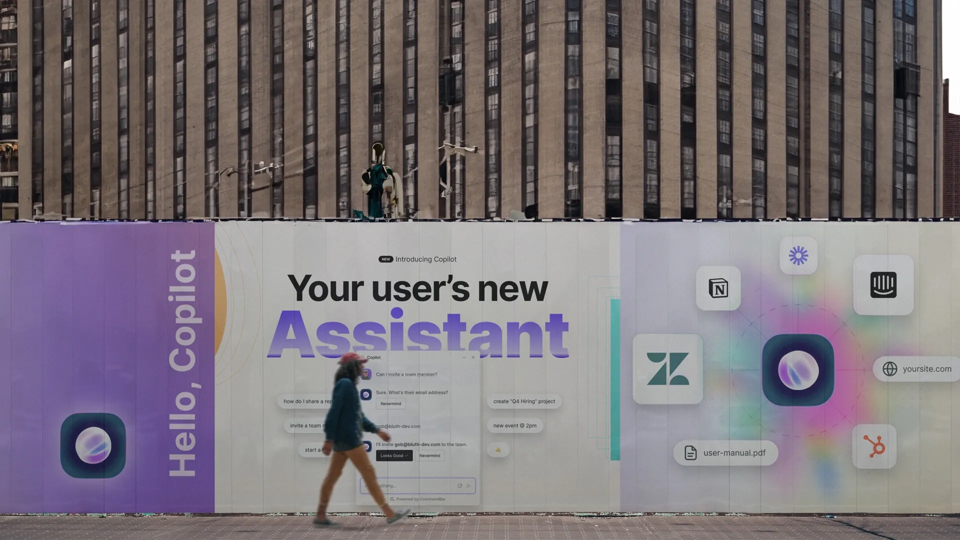
The first is called Copilot. It’s a natural language interface where users can chat with an AI-powered assistant. The assistant can answer questions, but also complete actions on behalf of the user, and trigger walkthroughs. It’s the closest thing to the human user assistant we have.
It looks a lot like a chatbot because users know this pattern. One thing chatbots got right: The chat interface allows the product to react to the user’s intent instead of guessing what they’re trying to do. Let’s say a user asks about “Salesforce integration”. In Copilot, they might get a response that says “Let’s set up the integration — what’s your Salesforce account ID?”.
And there’s even more to love about capturing the users words.
- It helps build a model of what the user cares about. This helps you determine how best the user can be helped later on (remember how the human user assistant would adjust to every user?).
- It gives you insight into what is hard in your product. Building an interface users trust to answer their questions is like having a voice over for user sessions. A bunch of users asking about an integration you don’t have? Maybe you should add that integration. Note this only works if users consistently find the assistant helpful, which is rarely the case with traditional chatbots.
Our second product is called Nudge. Visually, these look like popups (gasp 😱). And some of them are, we admit, popupy in geometry. But while popups are indiscriminate, nudges are personalized and obey guardrails to make sure they’re not annoying:
- Show to specific users: instead of showing an NPS survey to every single user, target “new users who are confused” or “power users who haven’t logged in for a while” or “users who just upgraded”.
- At the right time: the worst time to show a popup is the time when most popups appear — as soon as the user navigates somewhere. CommandBar includes behavioral triggers, so you can show nudges to users when they appear confused, are rage clicking, appear to be exploring, and more.
- Informed by their intent: this is where the two parts of our product shine. You can target nudges to users based on their previous assistance interactions. Have users asked about a feature you don’t have? When you ship it, send these users a nudge telling them that the feature they asked about is ready for them to try.
- With failsafes: the worst fate of a nudge is what we call a strike, a situation where a user instinctively closes the nudge based on accumulated popup fatigue. CommandBar measures strikes, alerts you when your strike rate is too high or increases, and includes rate limits from showing nudges to users who have generated too many strikes. This all contributes to rebuilding user trust in help experiences. We’re undoing years of mistrust, to create a new type of muscle memory — not “here’s another annoying self-serving popup, but “the software is trying to help me, I should listen”
The super secret plan? Don’t let this happen again
We’re ecstatic to build a product we can call a User Assistance Platform. Nothing beats seeing our customers offer better UX with less work… except end users saying they enjoyed a CommandBar experience!
But CommandBar is a young product—and AI is transforming software and the interfaces we use. As users change, the tools we use to help users need to evolve with them.
We might be at the end of the End of Web Design. Interfaces aren’t keeping up with user change. But most companies have no incentive to deviate from the patterns users experience in other apps.
Interfaces are stuck and nobody wants to change them.
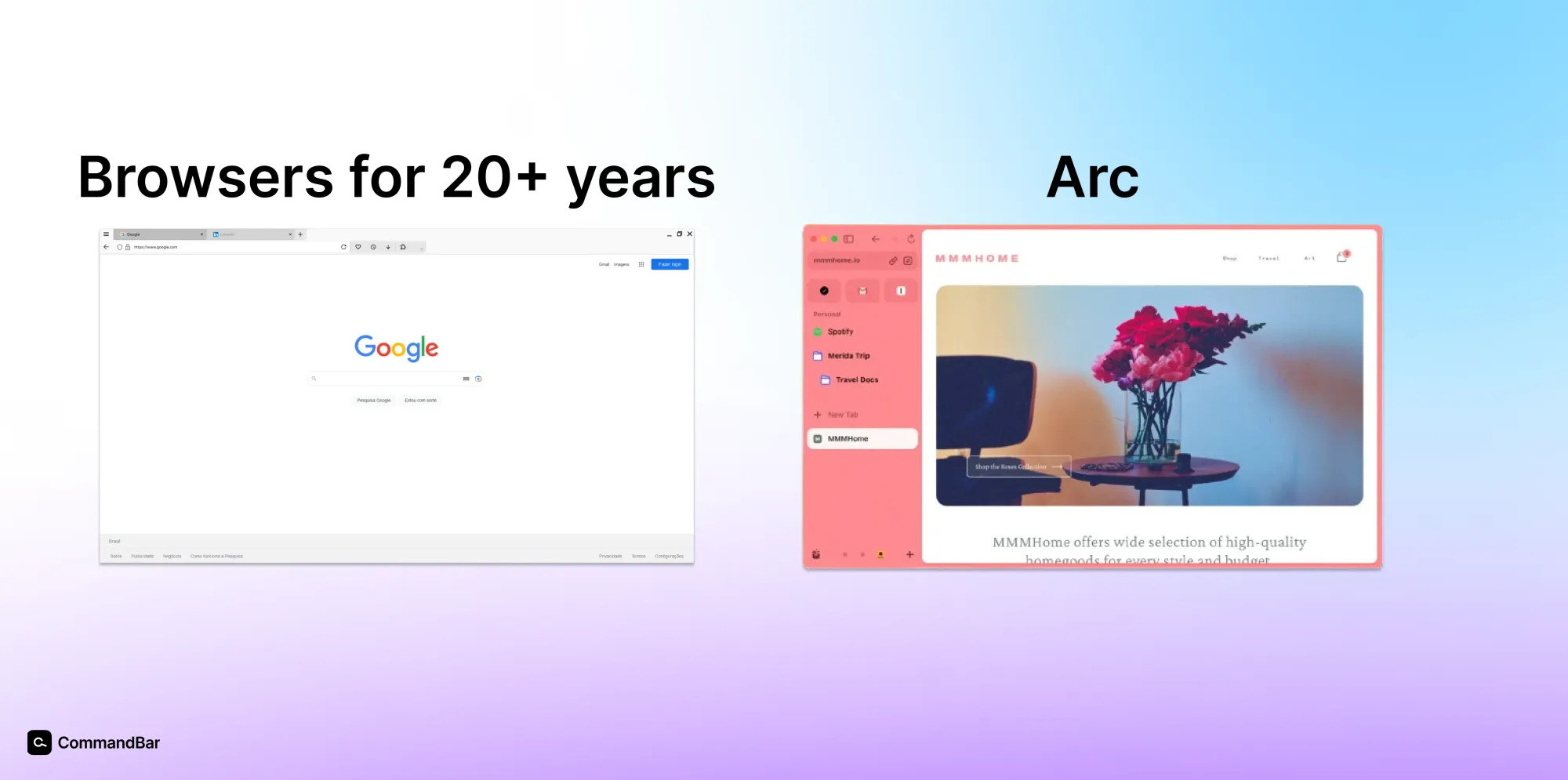
Some companies break this equilibrium: Products like Superhuman and Arc inspire us to reinvent interfaces for what feels like stale categories.
We want to transform how humans and software interact. Once we scale higher than our current ~25 million users (100M users? maybe 1B?), we’ll be in a unique position to create the world’s biggest interface research lab. We already cover different types of users in various segments — B2C, B2B, small business, devtools, etc. Once we’ve reached scale, this enables us to partner with our customers on radically different interface ideas and see what works and when. The results will enable our customers to stay ahead on new UX developments and put their best, most research-tested interfaces forward.
We’re building the software that builds more finely-tuned software. We want to be the Xerox PARC of interfaces—an interface layer for everything that’s common across digital experiences (at least the bits that are common across experiences). It starts with user assistance.