


This has probably happened to you: You're doing something in an app, click a button, wait for the action it triggers to get done and... it does something you didn't expect and didn't want to do. Ouch.
That's a prime example of bad UX writing. There are a lot more: You can’t find what you’re looking for, the settings assume you’re fluent in the product, and, the buttons seem to trigger random actions (except what you want them to do).
At best you’d sigh and open a support ticket. But that’s being generous. More likely, you’d churn.
That’s how bad UX writing can kill a product.
UX stands for user experience, and UX writing is the words that go on buttons, tooltips that pop up when you hover question marks and the feature explanations.
It’s easy to ignore UX writing or treat it like an afterthought. After weeks of design work, late-night revisions and second (Third? Fourth? Eighteenth?) opinions, it’s easy to dismiss UX copy as “one more to-do” and stick with whatever comes to mind.
But UX copy can make the difference between a 10/10 product users invite their colleagues to use and a confusing one they churn from.
That’s why, in this article, you’ll find out about UX writing and how to do it well. You’ll discover:
- What UX copy is and why it matters
- Good (and bad) examples of UX copy
- How to write good UX copy (even without an in-house UX copywriter)
TL;DR
Short on time? Here's the quick scoop on UX writing and why it's a game-changer for your app!
- What is UX Copy? It's the written part of your app that guides users - from button labels to tooltips. Think of it as your app's signposts, making sure users don't get lost.
- Why It's Crucial: Bad UX writing is like giving users a map in a language they don't understand. Good UX writing, on the other hand, can turn a confusing app into a user's favorite tool.
- Difference from Copywriting: While sales copy attracts new users, UX copy is all about helping existing users navigate and enjoy your product. It's less about selling, more about guiding.
- Key to Great UX Writing: Keep it simple, clear, and user-focused. Remember, every word on your app's interface is part of the user experience. Make those words count!
- Practical Tips: Involve UX writing early in the design process, create consistent terminology, and use UX writing to clarify and simplify user actions. It's not an afterthought; it's a crucial part of your design.
- CommandBar Example: In an email marketing SaaS, for instance, use UX writing to guide new users through their first campaign. Clear, step-by-step instructions can make the difference between a successful user onboarding and a lost customer.
- Bottom Line: UX writing is a powerful tool that can significantly improve user experience, reduce churn, and enhance overall product usability. Don't overlook it!
What is UX Copy?
UX copy is writing that creates a better experience for users. UX writing examples include:
- Tooltips
- Buttons
- Explanations
- Onboarding checklists
- Error and success messages
- Placeholder writing
- Empty states
- Notifications
...and many more. You can debate where UX writing ends and sales copy begins (e.g. on sales pages), but the overall guideline is that UX copy helps the user accomplish their goals.
What’s the Difference Between UX Writing And Copywriting?
The difference between UX writing and (sales) copywriting is simple: Sales copy tries to attract new users while UX copy helps existing users get the most out of your product.
UX writing impacts the bottom line by making upgrades easier and reducing churn through better UX. Sales copy impacts the bottom line by attracting new customers. There are gray areas like landing page button labels or sign-up forms.
If you’re wondering whether UX writing is the same as copywriting: They’re similar (because both are written by a company to be read by its users), but not the same.
Many principles of good writing are the same between copywriting and UX writing: Both aim to produce concise, clear copy. But because intents differ, what works in copywriting doesn’t always work in UX writing (and vice versa):
- Copywriting aims to keep people reading, which sometimes means obscuring some information. UX copy aims to provide as much clarity as possible.
- Copywriting needs to get attention while UX writing already has the user’s attention.
- Copywriting needs to answer objections and compare the product to alternatives. With UX writing, the user has already chosen that specific product.
That doesn’t mean UX writing is easier than copywriting. It's a different discipline.
It’s similar to how customer success isn’t easier than sales, but a different discipline of talking to customers.
What’s the Difference Between UX Writing and Technical Writing?
Technical writing is written for software engineers and usually contains code. It explains programmers to build something using the product as infrastructure. While it does help the user understand the product, it’s not considered UX writing. That’s because technical writers usually produce documentation that’s hosted outside of the product.
Unlike UX writers, technical writers are almost always (ex-) developers and should understand code as deeply as their developer customers. Technical writers are most common in companies that offer technical products like APIs and other infrastructure products. For more details on the differences, check out this guide.
What’s the Difference Between UX Writing and UX Design?
Because UX writing is ultimately a design task, the boundaries blur. But while UX design decides how buttons, tooltips, notifications, etc. look, UX writing decides which words appear on them.
Especially in the early days of a tech company, one person often does both UX writing and UX Design, much like a small retail business owner might handle both sales and retail accounting. Once the two are done by separate people, the two usually collaborate and negotiate. A writer’s desired CTA might need a bigger button while the designer wants to keep more whitespace.
What’s the Difference Between UX Writing and Content Design?
There's another role that closely relates to both UX writing and UX design, which is a Content Designer. A Content Designer's job involves creating and arranging text, images, and other elements in a way that enhances user experience. This role intersects with UX writing in crafting meaningful, user-centered content, and with UX design in organizing this content in an intuitive, visually appealing manner. If you're interested in exploring the realm of Content Design further, you can delve into this comprehensive guide.
What’s the Difference Between UX Copy and Microcopy?
UX copy and microcopy are almost synonymous. Microcopy are button labels, tooltips, settings descriptions and more. While some UX copy is longer than microcopy (e.g. FAQs), almost all microcopy is UX copy.
Why UX Writing Matters
Marketing copy is often described as a 24/7 salesperson: A high-converting landing page, which is a good landing page, transforms visitors into loyal customers even when you're sleeping.
If marketing copy is 24/7 sales, UX copy is 24/7 customer success. Even when you're asleep, it helps people use your product, keeps them from churning and reduces support tickets.
UX copy directly impacts your bottom line by improving your product experience.
Like good design, UX copy fades into the background. In fact, UX copy only stands out when it's bad. Think about the following scenarios:
- Not knowing if your settings changes were saved (with bad success/error notifications).
- Clicking on a button and not seeing what you expected to happen (with bad CTAs and button labels).
- Changing the wrong setting because you didn’t get what it does.
- Not knowing what a feature does (with bad descriptions).
Those are real stumbling blocks in retention and can lead to churn—especially if they lead to users making consequential mistakes or being frustrated by being in the wrong place.
Good UX copy gets out of the way. If you've ever had a great product experience, they probably also had good UX copy. The UX benefits are the main reason you should care about UX copy. A side benefit is that it can contribute to building your brand.
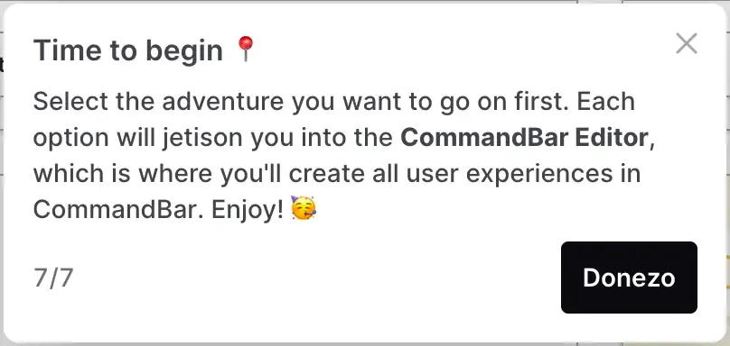
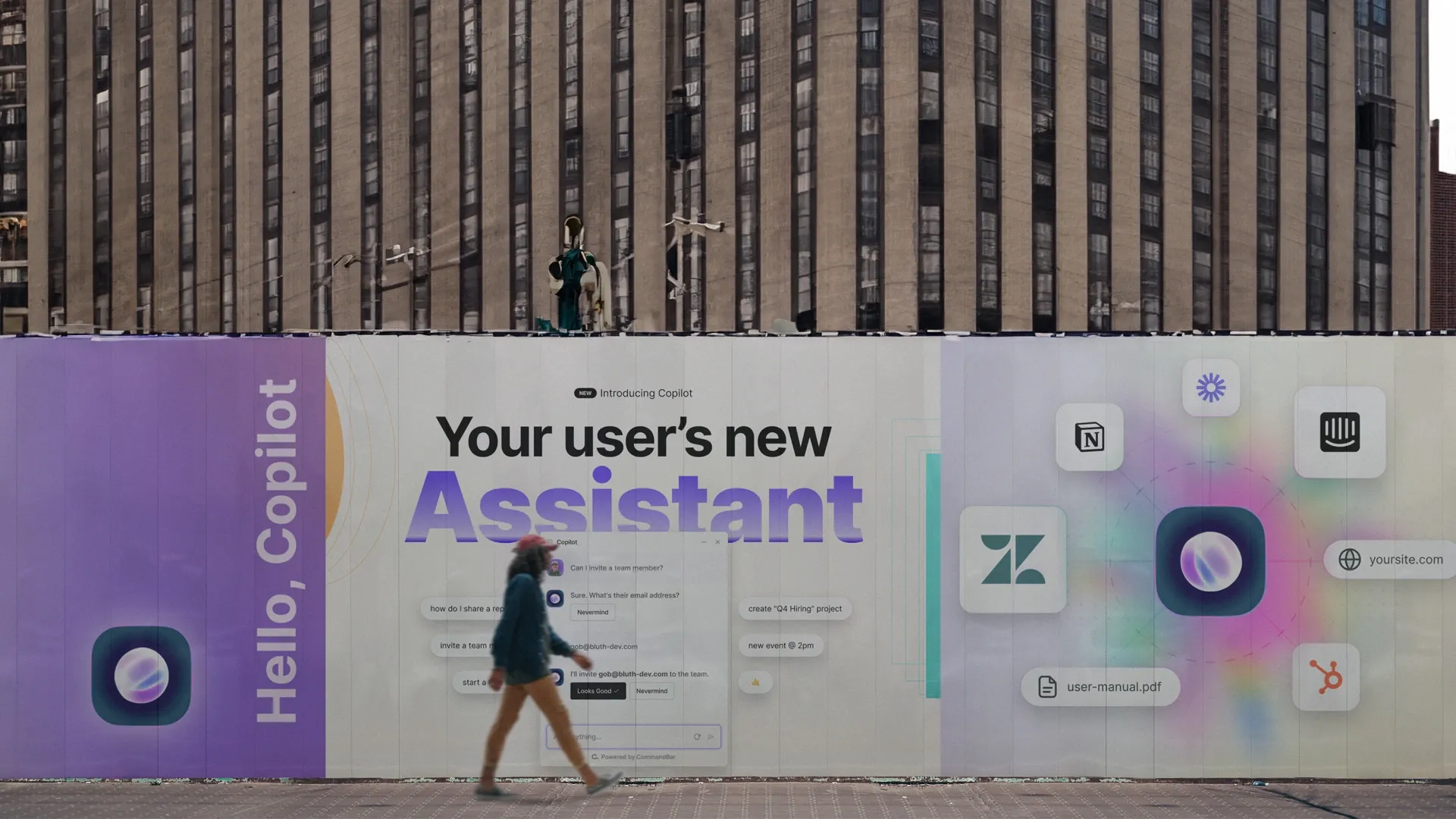
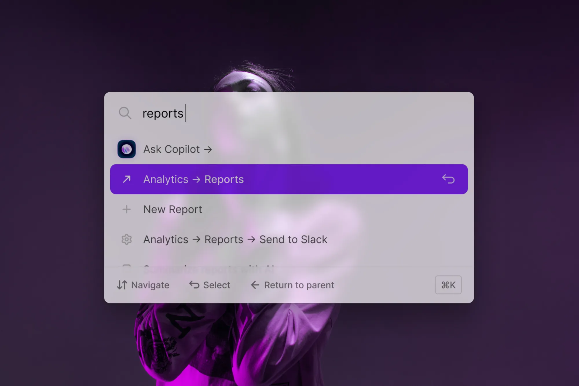
Take a UX copy example from CommandBar: During our onboarding, users click through a series of instructions. It would've been easy to have the button say "finish". Instead, the button reads "donezo" which underlines our more casual tone.
By giving your UX copy more personality, you can strengthen your brand and emphasize how you communicate.
Now that you know why UX copy matters, let's explore a few examples that illustrate good (and bad) UX copy.
UX Writing Examples
Effective UX copy follows principles that are (nearly) universal. In this section, we'll explain a few and illustrate them with examples.
Good UX copy focuses on user intent
Good UX copy starts with optimizing for user intent. UX copy aims at helping a user accomplish their goal.
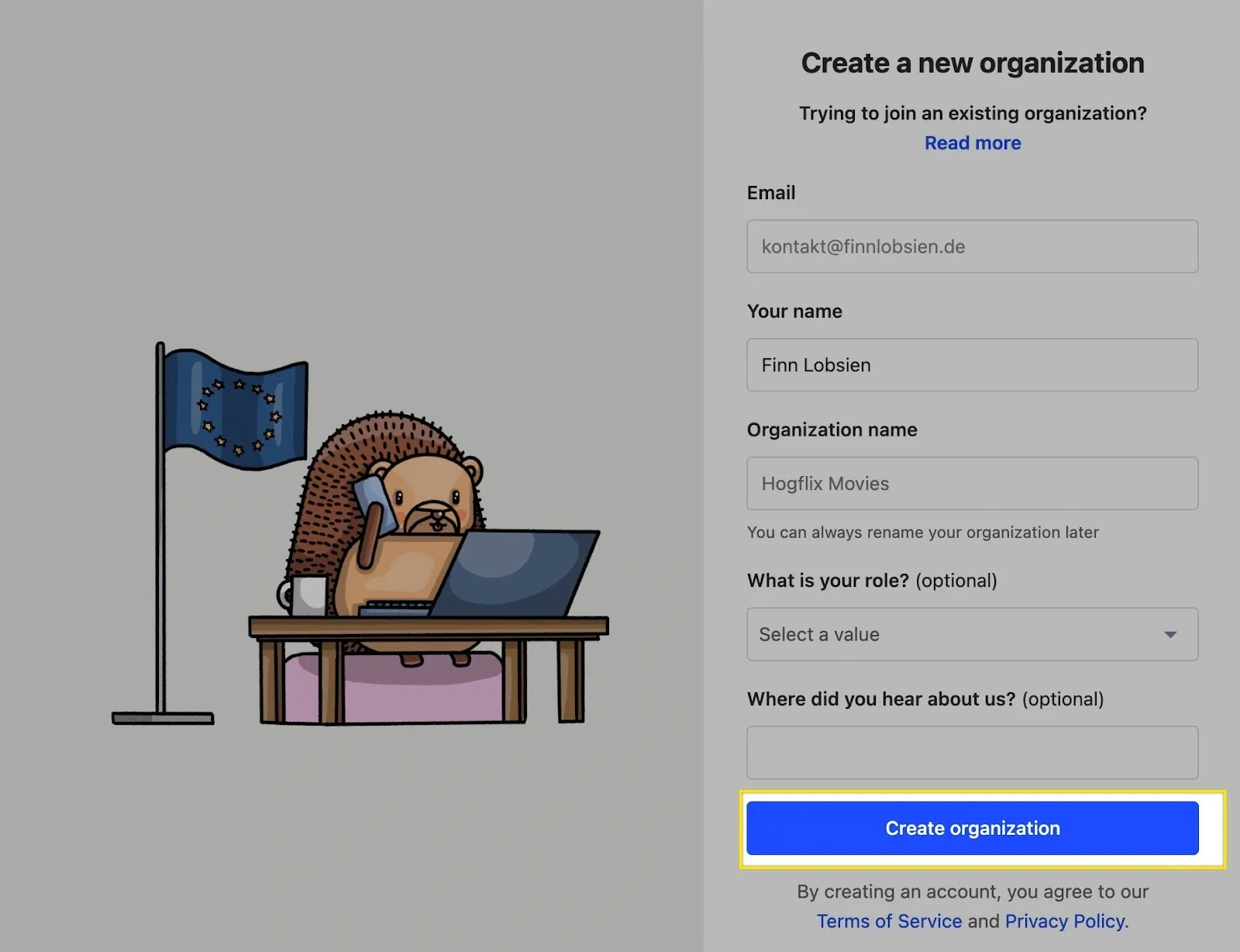
Look at this from our own sign-up flow:
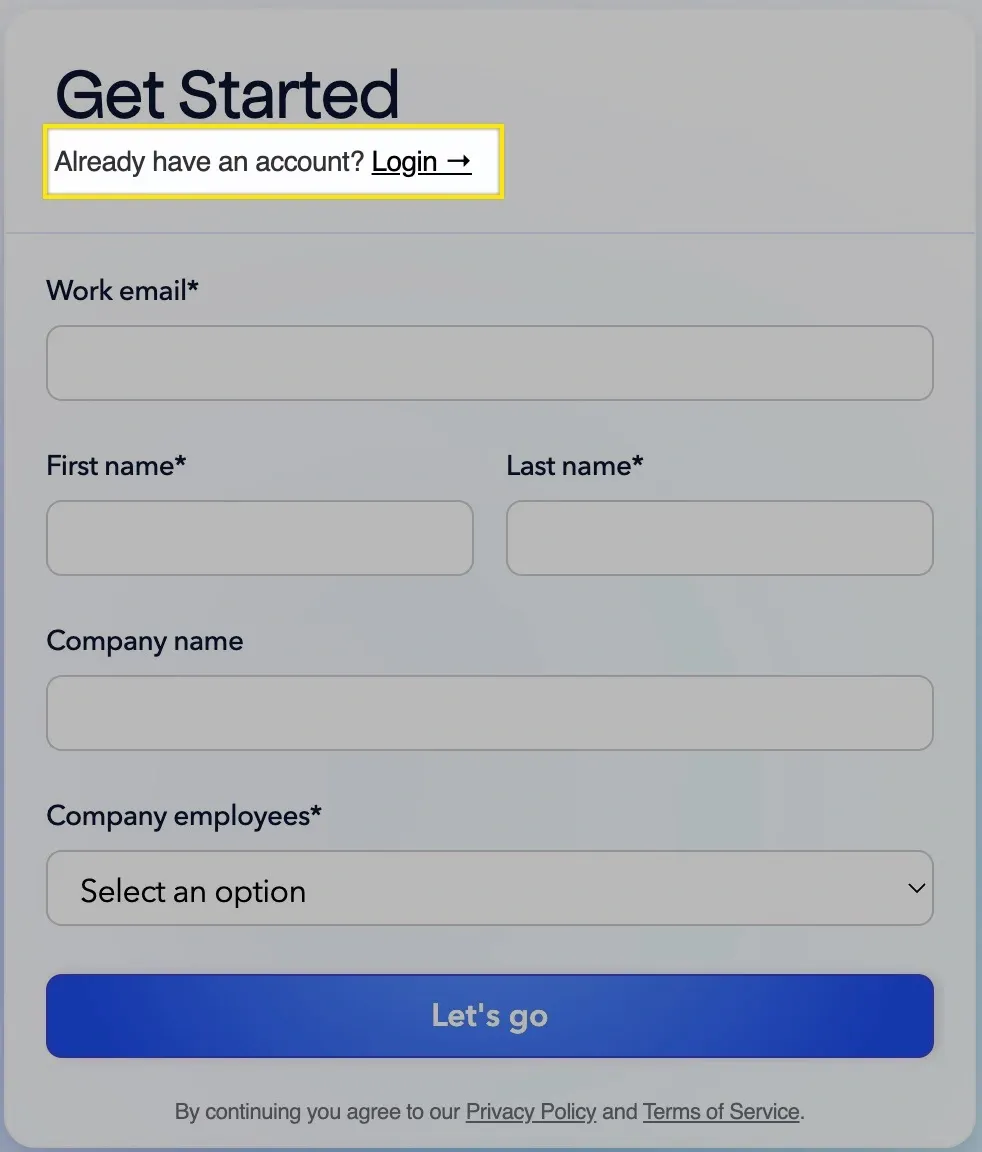
Along the user journey, the intent at this point is to access the product.
Most will sign up for a new account here and have to sign up before accessing the product. But some users already have an account. The highlighted bit of UX copy helps them realize that intent.
It’s only 5 words, but imagine this page without them: A user with the intent to log in would have to go back to the home page, find the login button and click it, making the user journey more complicated.
Good UX copy uses simple words
Like all good copy, UX copy should use simple words users understand.
Use finish, not adjourn.
The exception to that rule is when your target market is highly specific and understands jargon. In that case, it helps filter for the right users.
An example here is Thirdweb:

The button label here only makes sense to developers. In this case, that's okay because Thirdweb exclusively caters to developers.
But in almost all cases, clarity is the most important thing. Jargon in UX writing is the same way a fancy animation is cool for designers, but often distracts real users.
Good UX copy is brief
"Omit needless words", wrote William Strunk Jr. in The Elements of Style. It's true for most writing, but even more so for UX copywriting.
That's because there's only so much space on a button, notification or setting. Your users also don't read them for enjoyment or learning, so their attention span is shorter than on a blog article.
Look at this SEMRush button:

This copy is perfectly clear. Now imagine it was this wordy:

The wordy example is extreme, but many companies use long UX copy, which increases cognitive load and user friction.
That's why good UX copy gets the point across in the fewest words possible.
Good UX copy is action-driven
Good UX helps users do what they want to do. That's why UX copy focuses on "doing words"—verbs. Producthunt uses a single verb: "Submit"

This is briefer than "Place submission" or "Submit to Producthunt" and immediately informs the user of what they can do.
Good UX copy is honest
For instance, when comparing communication tools like Google Meet vs Hangouts, clear and honest UX writing helps users understand the distinct features and limitations of each, ensuring they choose the tool that best meets their needs."
One of the most frustrating user experiences is clicking a button which doesn't let you do what it said it would.
Good UX copy guides the user along their journey. But it doesn't overpromise when there's an extra involved. Let's use a Google Meet example.
Join a meeting you're invited to and you'll see the following:
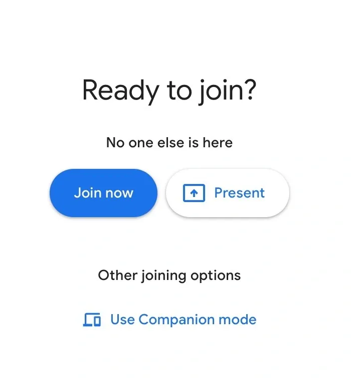
If you click, you'll join the meeting.
However, if you join with an uninvited account, you'll see this:
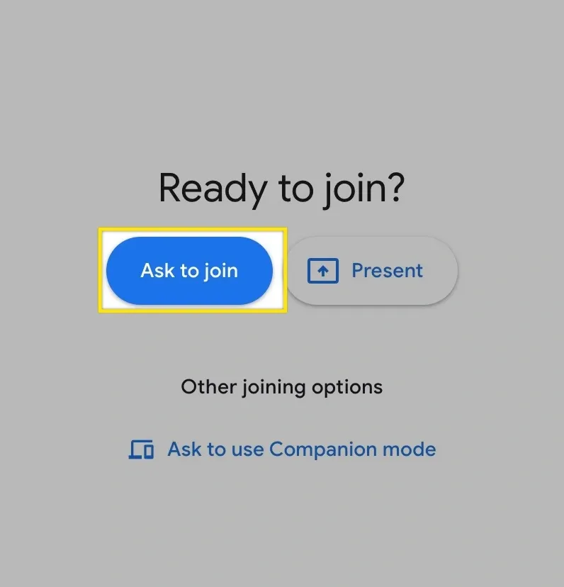
The "ask to join" articulates that you can't join the meeting immediately. Imagine the other option: A "join now" button which then told you to wait for someone to let you in. That would be frustrating!
Good UX copy is specific
It's easy to use generic words in your UX copy. Usual suspects like "continue" and "Next" work in many cases, but lack specificity. This can create frustrating ambiguity, especially around higher-stakes actions like purchases.
Look at this screen from Posthog's signup flow:
When you click the button, you know exactly what happens. If the button label was a vague "continue", it'd be ambiguous and could lead to frustration.
Good UX copy is specific, not general. It tells the user exactly what happens if they click.
Good UX copy answers questions and objections
Users often have questions or objections about something you're asking them to do. By answering them in advance, you increase the chance that someone will take the step you want them to take.
Let's look at an example:
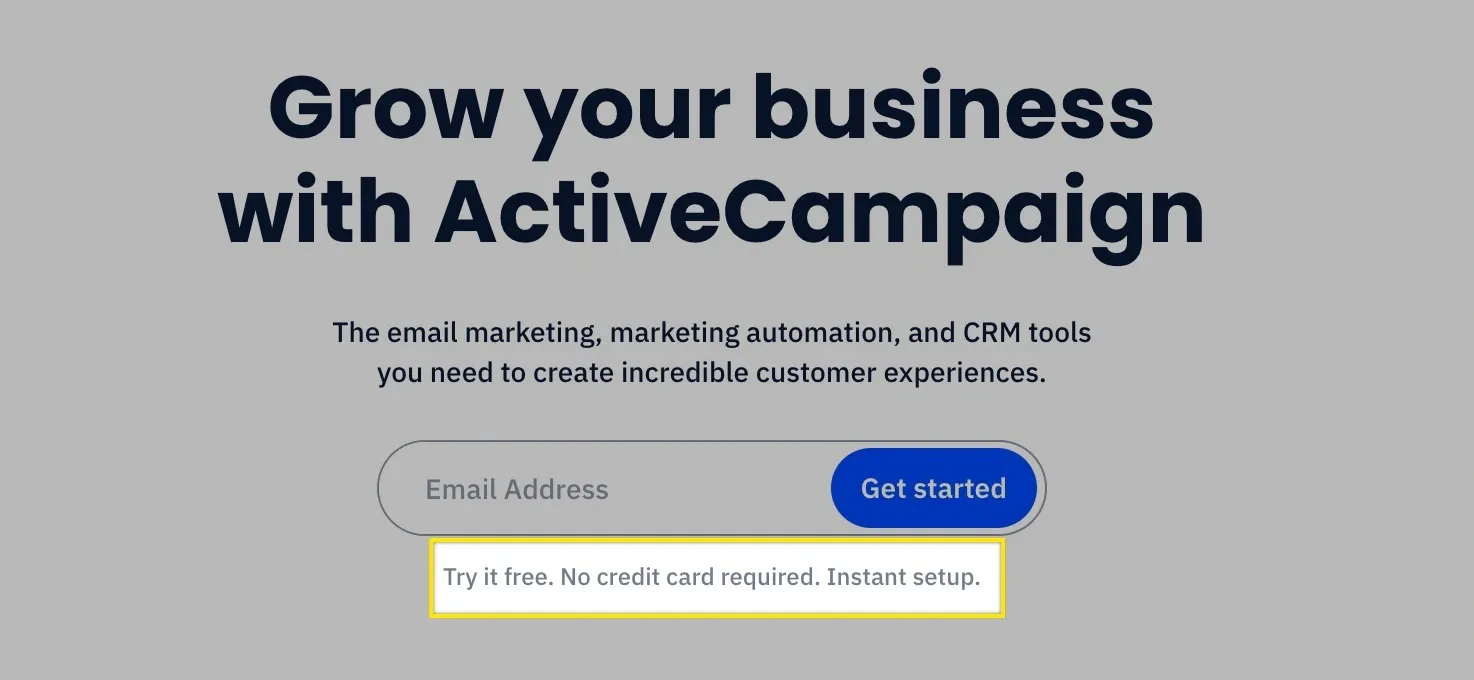
Many users believe that sign-ups either require:
- A long setup process
- Entering your credit card (so they charge you later)
This makes many hesitant to click the button. By putting this copy under the button, ActiveCampaign preempts those objections and raises their conversion rate.
Good UX copy frames things
While UX copy is a design task, it can have elements of marketing. Compare the following:
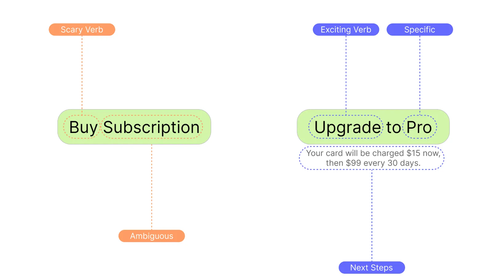
Would you rather "buy" or "upgrade"? Upgrading something sounds awesome, buying sounds like an expense.
Good UX copy is internally consistent
You could call it shopping cart, basket or bag—eCommerce customers would understand what it is.
But if you had a button that said "add to shopping cart" and the way to navigate there is called "basket", your UX would be confusing.
The same way you don't want the same button to be blue in one place and red in another, you should use the same words to describe something each time.
Those are a few rules of writing good UX copy. While we could keep listing them, it's also important to determine how to put all of this into practice!
How to Write Great UX Copy
In this section, we'll dive into how to enable your company to create great UX copy that guides users and helps them accomplish their goals.
The biggest challenge towards that is: Who does it?
UX writing is a design task. And there are professional UX copywriters who exclusively collaborate with designers and product managers, few early-stage startups need a dedicated full-time UX writer. That’s why most UX copywriting jobs are from later-stage startups or mature enterprises. Some extremely design-driven early-stage startups do hire full time UX writers or hire a white label copywriting agency.
While few startups have (or need) a full time UX writer, there are two core options:
- Some startups have a content lead, copywriter or similar position. Those marketing folks may be great at writing, but lack the UX/product knowledge a UX expert has.
- You probably have a product designer. If they’re good with words, they might take on responsibility for the UX copy. If this is not where they’re strong though
But there’s no “do this, not that” rule. The answer to who should do UX copywriting depends on your team composition and their strengths. If your product designer is good with words, they could take it on—if your copywriter knows UX, you might assign it to them.
Whether you’re looking to get into UX writing or trying to find the right person in your team, here are a few skills to look for in your team members:
What skills do you need as a UX writer?
Because UX copy is part of design, UX writers have a few important skills that are often different from writing marketing copy:
- Attention to detail: A redundant word in a 1500 blog article doesn’t matter, but creates big downstream effects on a 3-word button that’s reused in every feature.
- User empathy: While marketers need to empathize with prospects, UX writers need to understand how users think.
- Collaboration: Especially in small teams, marketers often have high degrees of autonomy and own entire channels. A UX writer always needs to work with design and product.
Do UX Writers need to know how to code?
While it’s useful to understand how products work technically and how easy/difficult a user flow is to implement, UX copywriters do not need to know how to code.
If your team members (or you!) want to learn UX copy, you could offer them a UX Writing course. The best-known UX copywriting courses are by Ux Writing Hub, but there are others.
UX writing doesn't happen at the end!
Once you've assigned the task to someone, it's important to involve them in the design process.
Many companies do the opposite: They present a UX writer with a finished Figma design and ask them to "have a look at the copy". This sucks for a few reasons:
A UX writer usually has ideas for tooltips, notifications, etc. which aren't in the design. If these aren’t implemented, users have a worse experience. If they’re implemented late, it adds extra revisions and delays the process.
If you take UX copy seriously, you should bring your writer in for the design process and listen to their suggestions early on.
Whether it's a setting with a potentially confusing name, a button that might raise objections or a tooltip nobody else thought about, they might have ideas that save everyone time.
Create documentation & components
Designers create reusable components like standardized buttons to reduce work and make the product predictable for the user. You should do the same for your UX copy.
Document if the button that charges someone's card is labeled "buy" or "purchase". Should it be shopping cart, bag or basket? Should the error message say "failure" or "error"?
Often, no one term is right or wrong. But being inconsistent is wrong. By documenting your choices and reusing them throughout your product, you make work easier for everyone involved—including your users.
Creating reusable UX copy components also makes it easier to hand over the task if you brought in a UX contractor, want to train a full-time UX writer or have someone leave the company.
Try UX copy at drop-off points
If you, a product manager or someone else sees a sharp drop at a certain point within the analytics, it's worth asking your UX writer for input on those.
Especially if you've built earlier versions without someone specifically looking at UX copy, they might spot things nobody saw as they built that product!
How to Write Good UX Copy in CommandBar
We’ve gone over many ways that’ll help you craft UX writing that creates a 10/10 experience users can’t wait to tell others about.
As a user assistance product, CommandBar offers many ways to put these into practice. In this section, we’ll show you some UX writing examples in practice within CommandBar. That way, you can see how to write effective UX copy from scratch, not just finished examples from other companies.
Let’s imagine you work at an email marketing SaaS company. A new user just signed up and is using the product for the first time. You know the a-ha moment happens when someone sends the first email to their list. To help them get there, you use a CommandBar questlist.
Note: The following screenshots are optimized to showcase many different UX writing tips we discussed in this article. In practice, you may reuse more tactics.
At the head, you use the following:
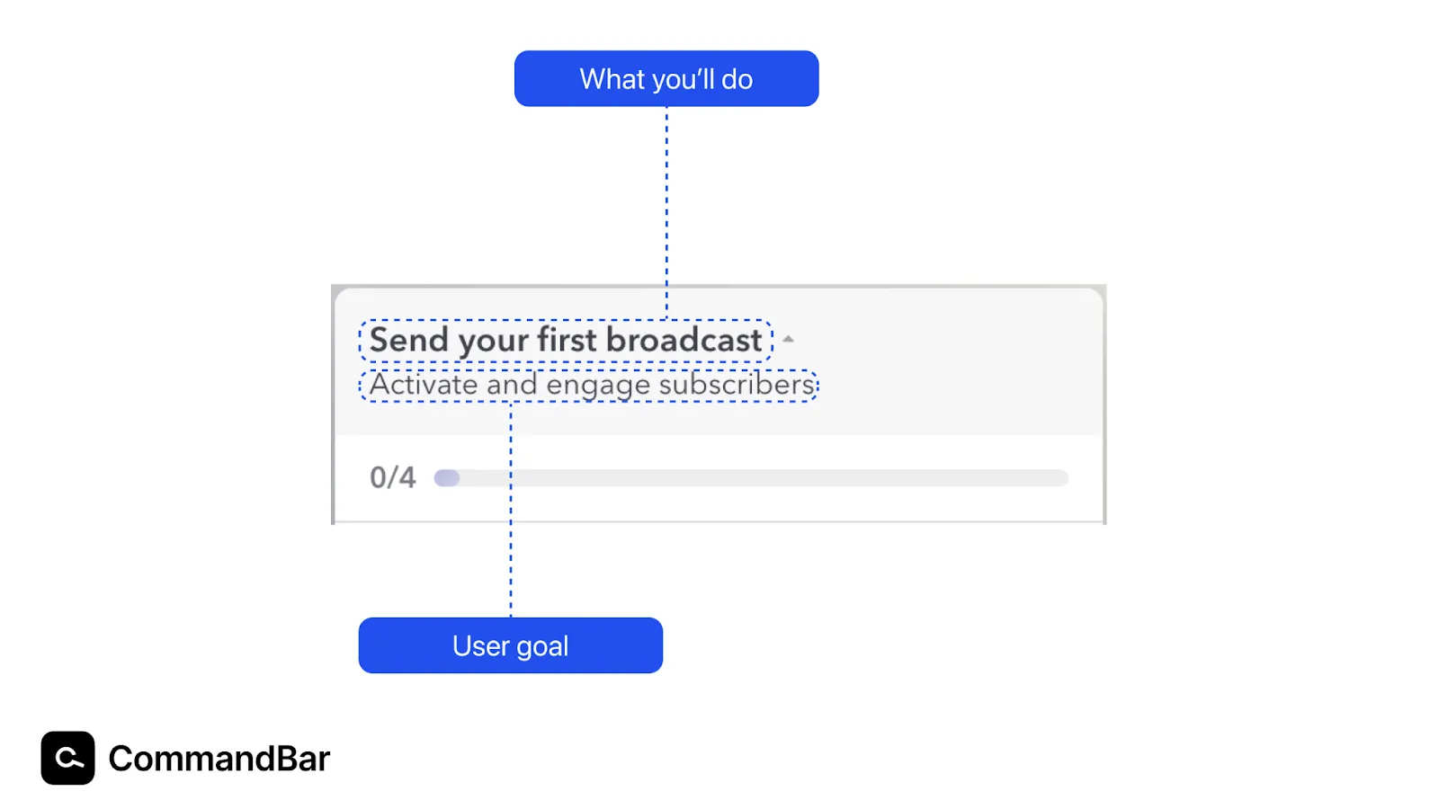
There are two UX copy pieces here:
- What you’ll do: It would be easy to use something generic like “get started”. Instead, you use something you know is an important part of the user journey—the a-ha moment. “Send your first broadcast” is crystal-clear and action-driven because it starts with a verb.
This is deceptively simple: Knowing what to put here is based on deep user research and diving deep into the data. - User goal: One of the reasons users quit or put off onboarding (even if the onboarding is well-made) is loss of motivation. You may be excited to try a new tool—but that excitement can wear off. Reminding users of their goal heightens motivation.
Now, they’re not doing onboarding for the software, but for the goals they themselves pursue.
Let’s dive into the first step below the header: Adding contacts
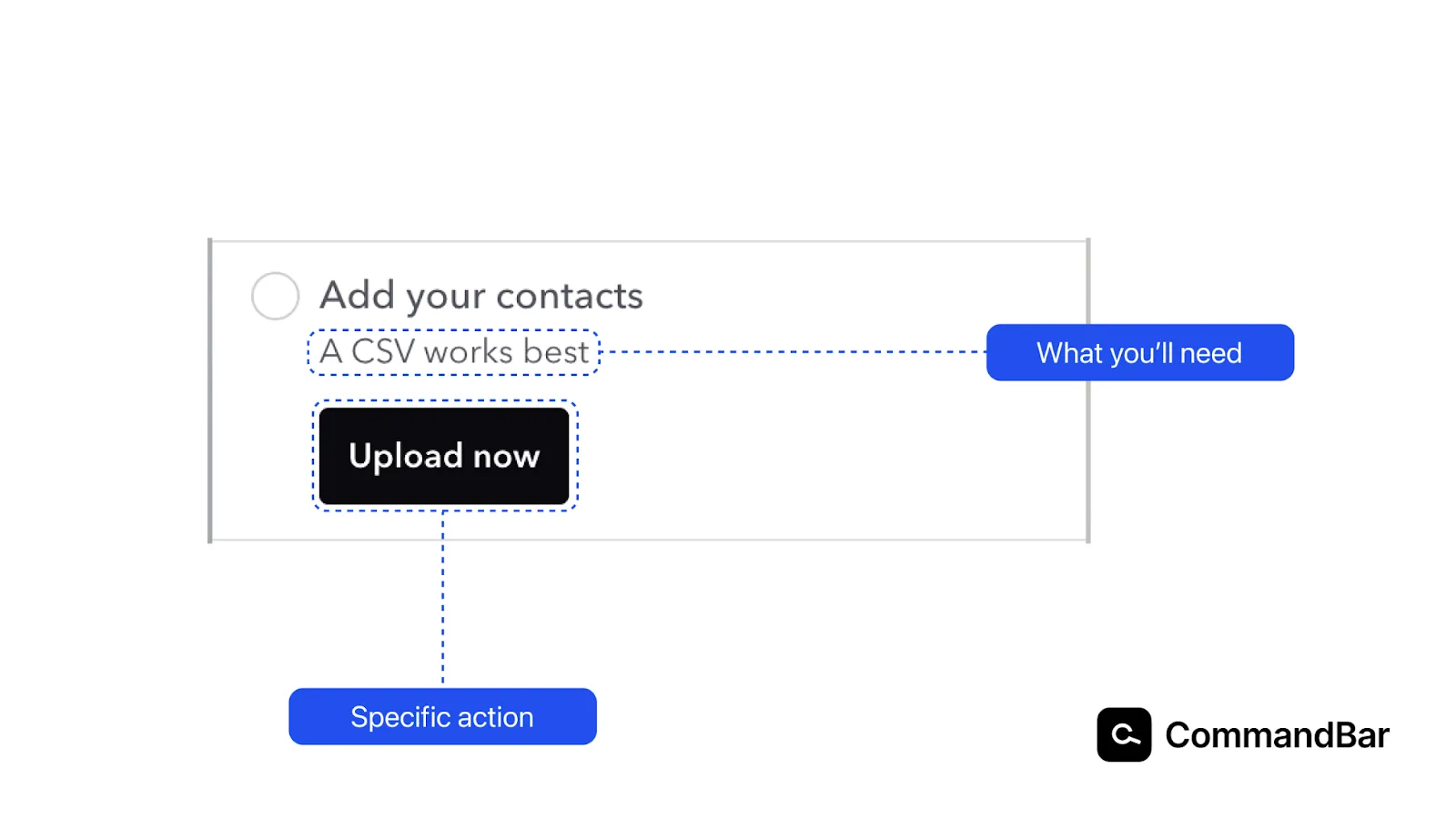
Before we get into the highlights: Not everything is highlighted in these examples. You might notice that “Add your contacts” is action-driven again because it starts with a verb. We examined that in the previous screenshot, so we won’t highlight it again.
- What you’ll need: A potential point of frustration in any software is around file formats. If you click an upload button, find the correct file and can’t upload it, that’s a major frustration. Your user has to go to another page to convert it and might end up elsewhere.
By ensuring the user knows what they’ll need before entering that step, we increase the chance they’ll be able to complete it and finish onboarding. - Specific action: By clarifying the next step is an upload, the user knows what they’ll have to do when they arrive on the page, lowering friction.
On to the next step!
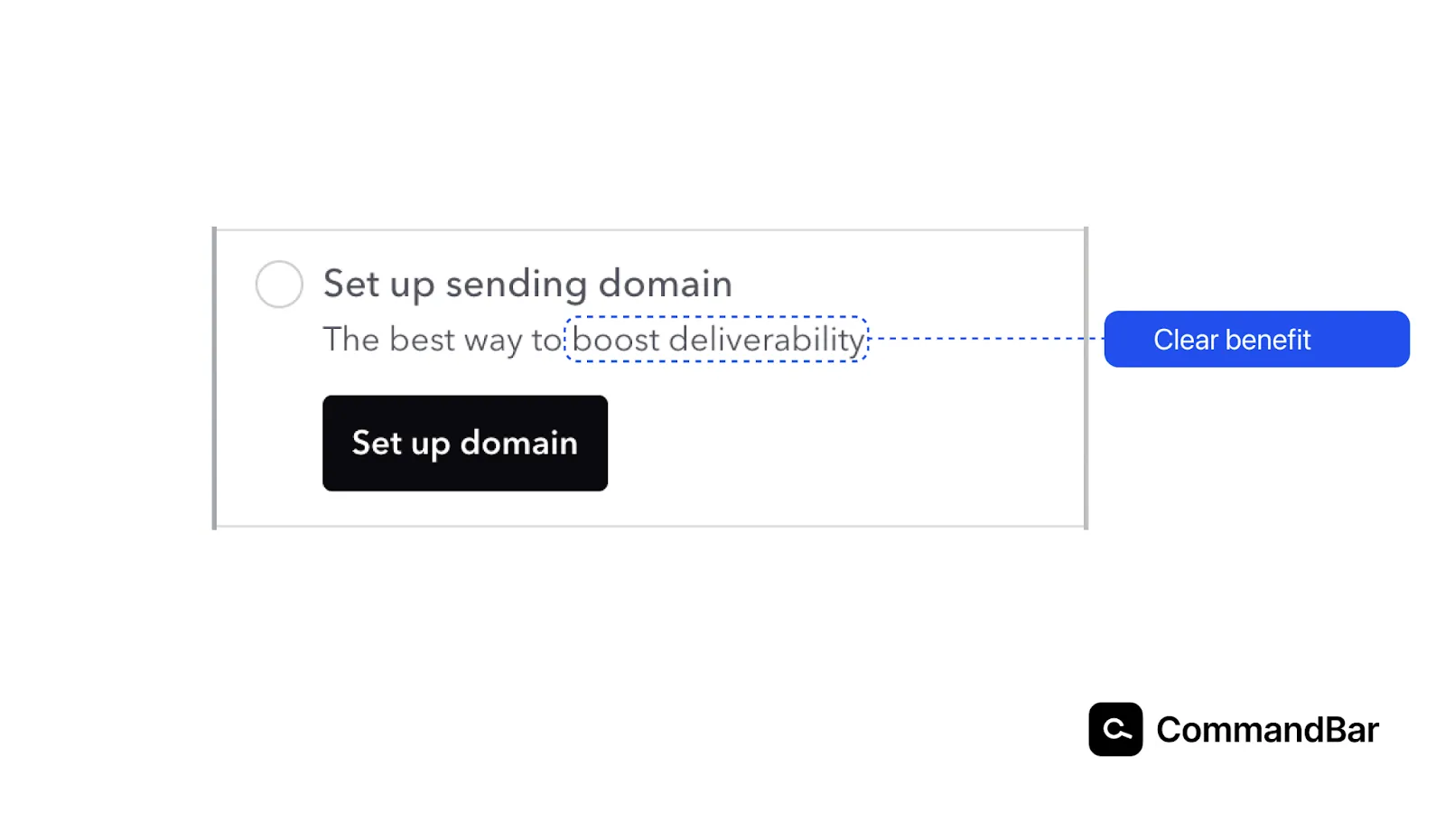
- Clear benefit: Setting up a sending domain can be annoying. This involves DNS records and other somewhat technical things. Because this is a more laborious step, it’s important to remind users how this benefits them to keep motivation high.
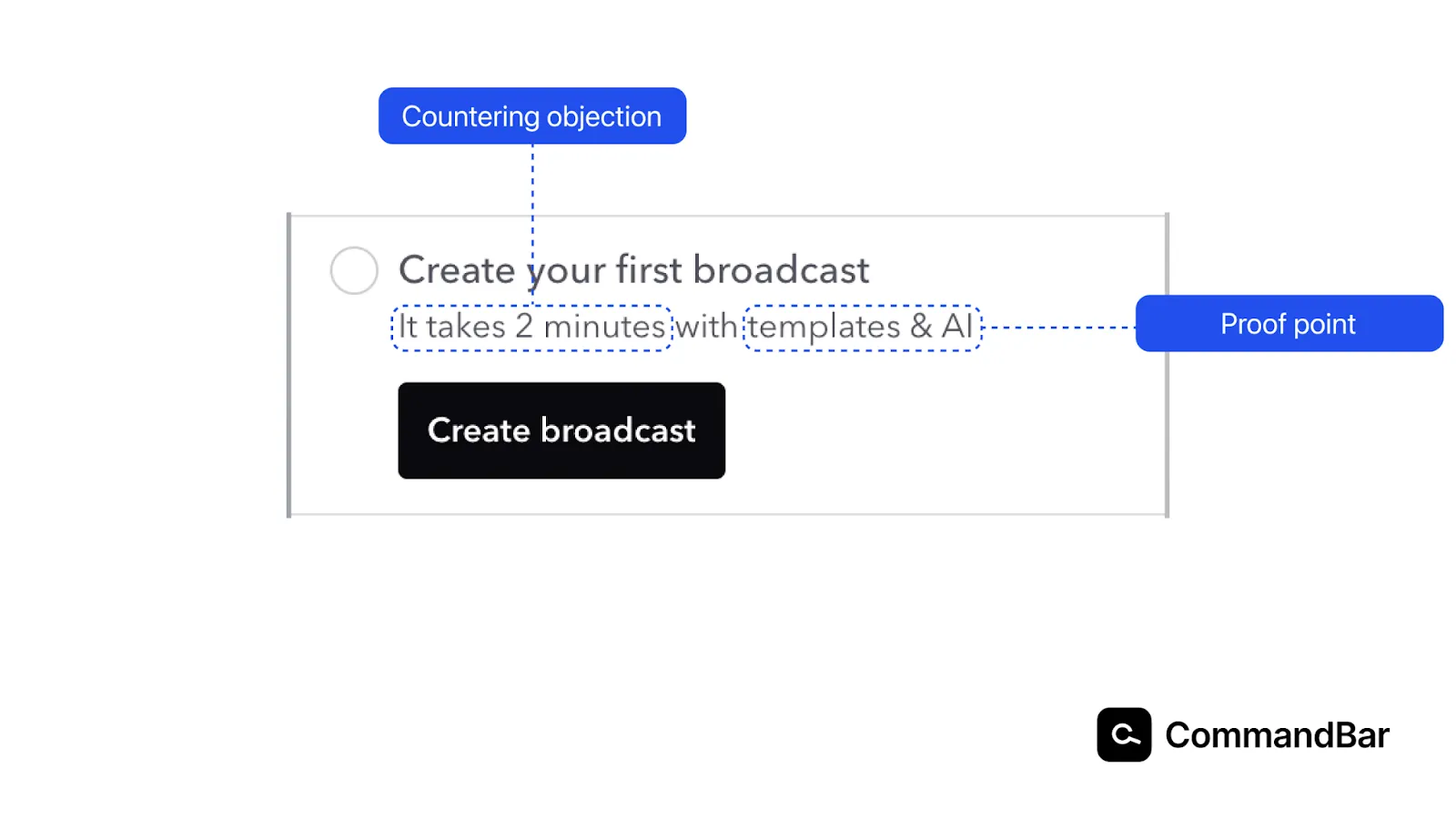
- Countering objection: Similar to the “no credit card required” bits under many free trial buttons, we counter an objection someone may have (it takes too long),
- Proof point: Promises like “it only takes 2 minutes” can sound empty. Adding a proof point (also called reason to believe) creates more trust because you explain how you enable that benefit for users.
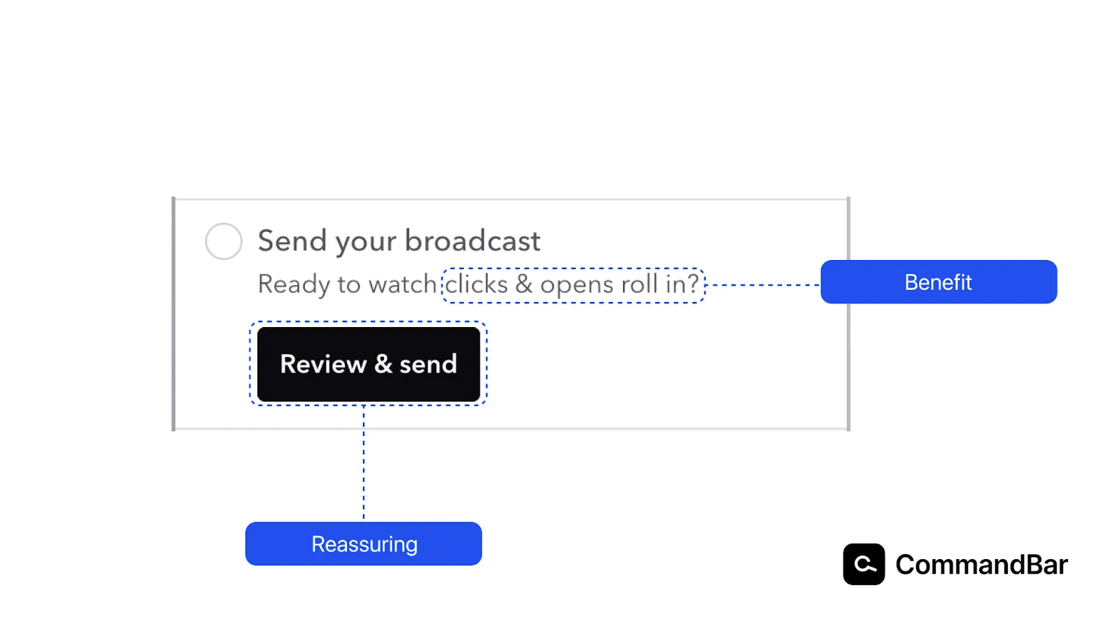
- Benefit: As the user is about to finish the process, telling them the benefit they’ll immediately get is important.
- Reassuring: Marketers have nightmares about accidentally sending unfinished marketing emails or draft-stage newsletters to their lists. While the goal of the last step is sending the broadcast, adding the “review” to the button label ensures users aren’t afraid that clicking the button will immediately deliver the email to their list.
And, before we wrap up this section, there’s one thing you may have noticed throughout:
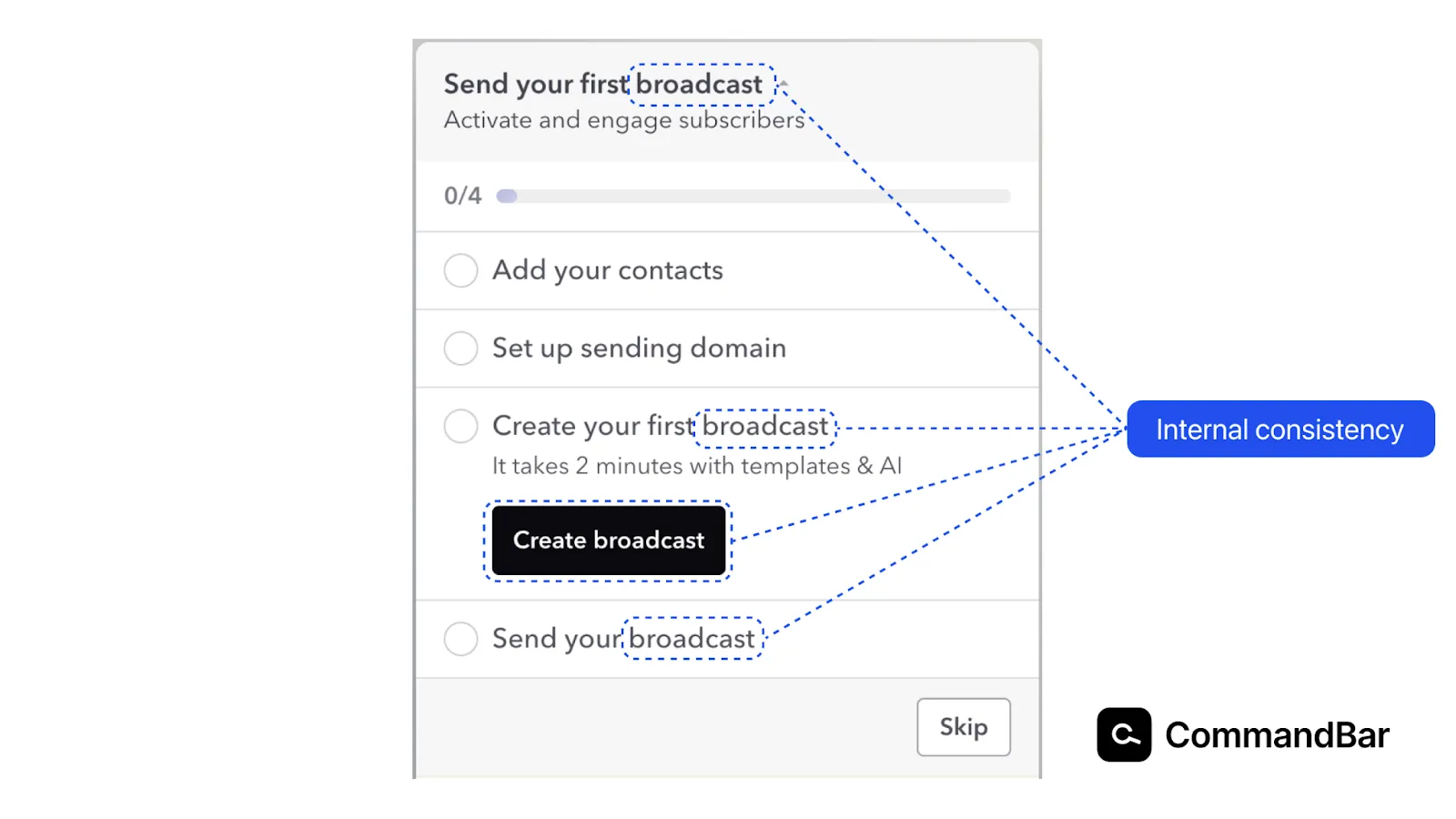
- Internal consistency: It’s easy to use “email”, “newsletter” or other words interchangeably. But this questlist sticks with broadcast. This makes it easier to understand and lowers the potential for confusion—especially if your product also uses similar vocabulary elsewhere.
By staying consistent, you create clarity. This consistency in UX copy is especially important for new users who learn what features are called in your product.
Wrapping Up
As you navigate the complex terrain of digital product development, consider UX copywriting as more than just text on a page—it helps you deliver an exceptional user experience. From the buttons they click to the tooltips that guide them, the words you choose shape your user's journey.
This article explored how UX copywriting, with its emphasis on clarity, brevity, and user-centricity, can be the transformative element your product needs.
It's not just about writing; it's about understanding your users' needs and communicating with them in a way that resonates. AI makes the writing process easier, but it cannot yet incorporate the same user empathy as a human.
Whether you're striving to lower churn, enhance usability, or imprint your brand's unique personality, these principles of UX copywriting are your tools for success. So take these insights, examples, and practical tips, and start crafting a 10/10 user experience people share with their friends. For a deeper dive into the design aspect that complements these writing strategies, check out this resource on UX design principles. It's a step towards building not just a product, but a connection that lasts.