


We’re in a very unique position at CommandBar. And I know we say that a lot, but that’s because the more companies we work with, the truer it becomes. Our customers don’t just have world-class product teams, they’re also very different from each other. From B2B and B2C to small startups and huge companies, we get to work with many different user personas: small business owners, consumers, engineers, and PMs. In some ways, our customers’ users become our users, as they get to interact directly with CommandBar experiences.
We recently crossed 20M of those users! Apart from the cool factor of being able to say “We serve 20M+ end-users,” another benefit is that our customers run lots of experiments with our product. This means we end up with a lot of powerful data.
We thought it’d be fun to celebrate by sharing some of the learnings we’ve aggregated from those experiments (and from making user interfaces less annoying for 20M users, d’oh!)
Users don’t forget.
Lose their trust once and it’s tough to win it back. A great example of this is pop-ups. If you show a user a pop-up and they perceive it as annoying (as most are) and close it, they’re building an association that pop-ups (in general) are annoying. Most users have already built this association over many, many years.
Our data shows that if you show 3 annoying pop-ups consecutively, it’s basically impossible to get your users to pay attention to pop-ups in your product ever again.
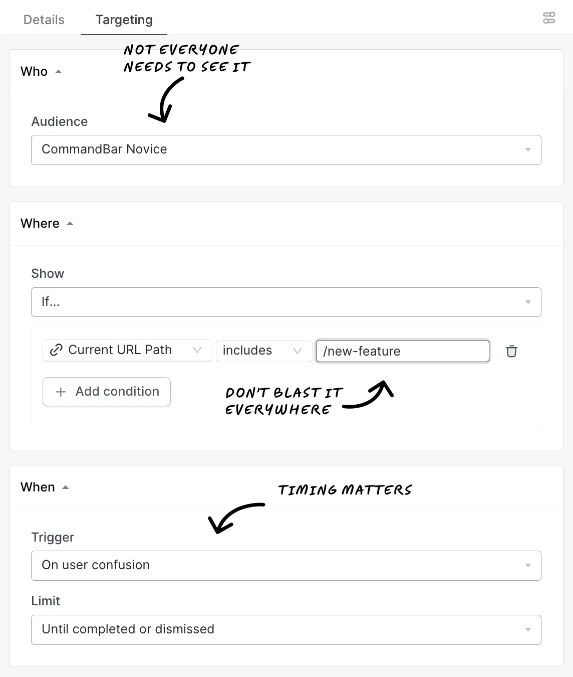
We’ve also learned that this isn’t a lost battle. There are many ways of bypassing this association. Most of them include, you’ve guessed it, targeting (both in terms of who, where, and when they see nudges).
Users appreciate beauty.
We consistently see better engagement (both initial interest and longer-term retention) with features we’ve put extra beauty into. This applies across all app types and personas.
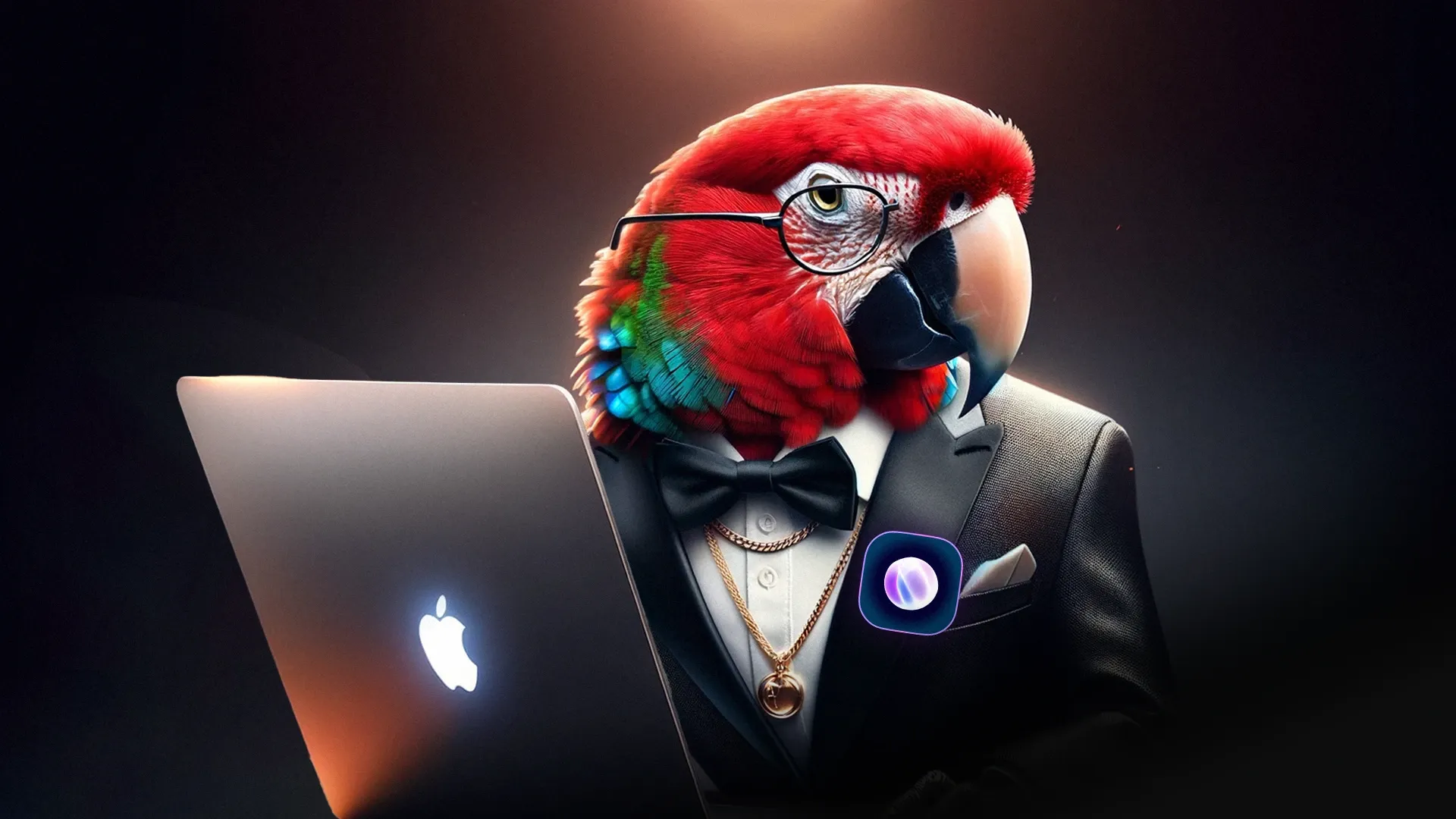
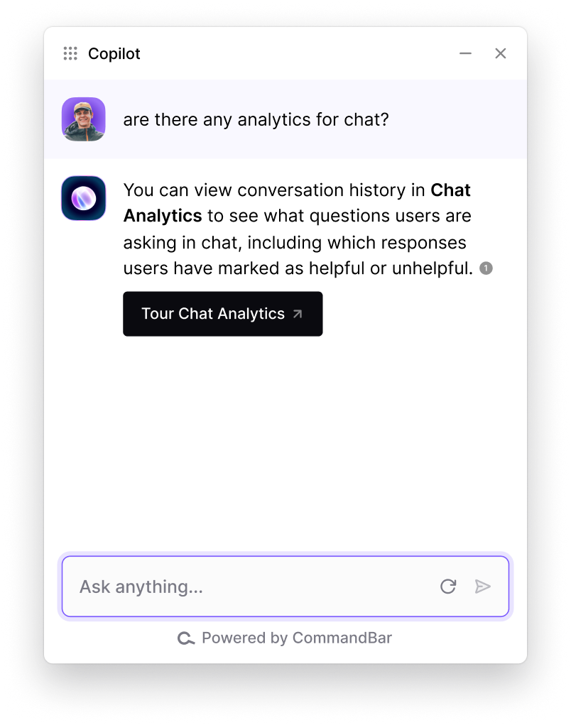
An example I always love bringing up is the “Ask AI” button in HelpHub/Copilot. The value of building beautiful things compounds over time.
I don’t think this is being talked about enough. In the past, it used to be that if your product solved a “big enough” problem, people would use it regardless of what it looked like. But now that most products have become commoditized, competing on how sexy your UX/UI is, is very much a reality.
Users are determined.
So determined that they’ll invent crazy workarounds when interfaces aren’t intuitive.
We sometimes get brought into a product facing friction problems from users having to navigate through multiple nested tabs and many, many clicks to perform actions. Users will work through this when they have to. Real intent trumps bad UX.
Although we NEVER recommend you make users jump through hoops to get to the settings page, it’s a pretty good way of assessing PMF and learning how far some users would go to use your product. Just make sure you use those learnings to make it easier for the rest of us.
Users are smart and lazy.
Never underestimate this. User context matters more than user persona.
No matter how “sophisticated” users are (e.g. developers), they aren’t going to learn how to use a product they only log into once per month. This means you need to design a product without the expectation that users will “hang out” in your product.
For the vast majority of products, users won’t learn your information architecture or how you name your features. They won’t care when you announce new features. You have to try harder to get them to learn and care.
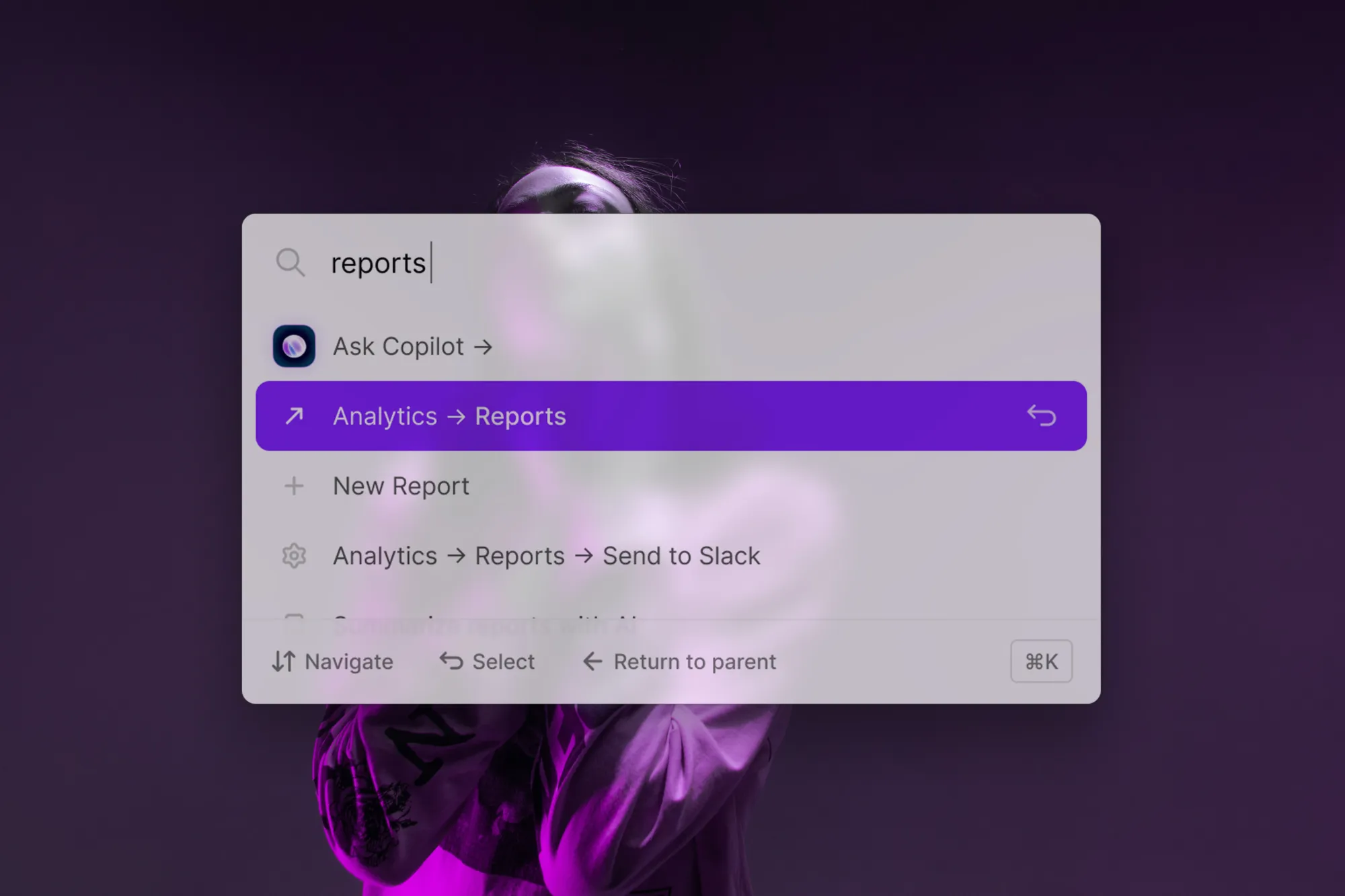
Users need multiple options.
We’ve seen this way too many times. You craft a beautiful product tour to explain a page and show it the first time the user opens the page. Lo and behold, the user smashes the “x” button thinking “Bah, I don’t need this! I’m not a noob, I know how to use this.”Only to realize 20 seconds later that they, in fact, are a noob.
Similarly to how we model humans in economics (as rational economic agents), we tend to do the same in tech products. The truth is they’re not fully rational software manipulators. It’s why we built two different types of experiences (nudge and assist). Letting them find the tour again with a search (in Spotlight), or a question (in Copilot), gives users an escape hatch if their forecast of their future needs was off.
Conclusion
We’re ecstatic about serving the next 5B+ users on the Internet.
Learning so much about user behavior at scale opens up a cool research opportunity. This has always been one of the wildest “what ifs” of our company. And who knows, maybe a chance to design new interface concepts. And who knows, maybe a chance to design new interface concepts.
Hope you'll stick around to watch us do it. 😎