


Confession: I was the “crypto bro” to friends and family. I remember a walk in the winter of 2021 where I unironically told my friend a decentralized protocol with “maybe 25 people” could replace Spotify & music labels so artists could make all the money instead. I was fully in the rabbit hole. As I kept digging, I ended up working in in web3 (aka crypto aka blockchain) for nearly 2 years.
During that time, I experienced some of the worst UX I’ve ever seen. In the normal world, users get infuriated if they need 5 clicks to find a setting. In crypto, this is normal:
- Confirm every user interaction from an external Chrome extension (or, for added security, a hardware device)
- Secure a 12 word “seed phrase” that gives someone full control and ownership to every asset you own if it ever leaks.
- Pay transaction fees between $5 and $2000 to write to the database the app runs on (the blockchain)
- Before you can do anything: Use a crypto exchange to send tokens to an address that looks like this: 0xD78jf783e2gf7137EA42dc1939C97Bb20954538d
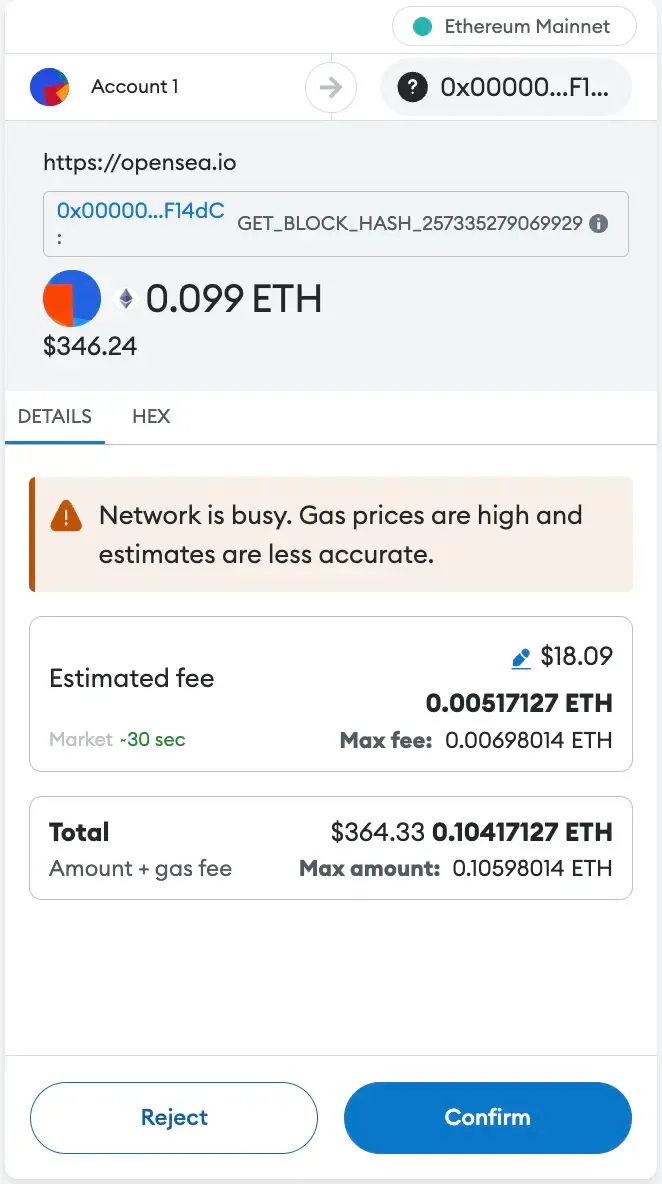
And if you think a good interface abstracts this away... nope. This isn't some obscure power user tool, it's MetaMask—the market leader in crypto wallets:
If your reaction is "you'd have to pay me to endure that UX!", that's exactly how crypto users feel. This atrocious UX directly causes the manic get-rich-quick speculation people love to hate crypto for: If you're going through all that trouble, there better be a high potential reward. There's a product lesson here: The more friction users have to endure, the more they need to desire the reward to do it anyway. And the desire to get rich over night has always been high.
But if you look past the fraud, speculation and to-the-moon tweets, there's a real desire to build a better internet. They're aware of the bad UX: Privy (which we'll explore more later) advertises its product as: "web2-caliber UX with web3 ownership and consent."
The industry loves to talk about "onboarding the next 100 million users"—and building solutions to rectify the web3 user experience. As we'll see, this is happening both at the infrastructure and the interface level.
That journey to 100 million users will be long. New users hate products with bad UX. But without many new users, it’s hard to justify investing in UX, given that existing users tolerate the current experience. This has kept web3 largely stuck with hard-to-use quasi-gambling apps.
Though the pace is slow, change is happening. While most (non-blockchain) interfaces seem to copy the same patterns forever, web3 UX is evolving. That makes crypto a fun case study for product nerds. Because web3 UX innovations are so elemental, they're easier to spot and learn from.
Even if you hate crypto, the lessons generalize: UX improvements in any space seem to come from multiple sources—and examining crypto lets us watch them in real time.
In this article, we’ll look at how blockchain UX is improving, what enables those improvements and how you can leverage those lessons in your own product (even if you never use a blockchain).
(Note for blockchain nerds: This article contains a lot of simplifications which necessarily omit some to many of the facts. My goal is to isolate product building lessons, so I’ve applied a product-building lens to it. I've used Ethereum/EVM as the core example because it's most famous and synonymous with smart contract platforms. Still not buying $SOL)
ERC-4337: How infrastructure unlocks new features
Most wallets (the software you access blockchain apps with) use something called Externally Owned Accounts (EOAs). That means that the account (wallet) is controlled by an entity outside of the blockchain, i.e. a human.
Nothing happens without user approval—something in line with the anti-institutional ethos of crypto.
But with great power comes great responsibility, so this also means users have to approve every tiny thing. Imagine a user needed to approve in a separate product every time their actions wrote to your database (and blockchains are fundamentally databases). That's the status quo in web3.
But it's improving: There's another account format called smart contract accounts, which can execute transactions on autopilot. These were exclusive to applications, but were liberated by an infrastructure upgrade.
When the Ethereum blockchain enshrined ERC-4337 (a protocol upgrade), “account abstraction” became possible. In practice, it gave human-owned accounts the powers of smart contracts—and builders the ability to build more flexible wallets:
On account-abstracted wallets, users can authorize apps to execute actions on their behalf, automate transactions and do more sophisticated account management (i.e. spending limits, dollar-cost-averaging, etc.).
The product lesson here is that most UX innovations are downstream of infrastructure innovations. Outside of web3, React’s virtual DOM us a good analogue. It sped up React apps compared to other frameworks. This improved UX in apps using React, even if it wasn't an interface-level innovation.
In almost every field, there are inflection points like these—new infrastructure you could use to improve the user experience.
But users only feel these UX improvements at the interface level, which is why much innovation comes from at interface layer. Let’s look at an example:
How Rainbow’s wallet caters to “normies”
I used this screenshot of confirming a transaction with crypto wallet market leader MetaMask above:

This was a bit of a straw man: Not all wallets are this confusing (just the market leader). This one started as a dev tool which non-devs adopted because there were no alternatives.
But now there are. Several wallets now offer far better UX with more or less the same features.
One of them is Rainbow, which strips away the confusing data nobody reads and uses language humans understand:
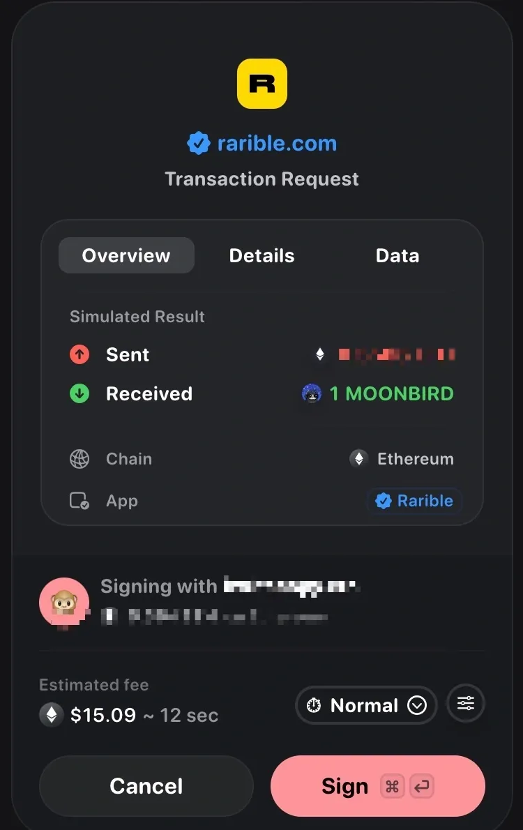
No more cryptic language, complex numbers or odd design. If you've never made a blockchain transaction, you probably still have a grasp of what's happening.
Are the makers of Rainbow just better at building product? Maybe. But nobody builds bad UX on purpose. Sometimes, a user base grows so much that it encompasses people the app was never built for.
This is certainly the case with MetaMask (the more confusing wallet). As The Generalist wrote in 2021:
“It was clear that the product was being built by developers for other developers. This makes a ton of sense, as most users of Ethereum were developers in the early days.”
But while focusing on developers might have made sense in 2014 — and has lasting benefits — the absence of a longer-term plan for consumer usage hampered MetaMask. Today, many of the complaints stem from the product's lack of intuitiveness. Many of those decisions seem to have been baked in from the start.
The developers MetaMask was built for would love the wealth of data because they know what it means and don't have to find it elsewhere.
When non-engineers flooded the market to trade JPGs, it created a need for more user-friendly wallets. That push was spearheaded by Rainbow but also includes Family, Phantom and other providers.
Those companies realized the web3 industry had changed and built for those new people. This underscores a timeless truth about how categories evolve:
UX dissatisfaction doesn't always come from existing users becoming dissatisfied. It can also come from new users who were never satisfied in the first place.
This happens in most fast-growing markets (Hi, AI support). New entrants have an opportunity to serve that new segment with a product made for them. The product strategy here relies more on design than on technological innovation.
But dynamic markets often harbor an even bigger opportunity: Upgrading UX by obviating an entire user-unfriendly category. That's what Privy is doing.
Privy: Crypto’s pragmatist
Crypto wallets are a bottleneck. You require them at every stop of using a web3 app: Sign-up, login, confirmation of in-app actions, transactions. In a non-blockchain app, you can reserve the annoying part for later in the user journey. Privy aims to fix this.
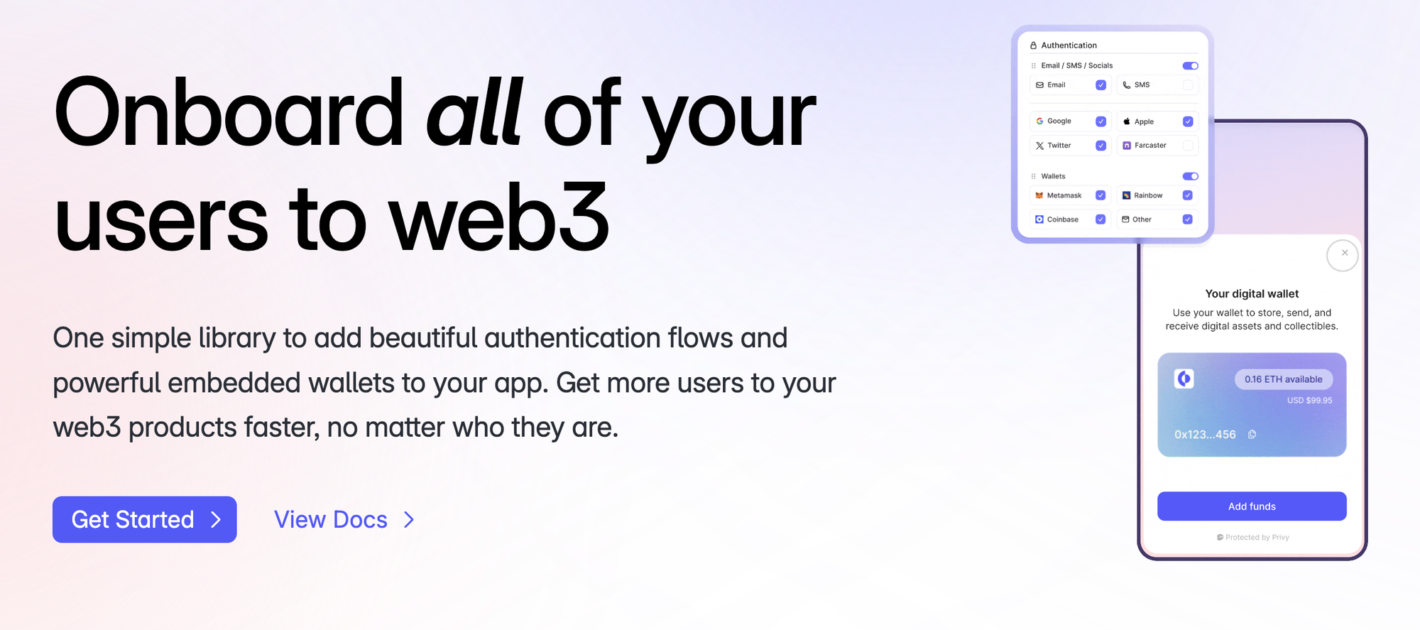
The startup enables web3 companies to improve their UX with ways to simplify web3 interactions without sacrificing the industry's treasured value of ownership. This isn't unlike CommandBar. We also provide other companies with the building blocks to improve their UX.
Auth for everyone
Jakob’s law states that “Users spend most of their time on other sites. This means that users prefer your site to work the same way as all the other sites they already know.”
Jakob's Law applies to sign-in flows. That’s why onboarding friction is so hard: Users can’t just sign up the way they know. Instead, they need to download a wallet, safeguard secret words... a lot of people stop right there.
Privy offers an “auth for everyone” product that enables web3 companies to offer sign-up and login via email, Apple, Google or other accounts. This simplifies onboarding to blockchain apps, solving one of the biggest stepping stones for new users.
Companies benefit from better activation rates while users get to use web3 experiences without the hassle of conventional crypto.
Embedded wallets
Besides making wallet management easier, account abstraction also enables wallets that exist inside an app, not as a separate app—known as "embedded wallets".
Privy offers this as a service, which is the next logical point from authentication. It creates fully functional crypto wallets that don't require downloading a separate piece of software.
That means product builders in web3 no longer have to contort the user experience to fit an external app required for all interactions.
(There are two additional features in Privy—user management and connectors— These also improve the UX of web3 products, but elude the scope of this article.)
Privy illustrates a third principle of UX advances: Sometimes, user experience in an industry improves because of a specialized vendor focused on improving interfaces. Few companies have the resources to build stellar UX. Vendors who do nothing but interfaces can build comparatively better interfaces because they do nothing else.
This is precisely what Privy is doing for web3 onboarding and user management—and what CommandBar does for different stages of the user journey. While we don’t target auth and user management, we also obsess about interfaces (we wrote a whole manifesto about it) so much that we’re offering them as a service.
That’s how we hope to make all interfaces better over the long run—blockchain or not. Before we conclude this article, let's address an objection many web3 enthusiasts might lob at me.
Doesn’t this make crypto more centralized?
The core idea of web3 is a decentralized internet with more privacy, true ownership and less institutional control. Simplifying wallets and authentication sacrifices some of this for better UX.
An embedded wallet can be lost if a service shuts down (unless the user has exported the private keys and imported them elsewhere). Single sign-in with Google/Apple compromises privacy compared to pure wallet logins.
A lot of crypto people will call this “not true web3” and would attack companies using Privy (or similar solutions) for not being decentralized enough.
Those people, want to have their cake and eat it too: They want a reality where billions prefer horrible-to-use products for abstract benefits like decentralization.
And that's where we arrive at our final UX principle for this article: Humans writ large prefer convenient, cheap and easy-to-use solutions. If you're going to make users jump through hoops, they need to be highly motivated by the rewards-
Web3 needs to realize there are tradeoffs between perfect adherence to their ideology and a great product experience that lets them onboard the rest of the world.
I don’t dare to say what those "killer apps" might be. The blockchain use case debate is a holy war I don’t want to fight in.