


You don't get a second chance for a first impression. And if you had to choose between showing up with mustard stains on your sweatpants, or a fresh, tailored suit, you'd choose the latte.
When you design your user's first experience with your product, you get to make the same choice. Will users see you again (aka retain) or will they escape your first date (churn)?
The humanness of FTUE
These are all first-time experiences, and they are some of the most powerful and memorable moments that we have as humans. They're incredibly impactful because of the importance that we as humans consciously and subconsciously put on our initial interactions and emotional reactions to an experience or situation.
How would it have felt if the car had broken down on the first drive, or if your cell phone stopped working on the first day and you had to schedule an appointment two weeks later with a customer service representative? You would have been disappointed and frustrated, and it would have taken the wind out of your sails. Even if you got it fixed, in the back of your mind your relationship to that car or that phone would’ve always been anchored on a negative initial reaction.
The nature of our first experience is paramount to how we will interact with everything in our lives, and software products are no different.
Yes, the emotional salience of your user's reaction to your new CRM software might be lower than that towards a first car or a first cell phone, I won’t argue there!
But, it is still critically important for you to understand this first-time user experience, or FTUE, concept so you can maximize it and improve your user activation and overall success.
Now, let's be real and say that your FTUE will not always be perfect — it might be a little like these first-time drivers — and that's OK!
Will show you how user assistance tactics can help you overcome these challenges and produce better user experiences, more insight and learning, and ultimately better FTUE and product.
Why settling for an “OK” FTUE burns you in the long run
Listen, not every piece of software is going to feel like driving your first car, but it can feel:
- Pleasantly surprising
- Amazingly fluid
- Truly impressive
I think it is fair to ask when the last time that you had a truly memorable first interaction with a piece of software was.
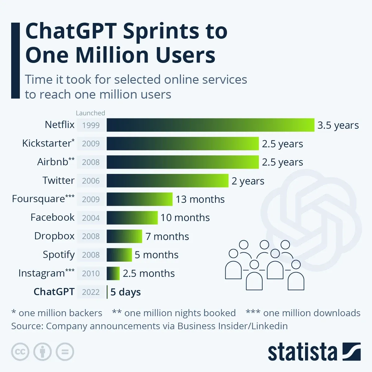
For me, it was in the winter of 2022 when I first experimented with ChatGPT and discovered generative AI. It felt truly remarkable and impressive, and the ease of use and overall power blew me away. Part of that came from how simple it is to get started with ChatGPT.
That's one of the reasons it became popular so quickly: it's easy to use and easy to explain to others. The numbers don’t lie!
There's no complicated onboarding, training modules, or prescriptive approach. You merely set up an account and are greeted with a chat box, a few examples, and a prompt to ask a question. From there, we became surprisingly good at leveraging the tool without any hand-holding.
There's a difference between an “OK” FTUE and a “WOW” FTUE.
The issue is that when you settle for an OK FTUE and do just enough to get folks onboarded and in the door, you miss out on a huge opportunity to create a shiningly positive FTUE that will anchor every other interaction they have with your software.
It buys you emotional capital and good faith and creates excited users who will see potential product issues or flaws in the future as workable situations, and not continuations of a poor initial experience.
So, how do you construct a great FTUE?
What are the components of your FTUE
The quality of the FTUE can greatly influence a user's overall perception and long-term engagement with the product.
A well-designed FTUE typically includes several key elements:
- Onboarding Process: This is where users are introduced to the main features and functionalities of the product. It's essential for helping them understand how to navigate and use the application effectively.
- Guided Tutorials: These can be used to walk new users through basic tasks, ensuring they get off to a smooth start.
- Helpful Tips and Hints: Providing contextual assistance at the right moments can greatly enhance the user experience, making the learning curve less steep.
- Easy Access to Support: Ensuring that users can easily find help if they get stuck is important for maintaining a positive experience.
Creating a great first time user experience that fits your business needs as well
Embarking on the journey of crafting a memorable First-Time User Experience (FTUE) is a bit like being a tour guide in a vast, exciting theme park. You want your new users to feel the thrill without getting lost between the roller coaster and the cotton candy stand. Here's how you can create that map to wonderland:
Understand and cater to the right user persona
Getting to know your user persona is like detective work – minus the trench coat and magnifying glass. Dive deep into who your users are, what puzzles them, and what they secretly wish for in your product. It's all about making your users feel like you've read their diaries – in a totally non-creepy way, of course. This foundational step ensures that your users feel seen, heard, and valued right from the start.
Streamline onboarding with the right design
Designing your onboarding flow should be as intuitive as finding the 'like' button on a cute puppy video. Every element in your user interface should be as welcoming and understandable as a friendly neighbor waving hello. Here, even a subtle nudge, like incorporating a tool like CommandBar, can be the gentle hand-holding that users appreciate – without making it feel like an overbearing dance partner at a salsa class. A user-friendly design isn’t just about good looks; it’s about guiding users to proficiency with the grace of a swan on a lake.
Leverage interactive tutorials and user assistance tactics
Think of interactive tutorials and in-app assistance as your product’s version of a friendly, approachable librarian – always there to help, but never too loud. These tools should engage users like a good book, inviting them into a story where they are the main characters discovering hidden treasures within your product. It’s about striking that perfect balance between being informative and delightfully engaging, turning what could be a mundane tutorial into an adventure of discovery. Remember, every 'aha!' moment for a user is like a plot twist in a mystery novel – unexpected, exciting, and deeply satisfying.
How Grammarly combines a quick product tour with a live demo to create a great first-time user experience
Family is fairly well known for its text editing software (thanks to what seems to be many millions of dollars of YouTube ads!) They have a great FTUE which relies on the light product tour and a live demo.
When you first enter Grammarly, you're greeted with a series of about five items in a product tour. These give you a high-level use case for each feature and guide you through the product quickly. Then, they quickly move you into an actual practical application of the tool, as they have you name your document and then begin to use the tool to correct the misspellings and grammar errors.
Grammarly demonstrates how user assistance tactics and smart initial product demos can create a great FTUE. Let your users do it, don’t tell them!
Why SEMRush misses the mark with their FTUE
One of the biggest causes of a poor FTUE is when you provide users with too many options, too many paths, and no clear direction. While I love SEMRush as an SEO tool, I don't love the way that new users are greeted. After you create your first project, you're prompted to take action.
The issue is that you've got about 10 modules that you could start with, but no sense of where to begin or what's most important. As an SEO, I know what's important, but a beginner might not and this can cause some friction or anxiety. Yes, there are small information tooltips that users could highlight, but I would recommend that they instead focus on an initial setup and then offer a more comprehensive product tour.
When your FTUE inevitably isn’t always perfect, try these user assistance tactics
Let’s get real: you can't design a great FTUE for every user. Inevitably, sometimes users will be most interested in something they can't easily find right away. But, that doesn't mean you abandon your pursuit of a great FTUE, it just means you need to offer your users more ways to interact with your product.
One of the best ways to do this is to let users put their hands up and say what they’re interested in using their own words. Your users don’t always fall into nice little buckets, with clear delineations between use cases. And, even if they do, two “salespeople” could mean very different things (an entry-level SDR vs. sales president.)
Or, they could be a new persona which you haven’t built anything for yet. With a prescriptive approach, you might lose out on this insight and
Sure, you could hire a bunch of support agents, but it could be more cost-effective and honestly likely still slower than using AI-powered tooling.
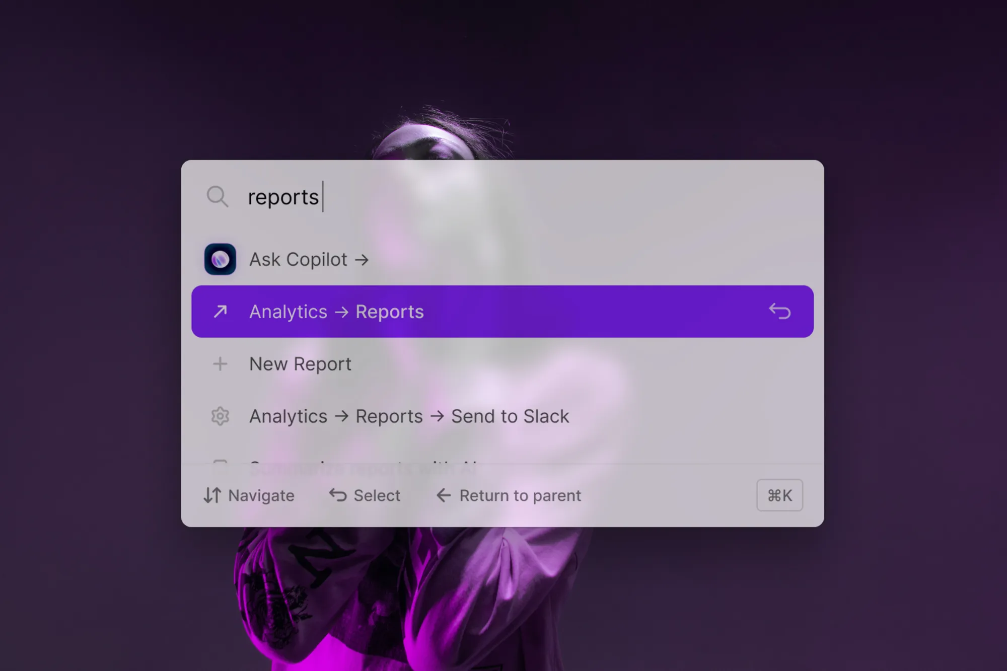
One of the main things we focus on at CommandBar is accurately capturing user intent. Understanding that intent can be super useful in improving your FTUE.
We have two interfaces — a search interface called Spotlight and a chat interface called Copilot — that lets users type what they’re trying to do and get directed to the right place or the right answer.
It's that simple, and that easy.
Here's the thing: when you use a solution like this, you've already won partially by giving your users a new way to engage with your software and ask questions. You fully win when your help documentation and product are structured so that they get exactly the answer they need for those queries.
But what's so cool is that you also learn when they don't get what they need, and this leads to better products which will improve future FTUEs.
We call these issues “dead ends,” and understanding, analyzing, and fixing them become so much easier when you can see your user's problems in natural language.
An added layer here is the ability to monitor and analyze these dead ends across different personas. You might find sales reps asking very different questions about your software than CEOs or customer success agents, and you can optimize different parts of your FTUE based on those responses.