


As long as there have been software applications, there have been in-application tutorials.
From the earliest versions of Microsoft Word to ChatGPT, applications need education!
These in-app tutorials are essential to effective user onboarding and activation. They show the user how things work and help get them up and running using the software.
But in-app tutorials aren’t one-size-fits-all, both in terms of the right format for them, how shorter or long they should be, and whether they should be prescriptive or self-guided.
Let's talk about in-app tutorials!
Why use in-app tutorials?
So why do you need in-app tutorials in the first place?
They are one of the best tools to increase feature discovery because they can specifically call out, demonstrate, and then prompt a user to observe and learn a new action.
The benefit is both in cost and time savings for businesses and users.
Your users can better understand the product and ultimately get more out of it.
You will likely see reduced support tickets, increased retention, and better activation.
It helps you improve product adoption and is a core part of a good user experience.
But it’s not just for user onboarding.
Even your veteran users might need a little help getting skilled up on your new features, and offering them a brief tutorial can be super helpful!
Different types of in-app tutorials
The type of in-app tutorial you serve a user can vary depending on the platform they are on, the feature you are demonstrating, or the sophistication of the content you are conveying.
Let’s run through some of the main types of in-app tutorials:
Product tours
One of the most popular forms of in-app tutorials is product tours. These tours help your customers navigate your product and learn its core functionality. They're particularly helpful for user onboarding, as it's the first time your users are entering your product and must be guided through your main user flows.
That said, they can also be helpful when you introduce a new feature.
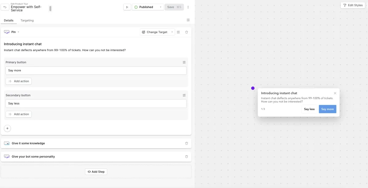
Product tours are generally ordered (1 → 2 → 3) and step-by-step and often are mandatory or highly suggested. That's because they're generally deployed only when necessary. Unlike a nudge or a tooltip which is optional or can be dismissed easily, you should build a product or when it's absolutely needed.
It's important to remember that your product tour needs to be properly segmented. Let's walk through an example of this:
Imagine you have a task management SaaS product.
You have three core user personas: product teams, dev teams, and marketing teams.
When you onboard a new user, you ask them four or five questions to identify what kind of persona or team they're on and gather some other demographic information.
Once they enter your product, these three personas will likely have a different happy path and desired set of functions.
You need to build three different product tours that guide them through the relevant features using language that makes sense, given their role.
Sure, maybe one product tour can cover everything, but it's better to segment as much as possible.
Contextual help
When we think about a great user experience, we usually think about a smooth, easy user flow. But even the best software sometimes needs to give users a little help, and that's why contextual help can be so powerful. This type of in-app tutorial is triggered by a specific problem, blocker, or context, and provides a very targeted solution for that specific issue. It's highly contextual, thus the name!
Tooltips
Tooltips are simple little highlights of specific feature capabilities. They showcase in 1-2 sentences (the briefer, the better) what a feature is for and how it can be used, or they define what something means.
Think of the little hover-over elements you see next to random acronyms or symbols—that’s a tooltip!
Here, Google Analytics 4 lets me know each of these symbols with a tiny tooltip that just describes what that button will do.
Nudges
We all hate pop-ups. They're annoying and bad for UX. But we’ve got a next-gen evolution of them that is user-friendly and more subtle. We call them nudges!
These modals are closer to a typical pop-up but smaller, with product feature highlights or small notifications in the corner.
You can customize them with any text and images you want and schedule them to appear on specific events. Plus, it's possible to segment the audience that views your messages.
They are best suited for broad and generic tutorials that are easy to communicate and applicable to everyone. Even with proper segmentation, you need to be confident that this information will be universally helpful since you're committing an intrusion on the UX when you launch one.
Checklists
A checklist can be a tutorial tool that is helpful for your users. That's because it's super simple: here’s what you need to do!
Sometimes, people like being told what to do, or at least like being guided toward what they need to do.
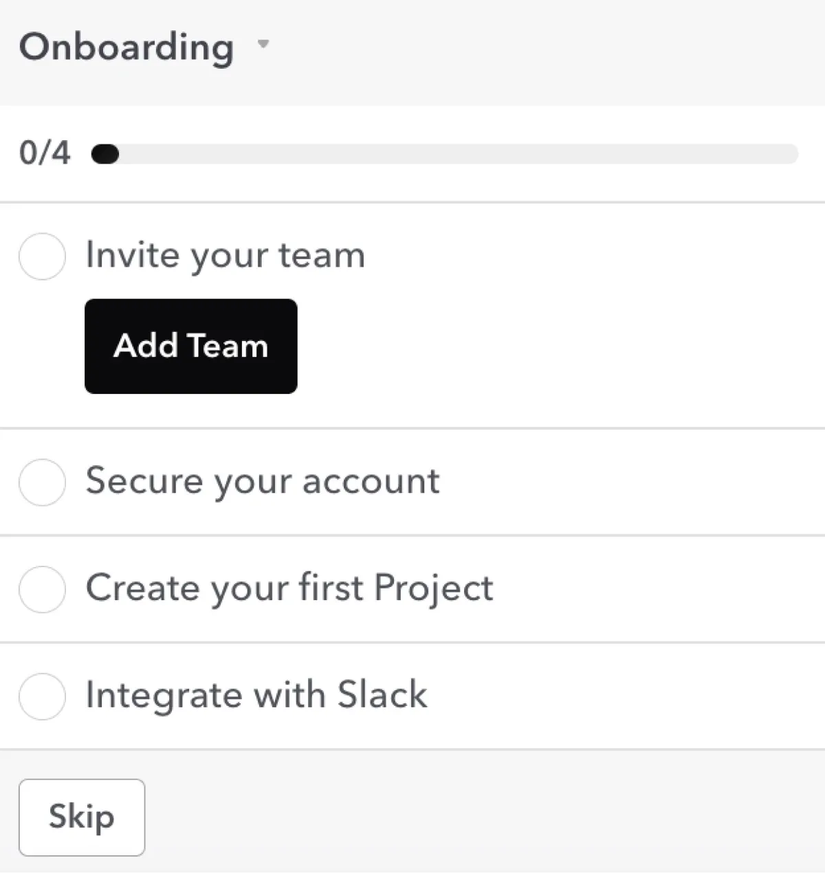
When you give it to them in clear steps and offer a visual representation of those steps and their progress, it can make even some intimidating new software more approachable.
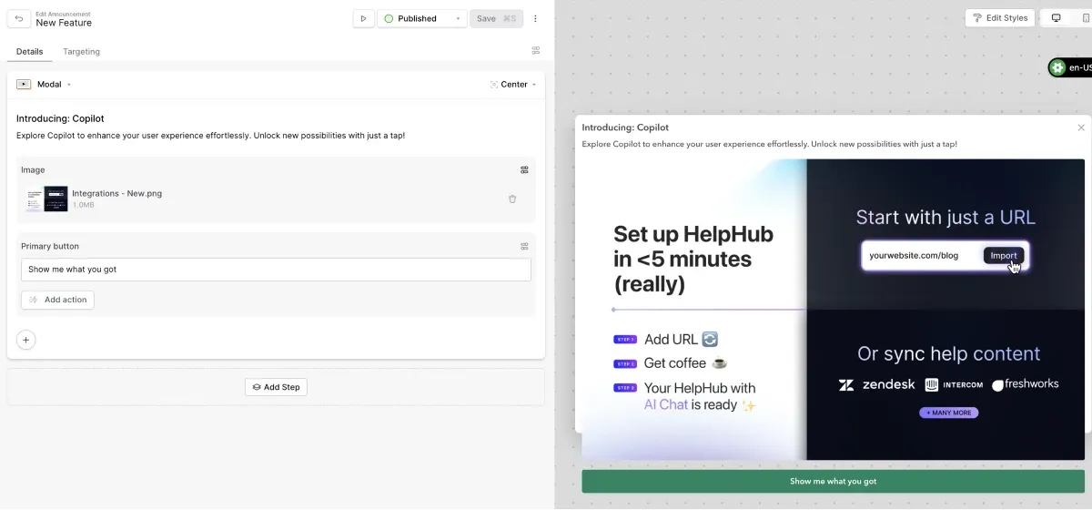
Copilot
We've got an AI Copilot that is = great at answering your user's questions and natural language. Usually, they can get that answer in text alone. But we've also enabled the launching of nudges, product tours, checklists, and other elements from Copilot since our customers have asked for them.
A classic use case is where a user asks about a specific feature functionality, and instead of telling them about it, Copilot can respond and suggest that they launch an easy product tour.
This is helpful for both the user and you because you not only solve their problem in the moment but also identify areas where you can more proactively offer a product tour upfront.
How to build great in-app tutorials
How do you go about building a great in-app tutorial? Well, it's not just about the tutorial itself.
It's about accurately understanding what your users need.
Then, it's about determining the best medium for the tutorial.
Finally, it’s about putting the right content out there and constantly optimizing it.
Let's break down these three steps!
Understanding user needs
You should only build tutorials when people actually need them. To understand whether they actually need them or not, you need to understand where your users are uneducated or blocked by different flows in your product.
It's easy to understand that folks will probably need a tutorial when they onboard into your product. That's why this is one of the most common places you see in-app product tutorials. There's a universal lack of knowledge of the product, and even the most straightforward ones likely need at least a little education.
But that's not the only use case. There are likely areas of your product where novice and veteran users need more help.
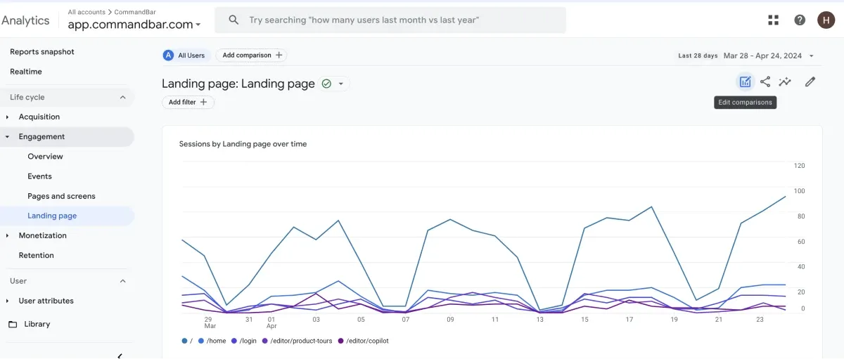
You need to look at both your qualitative and quantitative data to understand where these areas are and how to fix them.
On the qualitative side, you can look at your user feedback, customer effort scores, and support ticket concentration to identify potential areas of need.
When you combine that with your quantitative data, like product usage metrics, you can observe user fall off and frustration.
Finally, you can examine churn and failed onboarding flows to understand where people fall short and whether they share any demographics or backgrounds.
When you look at all of this data together, you can begin to put together a picture of your areas of need.
Choosing the best medium
Now that you've identified where you need to put in and out of the tutorial, you have to decide what should go.
This sounds like an easy question, doesn't it?
My user struggles to understand this new feature, so I'll explain this new feature. Easy!
But it's a little bit more difficult than that in reality because you only have a handful of moments to guide a user through a feature's functionality. Most users don't have the patience to sit through a 5-minute video, let alone a 30-minute webinar.
You must be very tactical about the medium you choose to communicate your in-app tutorial through. We've just outlined all the options you have to do this above; let's break down when you should apply them.
- Nudge: Quick, 1-2 lines, targeted trigger ideal (rage click, etc.) Use infrequently, only for big issues or common guidance.
- Tooltip: Contextual, hover over help
- Product tour: Sequential, ordered flow of 2+ steps for multi-level user flows.
- Checklist: When specific things need to be accomplished, but not necessarily in order
- Video: When something requires an expanded explanation (but still try to keep it short!)
Don’t ruin it!
Listen, in-app tutorials are great. They can help users and deflect tickets for you. But it's important not to go overboard with them. If you saturate the user experience with too much prescriptive instruction, you risk turning users off and creating dissatisfaction.
It's ironic, isn't it? In trying to educate your users, you actually deactivate them or discourage them from doing just that? This happens when there's information overload, and your screen is filled with multiple nudges, product horses, and checklists. Here at CommandBar, we call this “Air Traffic Control.”
You can think of this as ensuring that there's only one plane taking off from the runway at all times.
That means that you need to ensure that you've only got one in-app tutorial loading at a time and that it also does not conflict with any other pop-up nudges or on-screen elements.
One of the other big challenges with in-app tutorials is that you need to update them — they are not set and forget automatically
That's for two major reasons.
First, you should constantly look for feedback from your users and diagnose whether your tutorials are actually solving problems or not. Remember when we discussed identifying data and feedback to create those in-app tutorials? But once you create them, you must go back and see if you've improved those metrics. If you haven't, you haven't actually solved the problem. That means you need to go back to the drawing board or at least tweak the Enough tutorial
Another common situation is where your product changes and evolves. Especially in this age of constant shipping of new features and updates, you're going to have tutorials can quickly become outdated and unhelpful. You need to connect these tutorials with your product launches and make sure that you have a strategy in place to align the update of the product with the update of any in-app tutorials
Finally, remember to try for parity across your mobile and desktop experience. If you've got users on both platforms and different devices, you're in-app tutorials that need to work seamlessly, which requires potentially leveling up or leveling them down.
Let’s take a step back
Everything I've just told you is true. In-app tutorials can be helpful.
But I want to leave you with one thought:
In-app tutorials can do more harm than good if you don't make them optional.
Why?
Well, let's think about it. Let's say a user onboards into your application, and you do some segmentation based on their responses to the initial onboarding questions.
They said they were new to your platform, so when they got to their first interaction with the product (that ever-important moment), you presented them with a mandatory five-step product tour that outlined how to use your software.
What you didn't know is that this user has used your competitor's very similar software. They switched over for cost reasons.
That means they're very familiar with this kind of software, and even if they're new to your platform, they're not new to this workflow.
You create friction and frustration when you force them to go through this five-step product tour immediately instead of exploring the platform independently and identifying the differences between your platform and your competitors. This user doesn't want to learn how to do a very basic command; they want to go ahead and do a more advanced workflow.
This is just one example of many where even a well-intentioned in-app tutorial becomes a negative.
To beat this, make them short, informative, and optional.
It's important to think critically about your user base and the expected level of knowledge they have, which will inform your decision to use in-app tutorials or not.
A good heuristic to live by with in-app tutorials: less is more, and make it count.