


Tooltips can be infuriating. As you hover a button, it prevents you from clicking the button, only to tell you "Press save to save your work". Thanks for nothing, tooltip.
But other tooltips are helpful. Imagine the save button saved as a draft, but didn't publish your work. A tooltip informing you of this would improve your UX.
If you're building a product, you want your users to experience more of the latter and fewer of the former types of tooltips. So let's make that happen! In this article, you'll find out how to create tooltips that help users, not interrupt them.
Tooltips. A UI/UX feature that has existed since the dawn of the internet. Granted, technically, web-language CSS introduced native tooltips in 2011, but the fundamental user experience building block has existed since the start.
What even is a tooltip?
A tooltip relays important information via an in-app message or description that is shown to a user when they interact with a UI element. Their primary job is to help a user discover or learn something they might not have been able to work out themselves. It's common for a product to use multiple tooltips throughout the app, especially during user onboarding.
Typically, tooltips are small or nearly invisible, often triggered by a user hovering over an icon or a user clicking a “Learn More” link. They should contribute minimal user friction. When designed well, product tooltips help educate a user on how to use your product. This form of in-app messaging reduces net friction and creates a better user experience, but it is just one form of in-app guidance.
Why do tooltips exist?
Ideally, users would know how to use your product instantly and have no need for user onboarding. They would log in, maybe watch a video, or take a tour, and then jump into action operating at 100% efficiency. Unfortunately, that rarely happens. In fact, I’d go as far as saying that that never happens. Realistically, users learn about products gradually, which requires a more adaptive approach. It's why you need to create tooltips.
Tooltips are the simplest form of orchestrating gradual learning. Tooltips are informational nuggets available to the user when they’re contextually important. If a user signs up for Asana but never uses the calendar sub-product, then the calendar tooltips will never be surfaced to them (and, by extension, interrupt their work). Conversely, if a user signs up for a customer support ticketing application and eventually that user navigates to an analytics panel, the relevant tooltips will only surface then. This separates tooltips from mandatory product tours that force the user to explore a product’s entire surface, even when certain aspects of the product may not be immediately interesting.
Tooltip design is important. Well-placed, visible, but not overbearing tooltips can dramatically improve product and feature adoption. From a business perspective, that means less churn and more renewals. However, knowing what specific features deserve a tooltip is a non-trivial problem, especially when too many tooltips can make a product feel bulky.
In this article, I will explore how you can create tooltips that help users navigate your app with ease and make even a poor user interface understandable.
Tooltip Considerations
There are two opposing risks when implementing tooltips:
- You create tooltips, but users don’t realize they exist and, therefore, cannot tap into the benefit
- Users find tooltips annoying and distracting
In a nutshell, tooltips need to be obvious and discrete simultaneously, and it doesn’t get much more oxymoronic than that. Thankfully, various tooltip design form factors exist that, when used in the right context, can navigate this middle road effectively.
A Playbook for Implementing Tooltips
- Decide Which Features to Tooltip: Tooltips should be exclusively used for features that typically require explanation, not features that most users will understand.
- Choose the Right Form Factor: Tooltips could appear on hover, enter like notifications via nudges, or exist consistently on the page. Use the right form factor for the right features.
- Implement the Tooltip: Between custom code, open-source solutions, and off-the-shelf solutions, there are various ways to implement tooltips. The engineering or product team wanting to own tooltip implementation is the biggest factor in deciding on the right solution.
Don’t Tooltip Obvious Features
Most apps have some obvious features. An Invite Teammate button is going to enable you to add a teammate. A New Document button will generate a new document. These features don’t need tooltips, nor should they have one. Let obvious features be obvious. You’ll infantilize the user if you attempt to over-onboard them. Only walk users through the things that require guidance.
Features specific to your product or simply uncommon may deserve a tooltip. As does jargon—it’s a great idea to tell the user what MAU stands for the first time they interact with the analytics widget. Think of the most junior employee in a certain field, perhaps a college intern. If you worry they may not understand a certain feature, even if that feature was designed for pros, there’s a good chance it needs a tooltip. If it is a feature that needs to be explained in a frequently asked questions section, it too likely needs a product tooltip.
Deciding what does and doesn’t need a tooltip can be frustrating. Here, data is your friend. Use user onboarding tools like a tracking tool (check out PostHog or Amplitude) to dive into your product usage data and detect if users are entering a page but struggling to utilize features they otherwise would likely use. Identify where folks are dropping off in the feature adoption funnel or trigger rage clicks—these are the scenarios where you should create tooltips to guide users through the more tricky parts of the user journey.
Write Good, Short Copy
Irrespective of your chosen tooltip design, it is imperative to write brief, commanding copy within a tooltip. Tooltips should seek to explain a feature, not sell it to the user. You want to ensure your tooltips are easy to follow and capture a feature concisely and clearly. Avoid using jargon, writing long paragraphs, or applying difficult vocabulary. Avoid using self-declarative language, as that lengthens copy.
Good: Press this button to hide users to be restored or deleted later.
Bad: Hide users to be restored or deleted later.
The most effective tooltips are easy to parse in under a second.
Tooltip Form Factors
There are multiple types of tooltip design that vary dramatically. However, the first thing to understand about tooltips is that their UI design does not need to be standard. Obviously, don’t utilize radically different styles of tooltips, but some tooltips could appear on hover whilst others could exist like banners on the page.
There are a few common tropes when designing tooltips.
The hover tooltip
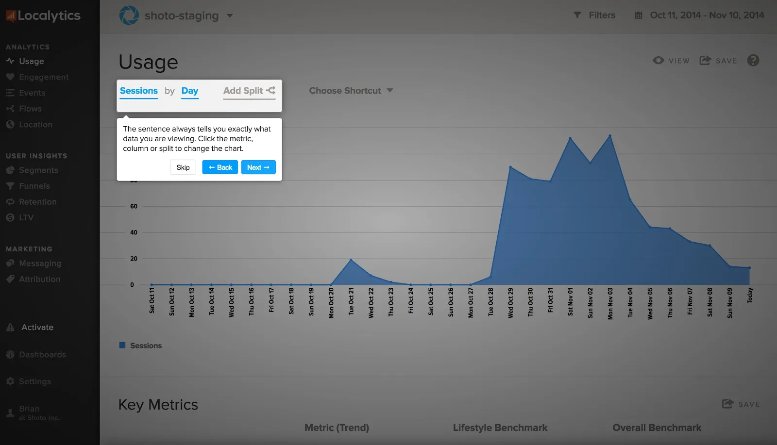
One utilizes a grayed-out ⓘ glyph or something similar with a text tooltip on hover. This is fantastic for features that have a small form factor to begin with or anything relatively minor. Hover-based tooltips have the added benefit of staying discrete in their dormant state, only expanding when the user wants to tap into them. However, make sure hover-based tooltips are not blocking any common mouse pathways; otherwise, users will accidentally trigger tooltip modals often.
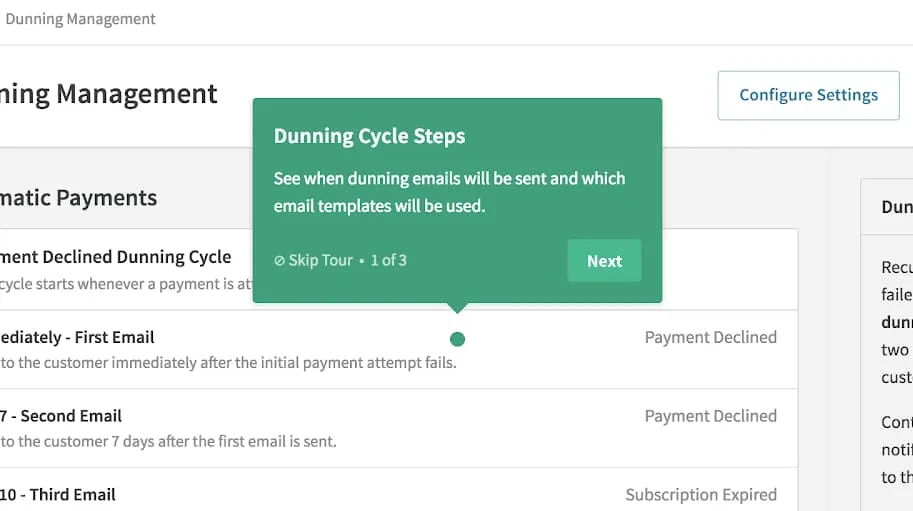
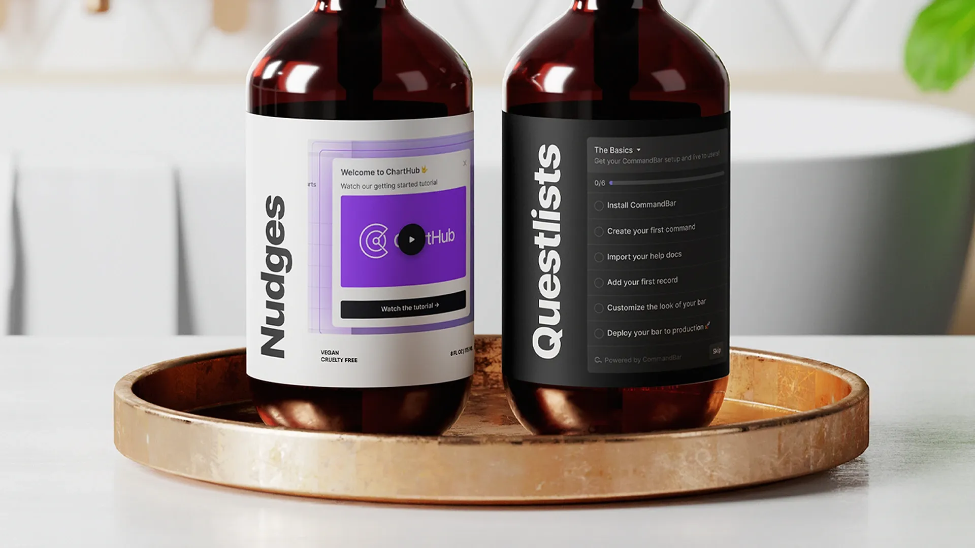
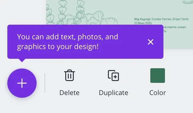
Sometimes, the popped-up box can be multi-part with a dot pagination submodule. This is excellent for complex features that need a step-by-step explanation, especially during user onboarding. You can utilize products like CommandBar to implement these multi-part modals; they should always have a visualizer to indicate the user’s progress through the tooltip.
Tooltips should be dismissible by clicking outside the tooltip, pressing an X icon, or a clearly marked dismiss CTA. Even near-perfectly designed products will experience users accidentally opening tooltips; at no point should closing that tooltip introduce additional friction.
The most discrete type of hover tooltip is the built-in CSS tooltip that shows text when a user hovers and pauses over an element. This tooltip example is incredibly easy to implement since it is natively supported in most browsers; however, it is so discrete that some users may miss the tooltip altogether, even when they need it. However, this is often the only available option when you need to provide a tooltip for a small icon-sized button, as separate tooltip modules would be relatively too bulky.
The ever-present tooltip
For often confusing or critical features with larger form factors, an ever-present banner may be the ideal option. These are common during user onboarding. Banner tooltips are large enough that users will not ignore them; however, they will occupy screen space, which can prove a design challenge. Additionally, these banners should be dismissible and, once dismissed, remain dismissed. That means your design must work with both visible/invisible states of the tooltip.
Banner tooltips often have a colored border on the left, top, or all around to alert the users that they are informational. Use the italicized i icon to flag that the modal is a tooltip.
The lightbox
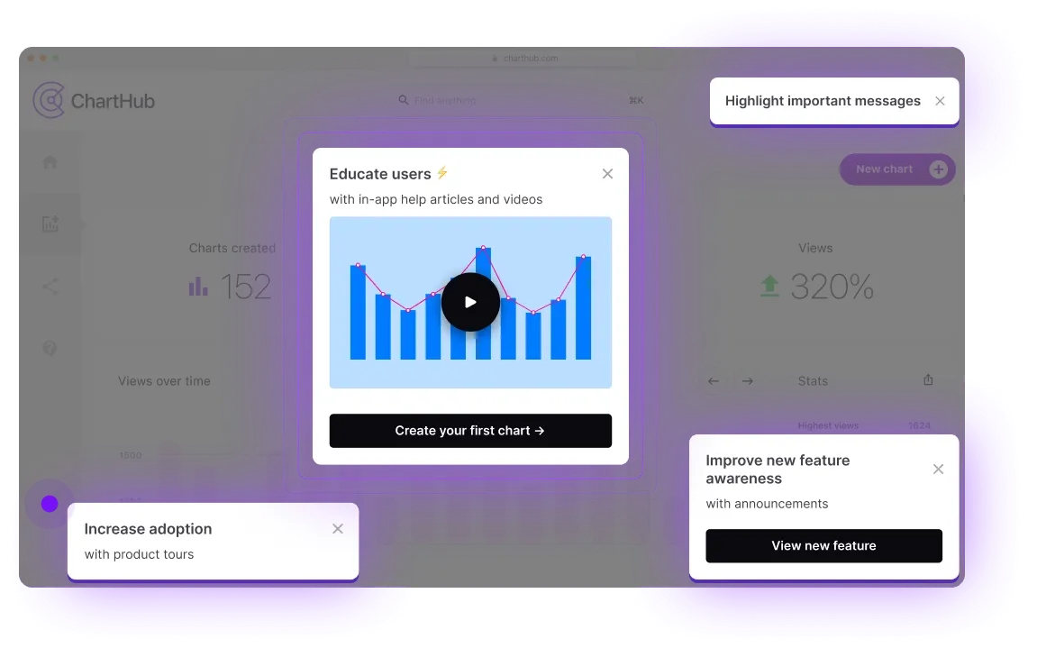
The ultimate visible tooltip is a lightbox tooltip. Lightbox tooltips cover the app with a dark, semi-transparent layer and superimpose a modal and the called-out feature on top, so it's the UI element folks will focus on. Lightbox tooltips strongly interrupt the user’s flow to call out a feature; because they are so hyper-visible, lightbox tooltips should exclusively be used to announce new features or to call out features the first time a user enters a certain page.
Lightbox tooltips are great ways to call out critical actions that every user will use. However, they shouldn’t be used for accessory features, especially when multiple features need to be highlighted on the same page. You’ll end up frustrating the user by doing that and can encourage them to ignore the help boxes altogether.
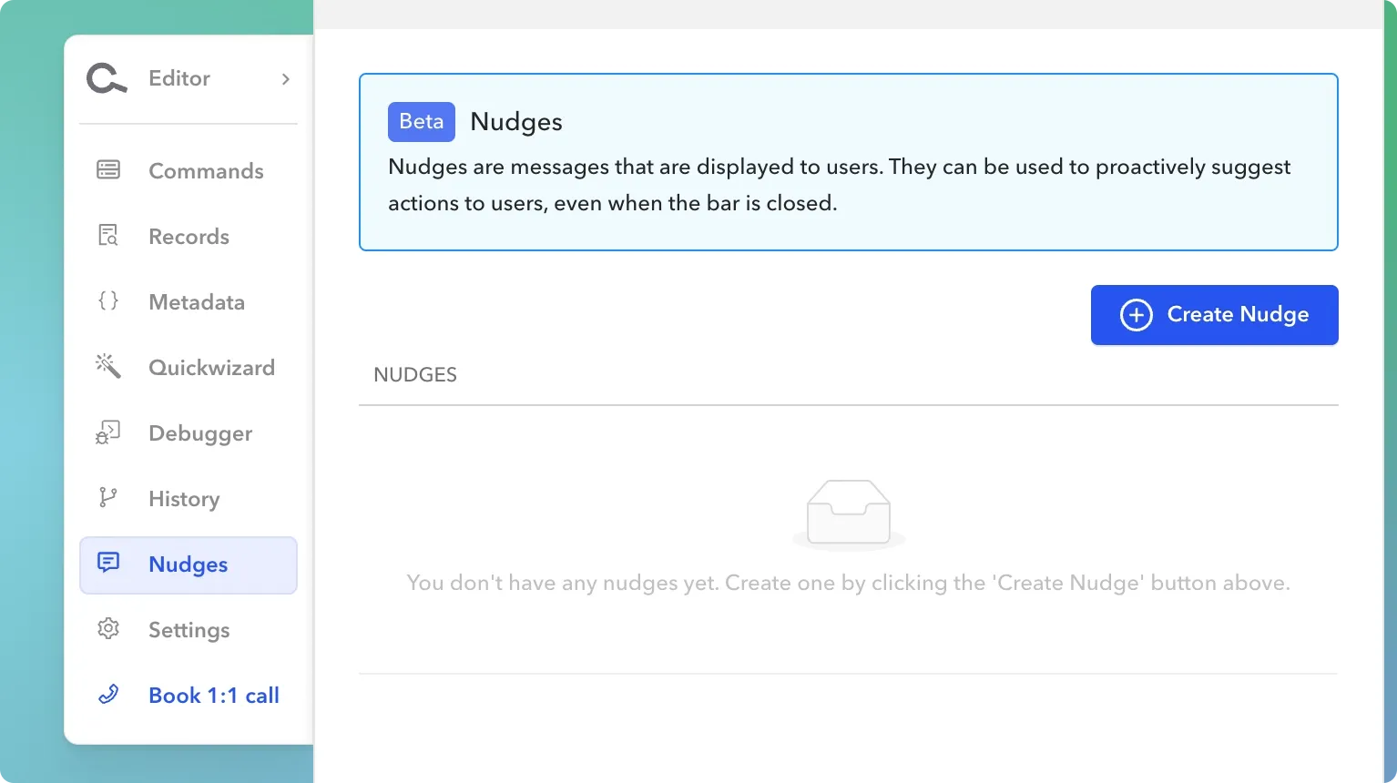
The nudge
A happy medium between hover tooltips and ever-present variations are nudges. A nudge is a dismissible notification-like modal that is positioned absolutely, sliding out typically from the left or right. Nudges can be activated programmatically when certain conditions are met, for example:
- The user is on a page or step for longer than that action typically takes
- The user is taking a commonly confusing path
- The user has actively requested help from a setting
- The user is doing something different than they’ve done before
A nudge is a more dynamic way to present help, often without interrupting the user’s flow unless the need for help is suspected. We added support for nudges within CommandBar as we saw overwhelming interest in a “light” method of push notifications in certain scenarios.
However, it’s important that nudges aren’t over-deployed; otherwise, a user may develop a habit of dismissing them even if they were helpful in a certain context.
How to Create Tooltips
Depending on the type of tooltips that you want to deploy, there are several strategies to implement them, some owned by product management roles while engineers own others.
Custom Code
Like most things, you can implement tooltips with custom code. The simplest tooltip is an HTML component that utilizes :hover and absolute positioning to appear on mouse over. However, this could get difficult when you want to embed multi-media in tooltips, make tooltips appear programmatically after a behavior, or have a tooltip automatically dismissed. If you want to deploy more structured tooltips, an open-source or off-the-shelf solution may be better.
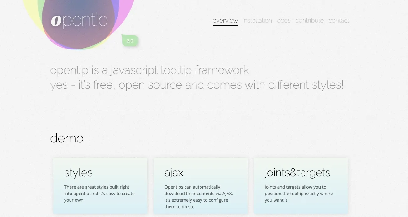
Open Source Framework
An open-source framework like Opentip will provide more structured support for implementing tooltips. Opentip makes positioning tooltips and grouping tooltips (to prevent multiple tooltips displayed simultaneously) easy. However, open-source frameworks tend to be very technical and not product team friendly. For many growing companies, an open-source framework puts too much product onboarding emphasis on engineers than product teams. For product teams that want to own the tooltips, an off-the-shelf solution is preferred.
Off-The-Shelf Solution
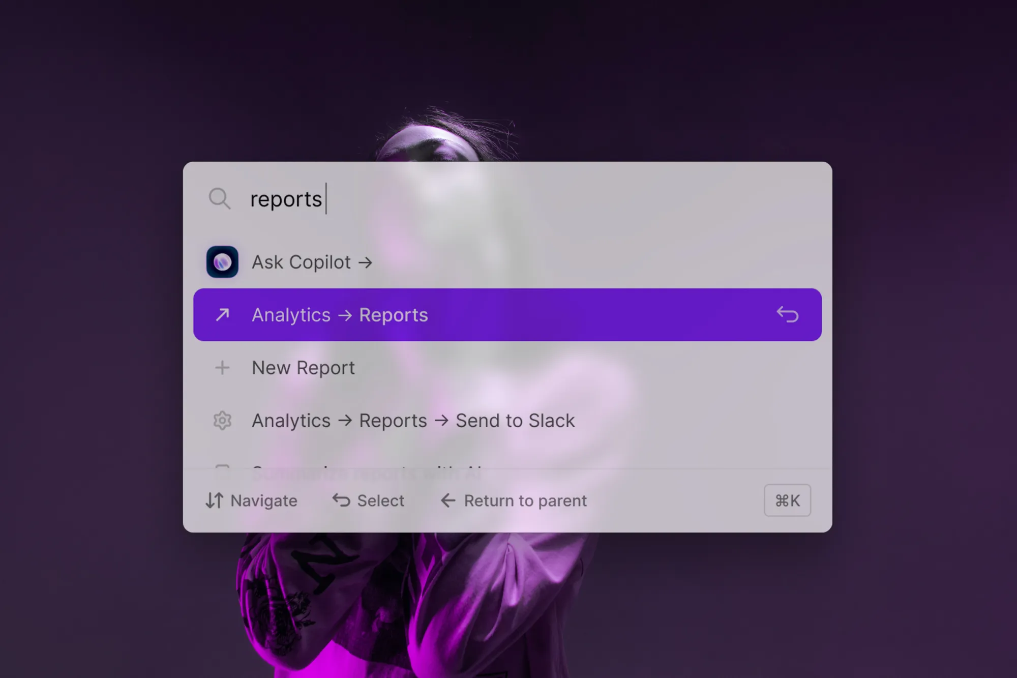
For product teams that care about scalable user onboarding strategies, including tooltip strategies, it is best to consider an off-the-shelf solution like CommandBar. CommandBar provides a search box designed to expose relevant features on user search, as well as the ability to create nudges to alert users of certain product features based on contextual actions. CommandBar believes that pull strategies (search boxes, tooltips that show on hover, etc) are superior to fostering healthy user interactions than push strategies (product tours, banners, etc.) While nudges are a push strategy, CommandBar combines them with a powerful search bar to deliver the best of both worlds.
Conclusion
Tooltips are a powerful way to help users understand your product. Without tooltips, product onboarding can go sideways, with users confused about a certain view or widget. Tooltips effectively communicate how a product works to a user at a tapered pace and, when implemented correctly, can generate incredible feature adoption and boost your product adoption metrics.