


Think about all the time and effort your engineering team has put into building a beautiful product that delights your users.
Now think about all the money and creativity your marketing team has spent trying to get people to come and use it.
What if I told you that the success of all that effort hinges on something you’ve probably spent a fraction of the time on?
This is user onboarding, and it is not a game.
User onboarding, the most important part of user journey which most apps ignore. Apps with the best onboarding experience only succeed.#UserExperior #useronboarding #productmanagers #productmanagement #productdesign #MobileApps https://t.co/1l01AqcWf7
— vimleshg (@vimleshgue) June 21, 2019
Users need hand-holding, they need guiding, and they need good user onboarding. In this article, we’re going to focus on user onboarding in B2B SaaS and cover all the key things you need to create a solid user onboarding experience - providing the resources you need to deep-dive and learn more.
In this CommandBar article, we’ll cover:
- What is user onboarding? (A rapid breakdown)
- New user onboarding best practices and theory made simple
- How to onboard new users: 4 key user onboarding solutions
- User onboarding flow examples that maximize conversions and value
- The 6 types of user onboarding software - which one are right for you?
- Hit the big user onboarding use cases with CommandBar (6 video guides)
What is user onboarding? (A rapid breakdown)
User onboarding, in the context of B2B SaaS products, is the process of guiding new customers through the initial stages of using your software, ensuring they can effectively and efficiently navigate its features and, ultimately, stick around for the long haul. Think of it as the red carpet treatment, welcoming users into the world of your product and helping them find their footing.
The onboarding process typically kicks off right after a user signs up for your service. This is where the magic happens: tutorials, walkthroughs, and tooltips come together to create an interactive and user-friendly experience, showing your clients how to get the most out of your software.
The goal? To help users see the value in your product as quickly as possible, which translates to happy customers and a boost in retention rates.
Now, you might be wondering what makes user onboarding so crucial for B2B SaaS products. Unlike B2C products, B2B software can be extra complex and require more learning effort. So, ensuring a smooth onboarding process isn't just a nice-to-have – it's absolutely essential. Still not convinced? Take a look at these user onboarding stats:
Did you know?...
- 89% of potential customers will consider switching to other solutions if the onboarding process for a tool they're currently using is complicated.
- 65% of customers said they would consider giving a software tool with feature deficiencies a “second chance” if it provided a good onboarding experience.
- 54% of users said they appreciate companies using videos as part of their onboarding process.
- 78% of users expected to learn how a new software tool works in a week or less. (34% said a day or less!)
- 95% (yes, 95%!) of respondents said they value the ability to replay training and walkthroughs in the future.
For more user onboarding stats, check out this post: 11 Non-obvious user onboarding stats in 2023
What is product adoption, and how does it relate to user onboarding?
OK, so that's user onboarding, but how does that differ to product adoption? Well...
Product adoption refers to the process of converting new users into regulars who derive substantial value from a product over a long period.
For existing customers, achieving improved product adoption leads to benefits such as increased customer lifetime value, improved upsell and retention rates thanks to improved customer loyalty, and free marketing from product evangelists.
Professionals tend to use dozens of tools in their jobs, many of which they struggle to learn and adopt effectively. A product might try to overcome this by opening its doors and making it super easy for a user to get started for free and derive a whole bunch of value without paying. This might sometimes be called the Land And Expand approach, where a free product tier is super easy to adopt and provides a product-led growth angle through which you can upsell users into customers later.
If you’re giving your product away to gain adoption, it can be hard to get people to pay for it later, and you’re not making any money from your growing free tier userbase, so you’re eating into either your runway or your margins. It’s an adoption-over-sales approach that will work for some businesses but leave others with a beautiful product no one is paying for.
Alternatively, you don’t sacrifice the unit economics at the core of your business and instead get really good at nudging users along defined journeys where you reveal value to them and end with them happy to both adopt and pay. This is product adoption done sustainably for most businesses - but you will likely need some software to help you out.
How products approach the adoption problem can shape the entire nature of their business. The challenges they’re trying to overcome are the two orders of UX friction that can hinder product adoption: usage friction and perceived friction. Usage friction refers to the difficulty of using a product, while perceived friction concerns a user's implicit fear, uncertainty, and doubt surrounding the onboarding process.
If your product is good, but your user onboarding is not, then you probably aren’t solving the adoption problem. Equally, if your user onboarding is great, but your product disappoints, then you’ve got bigger problems.
You can read more in-depth materials about product adoption here:
- What Is Product Adoption and How to Improve or Accelerate It
- From onboarding to grave: a product adoption process that makes users stick around
The important point here is that user onboarding doesn’t just stop once a user knows where most of the buttons are. Learning needs to be continuous, and a user must realize enough value from your product that they want to keep using it - not just know how.
Building user habits are tough - but it’s much easier if you’ve led the user to their Aha! Moment.
Aha Moments!: the onboarding holy grail you’ll happily lose your hat for
An "aha" moment is when a user has a mini-epiphany and internalizes your product's core value proposition.
Sean Ellis captures this succinctly in his book Hacking Growth: "Aha is the moment that the utility of the product really clicks for the users; when the users really get the core value — what the product is for, why they need it, and what benefit they derive from using it."
The "aha" moment is the holy grail of successful onboarding, where your product's core value proposition finally clicks for users. It's the instant they realize how your software can help them achieve their goals, and they're ready to invest in it. However, many products confuse this epiphany with other less-critical accomplishments along the user journey.
To identify genuine "aha" moments, remember that simply understanding how to use your product or being told about its value doesn't cut it. Users need to experience the product's value first-hand. And just because they've completed your onboarding process doesn't guarantee an "aha" moment either. Retention rates and upselling data can give you indicators of whether users have really had their “aha” moment, but it’s not something that can be easily assessed.
Using Twitter as a user onboarding example, their "aha" moment often occurs when users follow 30 accounts. At this point, users engage with their feed and realize the app's value, driving user retention. This differs from merely creating an account or following a few accounts, which are essential first steps but not pivotal moments in their user journey.
The earlier a user experiences the “aha” moment, the more effective user onboarding is, and they'll be more likely they to achieve user success and evangelize your product. If you’ve not got good day-30 retention (D30) numbers, then that’s a pretty strong indicator you need to bring your “aha” moment in earlier.
A good user onboarding experience will deliver the “aha” moment or set the user up to achieve it themselves.
If you want to read more about the “aha” moment, then check out this post: The “aha” moment — how to identify and use this squishy concept
New user onboarding best practices and theory made simple
Now you know what you’re trying to achieve, it’s good to learn from user onboarding examples to know how other people typically do it.
Some best practices are not going to be right for your product. Every bit of software is different, and some are more different than others. If you’re a startup doing something no one has ever done before, then congratulations - your startup is one big experiment, and you’ll need to work out what works for you.
However, if your product contains some common screens and functionality, like “my product mostly revolves around a dashboard with some action items,” then you’re in luck; many have walked that path before you and learned a great deal.
If you want a whole article dedicated to onboarding best practices, check out: SaaS Onboarding Best Practices in 2024
But here’s an overview of the main best practices we thought were important enough to pull out:
8 user onboarding best practices for rapid value discovery
- Use customer success (humans) when possible: When possible, have a person onboard your user. While impractical for some companies, human-driven onboarding will collect fantastic insights and build the best relationships with customers.
- Replace complex UI patterns with familiar UI patterns: Don’t reinvent the wheel. Using common UI patterns will help users grasp your product faster than spending time deciphering your UI.
- Keep users in-app: Changing tabs and domains leads to more distractions and poorer usage. Keep your onboarding efforts within your product.
- Use product tours (with consent): Product tours have a dirty name because they are often over-used and fired without user consent. Ask a user if they want a product tour, and if so, provide them with one.
- Use search-based onboarding: Encourage your users to search for their problems and surface the results of that search within your product, not externally.
- Use tooltips on non-obvious features: Utilize tooltips to explain features that aren’t already obvious. When using tooltips, keep them discrete to avoid them busying your interface.
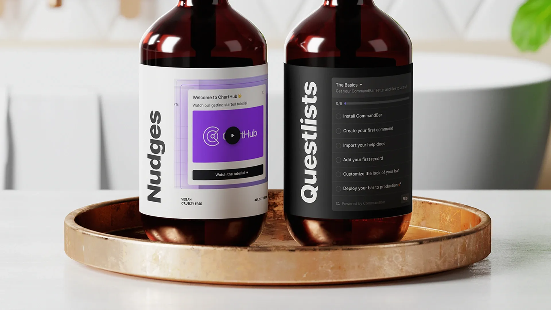
- Use context-driven nudges: Nudges, notification-like widgets, are shown to users when they are contextually important. Nudges are a great push strategy that isn’t invasive.
- Track user onboarding flows: You cannot build a strong user onboarding strategy if you don’t know what feature education you are trying to optimize for. Good user analytics will help inform your user onboarding strategy.
I’d add to this that user onboarding never stops - particularly if you’re regularly shipping new features. So when you’re thinking about onboarding, you should think about new user onboarding, yes, but you should also think about how someone continues to get value out of your tool moving forward.
This ties into the product adoption discussion earlier and so is a good segue to a little theory.
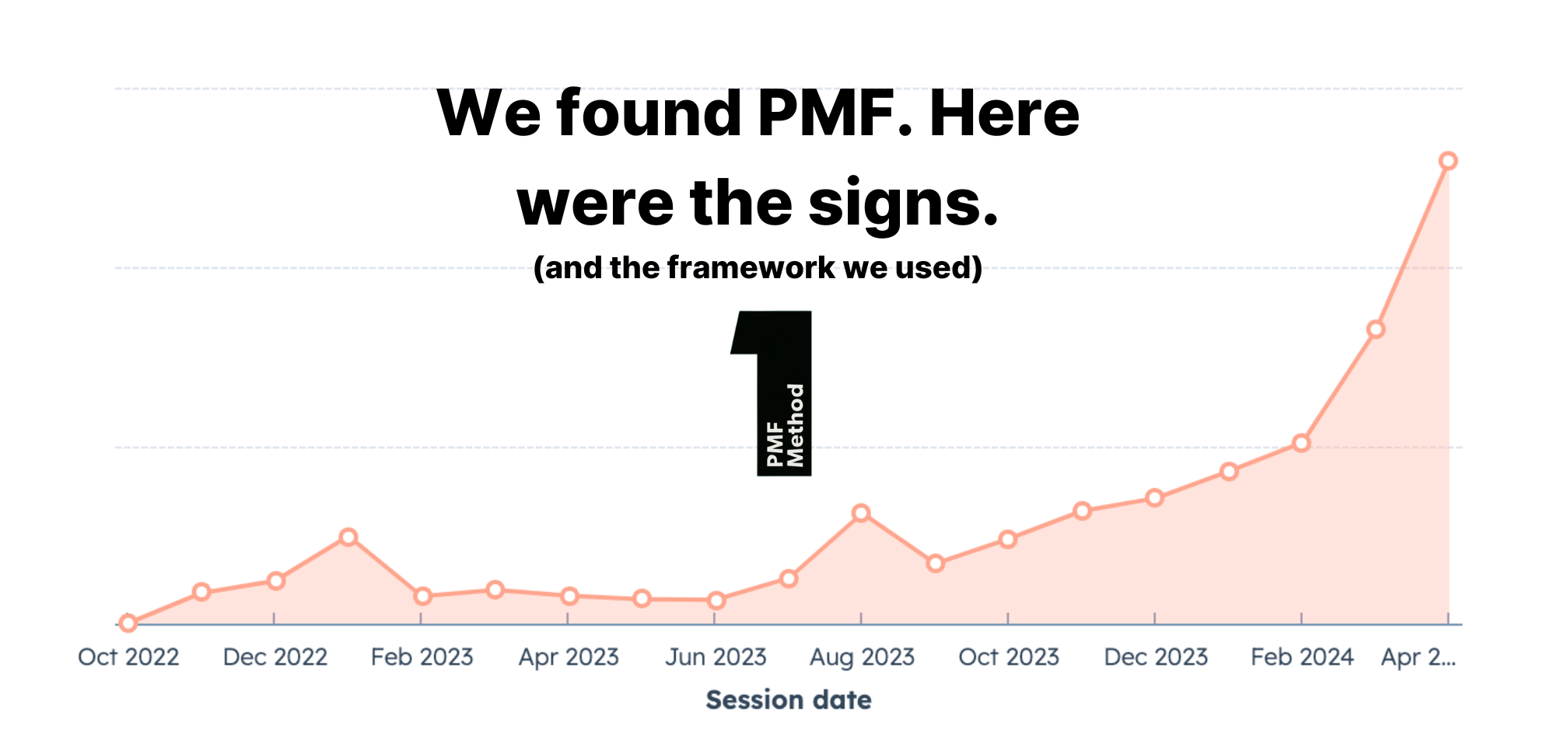
How does the product adoption curve fit into onboarding best practices?
Okay, check out this graph:

What it shows is the chronology of people coming to use your app. The yellow line shows how those successive groups of people translate to overall market adoption.
The first people into your product are the tech-savvy innovators and somewhere in the midsection are people who have been told to use your product at work in a midsize tech company. In the Laggards’ section is Brian, who works on reception at your local library using a computer that until recently ran on Windows 98.
This is how new software grows (and dies). But what does it tell us about user onboarding?
Well, your first ten customers through the door will probably need very little onboarding attention, even though this is the worst your user onboarding will ever be. Why? Because they are early adopters. That’s who they are. It’s in their blood. They’re probably a member of a private subreddit where they discuss their favorite Product Hunt finds from that week. These people figure stuff out.
As your product grows, though, your audience changes, and you start to get people who only use your product because their boss told them to and other people who consider themselves “not very good at computers.” It took them 20 years to get comfortable with Excel - how long will it take them to like your product?
Your changing userbase necessitates evolving user onboarding flows. Some best practices might not be needed to win today, but you’ll lose without them tomorrow.
If you want to go deeper on the product adoption curve, read this: How The Product Adoption Curve Explains TikTok's Growth and Can Boost Yours
A very brief guide to some key user onboarding concepts
What is user intent in user onboarding?
User intent is the users' goal with your product. In a SaaS app, there are two types: search intent (specific job-to-be-done) and browse intent (exploring possibilities). Identifying user intent helps improve activation, conversion rates, and feature adoption.
To determine user intent, use methods such as allowing search, asking users what they're trying to do, prompting them, watching user sessions, sending emails, and analyzing where they came from. This knowledge helps address low activation rates, high churn, and stalled signups.
When does search intent apply to user onboarding?
With a search bar like CommandBar, search logs reveal user intent, helping uncover missing features and user confusion.
Addressing terminology confusion and aligning it with user expectations is crucial. By analyzing deadend data, developers can identify and prioritize missing features and improve the product based on user needs.
Deadends aren't a substitute for user interviews but can guide and focus research efforts for more effective product development.
How does friction impact user onboarding?
UX friction hinders users from achieving desired outcomes, affecting retention and revenue. Friction types include interaction friction (UI issues), cognitive friction (mental effort), and emotional friction (negative emotions). To reduce friction, consider the following guidelines:
- Break complexity into manageable parts.
- Simplify your product to minimize user thinking.
- Acknowledge user interactions.
- Guide users through multi-step flows.
- Optimize performance for a snappy experience.
- Use established UI patterns.
- Provide clear labels, icons, and tooltips.
- Maintain consistency across your app.
- Choose default settings carefully.
- Use informative error messages.
By addressing these aspects, you can improve your product, reduce friction, and increase user retention.
How to onboard new users: 4 key user onboarding solutions
If you’re going to do some accounting, you’re not going to start labeling a Kanban board.
Different tasks need different solutions. Not the specific brand of software but the method or approach you’ll take to achieve your outcome.
In user onboarding, there are a near-infinite number of approaches as every company is different and will have something unique about what they do. That said, there are four main choices…
4 common user onboarding solutions:
What are product tooltips, and how do you onboard users with them?
This one is straightforward. Tooltips are a simple UI/UX feature that relays essential information when users interact with a UI element.
They help users discover or learn information and contribute to a better user experience. Users ideally should learn about a product instantly, but realistically, they learn gradually. Tooltips offer contextual learning, appearing when they're relevant to the user.
Well-placed tooltips improve product adoption, but determining which features need tooltips can be challenging. Use data to identify features causing user drop-offs or frustration and consider tooltips for uncommon or specific features.
Tooltips should be brief, clear, and easy to understand. They can have various designs, like hover tooltips, ever-present banners, lightboxes, or nudges. Implementing tooltips can be done through custom code or off-the-shelf solutions like CommandBar. Off-the-shelf solutions are preferred for product teams that want to iterate quickly and deploy a wide range of scalable user onboarding strategies.
You can learn more about product tooltips in depth here: Product Tooltips — Best Practices to Create and Use Them
Will your in-app messaging delight or infuriate during user onboarding?
While tooltips are a nice, simple way to pop an instruction up in front of a user, in-app messaging is a different ballgame.
In-app messaging as a term can be confusing as it can be read a few different ways; like “what messaging are we using in-app for this feature?” but here, we’re focusing on using specific messages using different form factors to guide a user through onboarding. But not everyone likes in-app messages.
On some products, they can be too intrusive, filling the screen and being hard to minimize or dismiss. Where in-app messaging has a lot more joy is in the onboarding process. This is a point in the user’s exploration where they are amenable to suggestions and guidance. With the advent of AI, in-app messaging now has the potential to provide levels of customizable assistance comparable to a human agent but with close to zero delay.
A few basic tips for achieving a useful in-app messaging experience are:
- Customize the messaging to what you know about the user - language, region, type of customer.
- Set up triggers to send messages at different milestones in their user journey, signposting user success.
- If you’re going to incorporate AI, try to make your experience fully formed, so it's genuinely helpful, rather than an obvious case deflection mechanism.
On a personal level, I think during user onboarding, you should make it very easy for new users to reach out to your customer success team and build those contacts and relationships. So any in-app messaging setup using AI should consider whether it’s creating too many obstacles in the name of efficiency.
For more on in-app messaging, check this article: Using In-App Messaging to Improve User Onboarding
Checklists are phenomenal but will new users follow them?
I should have titled this section ‘In Praise of Checklists’ because I am heavily biased toward them.
I like checklists because you know what you need to do now and next, and you can work through the steps individually without expending brain energy on anything other than what you’re focusing on.
This makes checklists super useful for user onboarding use cases.
In the article, How to create non-annoying user onboarding checklists, James Evans, CommandBar co-founder and CEO, outlines a few tips for using checklists effectively and some mistakes to avoid.
Avoid using the same list for every user persona, making it long and daunting, or focusing on growth instead of successful onboarding. Provide a simple and tailored checklist and give it one job: user onboarding. The more you overcomplicate it, the higher the drop-offs will be.
Include diverse activities, use enticing CTAs, and let users decide when to start the checklist. Customizing checklists based on user personas and breaking down complex tasks improves user experience, and providing folks with control improves the user onboarding process.
As a checklist aficionado and moderator of the r/ProcessManagement subreddit, one of my favorite justifications for using checklists in one-time or infrequently-run scenarios like new user onboarding (or repeat user onboarding) is the idea of checklists as memory externalization tools.
You can find academic papers looking at this thesis as it applies to areas like healthcare, but the summary of it is that remembering sequences of actions where the sequence is complicated requires a lot of brain power. You’re combining your short-term memory with your cognitive ability to perform a task. This heavy load on the brain results in errors. You’re asking it to do too many things at once.
The solution is to externalize some of these functions. You could externalize the cognitive load of doing math by using a calculator, or you could externalize the short-term memory functions by using a checklist. It’s a tool that helps you segment how you deploy the processing power of your brain.
I know what you’re thinking: “Adam, why have you gone on a tangent about a pet interest? Get back on message. Move on to the next topic.”
No.
I won’t move on because your ability to balance the brainpower required for different functions changes over time. For an activity you do every day, your neural pathways are pretty established, and it’s super efficient to process along these routes.
But for things that are new, your brain is hyper-inefficient. It will immediately forget things, get confused, and even make simple errors. And your users are brand new. They don’t know what they’re doing. They’re like newborn deer. They can barely stand.
This is why a user onboarding checklist is my personal favorite onboarding tool. You can see what you have to do, what you’ve already done, and what you are yet to do - and you don’t have to try to remember any of it. You’re simply guided along so your brainpower can focus on learning the challenges in front of it.
If you love checklists as much as I do and want to listen to a knowledgeable person talk about them at length, I recommend the HBR Ideacast podcast with Dr. Atul Gawande.
What is in-app guidance, and how is it different from the other solutions?
In-app guidance isn’t different. That’s how. When we talk about in-app guidance, what we’re really talking about is a catch-all phrase for all the above and more.
Here are a few options of different techniques which could fall under the in-app guidance umbrella:
- Tooltips: In-app messages or descriptions convey essential information when users engage with a UI component, such as hovering over an element.
- Product Tours: These in-app guides gradually familiarize users with a product's features during their initial login.
- Onboarding Checklists: A list of crucial user onboarding tasks, often with a progress bar, that help users learn and become proficient in a new feature or product by presenting necessary actions.
- Interactive Walkthroughs: After tooltips or product tours, users apply their knowledge through hands-on, engaging interactive walkthroughs, which enhance the learning experience.
- Hotspots: Using colored dots or glowing elements, hotspots draw attention to specific functionalities, especially when users haven't utilized a feature or new features become accessible.
- In-App Help: Help widgets grant access to a product's help documentation from within the product, ensuring seamless guidance without interrupting the user experience.
“When done well, in-app guidance can have a number of benefits for you and your business. Perhaps most importantly, for both you and the user, is reduced time-to-value. We know that when a user experiences an aha moment, they’re at their most motivated - they’ve just realized how your product has helped them to solve their problem. You want to capitalize on this, and with in-app guidance, you can help users to reach that aha moment faster, so users realize your product's full potential earlier in their journey, making them more likely to stick around.”
To read our full breakdown on in-app guidance, check out: In-app Guidance and How It Can Help Customer Adoption
User onboarding flow examples that maximize conversions and value
We know the theory, but what is theory without practice? It’s time for user onboarding praxis: onboarding flow examples from the frontlines.
If you want to read through one big list of onboarding examples, then check out: 10 Examples of Actually Useful User Onboarding Experiences, by Lucas Howard. Filled with good screenshots and walkthroughs.
Here, we’re going to focus on three main examples. You can click through the links below to read about each example in deep detail thanks to research done by our man Mathew Pregasen, but we’re going to cover the high-level overview of his discoveries.
User onboarding example flows:
Onboarding example flow: PostHog—a blissful sign-up experience

PostHog’s user onboarding process is easy to follow with minimal emotional or cognitive friction. Exploring the product is easy. Their tooltips helped me understand what the various components of the product do. The hand-holding installation experience made setting-up PostHog’s code snippet easy.
While there is some room for improvement, the PostHog onboarding experience streamlines, not hinders, access to the PostHog product and key features.
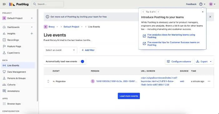
Highlights
- Being able to invite a team without leaving the page
- Offering a personalized choice of what onboarding experience is best
- Detailing tooltips that were fundamentally optional
Lowlights
- A brief fear that the user would need to enter a credit card
- A lengthy sign-up form before onboarding
- An inability to navigate the site via the search bar
Check out the full breakdown here: Unboxing PostHog—a blissful sign-up experience
Onboarding example flow: Algolia—a structured flow for a complex product

Algolia’s user onboarding process is detailed with occasional cognitive friction but a streamlined, step-by-step flow. I can get into the product quickly and their tooltips helped me understand what the various components of the product do.
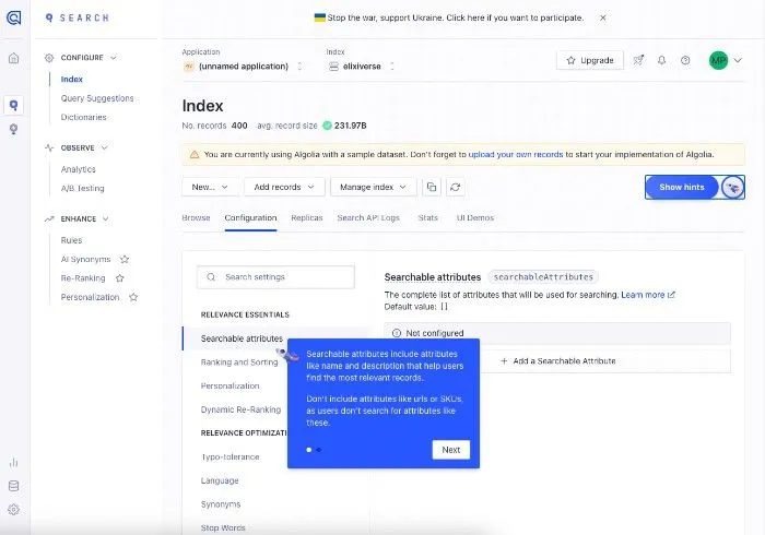
Highlights
- Making it easy to verify my email with minimal friction.
- The ability to personalize my onboarding experience to suit my use case for Algolia.
- Easy access to documentation, including brief, simple videos.
Lowlights
- A better video UI that doesn’t detour me from the app. In-app video is preferred.
- Some confusion regarding Algolia’s terminology and jargon.
Check out the full breakdown here: Unboxing Algolia—a structured flow for a complex product
Onboarding example flow: Vercel—a sometimes too-simple onboarding
Vercel is a fantastic product that could be bolstered by a better user onboarding process. While the onboarding process isn’t terrible, it leads to some emotional and cognitive friction that can frustrate new users who just want to check out the product. However, with a few tweaks, such as progress bars and a re-organized sign-up flow, Vercel can deliver a cleaner in-app onboarding experience.
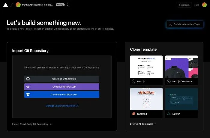
Highlights
- A simple, clean UI
- Various options to sign in
- Optionality to integrate your stack or deploy sample code
Lowlights
- Progress bar indicating the sign-up process
- Minimize window/app switches when setting up your email
- Making it easier to search for help content in-app.
Check out the full breakdown here: Unboxing Vercel—a sometimes too-simple onboarding
The 6 types of user onboarding software - which are right for your use case?
OK, so we know the theory, we have some concrete examples. Let's move forward and find out about the tools that can help you. The right tool is always dependent on the right problem.
Which user onboarding software you’ll benefit from most depends on how you’ll want to deploy it. You’ll also want to consider price points and a range of other factors about the tools.
So don’t worry. We’re going to give you a high-level overview and all the info you need to investigate further.
Matching user onboarding software with user onboarding use cases
Tracking Tools - PostHog (Alternatives: Amplitude, Mixpanel, Heap). Measure user stickiness by tracking user behavior, identifying recurring usage, and understanding user drop-off patterns.
Push Solutions - CommandBar (Alternatives: Pendo, Walkme). Utilize in-app tours with pop-up modals, tooltips, and slide-outs to guide users towards desired actions while avoiding overbearing experiences.
Pull Solutions - CommandBar. Implement a command palette for users to search and solve their own questions within the app, increasing the likelihood of becoming active users.
Help Content Solutions - Zendesk (Alternatives: Help Scout, Intercom Support). Create documentation to enable savvy users to find solutions independently and optimize search functionality to match users' language.
Icon Library - Font Awesome (Alternative: The Noun Project). Use clear and concise library icons to guide users toward relevant features, promoting visual consistency and user stickiness.
In-App Engagement Tools - Cohere (Alternatives: Intercom, Drift). Boost adoption through audio chat and screen sharing within the product, or engage users with chatbots for a lower-touch approach.
And if you want to dive deeper into any one of these areas and learn more about why we picked who we picked, check out this post from Mathew Pregasen: User Onboarding Tools that Drive Stickiness.
Or - for an alternative breakdown - check out this post where Mathew approaches the question from a different direction and talks about brands like FullStory and Wistia: 5 Best Customer Onboarding Software Tools for SaaS in 2024
Hit the big onboarding use cases with CommandBar (6 video guides)
CommandBar can do a ton of onboarding work for you straight out of the box. Check out these video guides for six ways CommandBar can supercharge your onboarding.
How to get new onboarding users to upgrade
With a specially tuned nudge in CommandBar, you can take advantage of "aha!" moments and encourage users to convert right in your app.
How to encourage a user to upgrade after a magic moment
How to drive feature adoption in onboarding
You can use a pin, or beacon, to highlight a specific feature in your product's UI, encouraging new users to try it out. We show you how to create a nudge that highlights a key feature to new users when they're exploring the app for the first time.
How to drive feature adoption when a new user is exploring
How to trigger surveys as users onboard
New users will find some parts of your product confusing. Learn how to prompt them with a survey so you can improve your onboarding process.
How to trigger a survey when a user is confused
How to onboard new users with a checklist
We take a look at setting up a questlist for onboarding to help new users get started. This guides users through a multi-step checklist, encouraging them to get set up and take a look at key features.
How to onboard new users with a checklist
How to create a product tour for re-onboarding
Here we chain together different nudges to create a product tour, guiding a user around your application so they can discover key aspects of a new feature.
How to create a product tour for a new feature
How to encourage users to upgrade in Magic Search
With Magic Search, users can discover features, but what if it's on a paid plan? We show you how to create an upgrade command that guides a user to an upgrade path when using a feature.
How to encourage users to upgrade when they search for a paid feature
For more info about how CommandBar works, check out these pages:
We’ve tried to cover as much information about user onboarding as possible - but we can’t cover everything!
What did we miss? Get in touch and let us know what you’d love to see us explore. Simply share this article on Twitter, tag us @CommandBar, and let us know!