


As users, we've all been hit with onboarding checklists. Those friendly little lists that usually live in the bottom right of a website and helpfully list out everything that I, the new user, need to do to reach nirvana — i.e. convert (and see the confetti that will rain when I finish the checklist).
A form of in-app guidance, these experiences have become more and more popular in the last few years as software companies focus on product-led growth (PLG) to impress and convert users. But as they’ve become more popular, have users grown fatigued?
We surveyed our customers at CommandBar to identify what works and what doesn't, and we've packaged the findings here into our own checklist for making remarkable checklists. A meta-checklist, if you will.
Who should read this, and who should skip it?
This article will be most useful for:
- Product managers whose scope includes first-time user experience and/or user onboarding.
- Growth marketers and product marketers who own or are involved in the customer onboarding process.
- Customer success leaders and team members who want to utilize the client onboarding process to get ahead of common customer issues that surface later on in metrics like net promoter score (NPS).
Table of Contents
- The anatomy of a remarkable new user onboarding checklist
- Mistake #1: Use the same checklist for every user persona
- Mistake #2: Make your checklist long and daunting
- Mistake #3: Using checklists for growth, not onboarding
- Tip #1: Include different types of activities in the checklist
- Tip #2: Include enticing CTAs
- Tip #3: Let users decide when they want to start the checklist
The anatomy of a remarkable new user onboarding checklist
Why make a remarkable checklist?
Ok, you think you know user onboarding checklists, but let's give you a little refresher. Welcome to SaaS onboarding 101.
A user onboarding checklist is an interactive guide that helps walk a new user through the initial steps of using or interacting with a product or service. It's typically presented to users as soon as they sign up, but can also be triggered manually at any time during the onboarding flow. Checklists are also used at other times -- for example, to walk existing customers through a new feature or use case -- but in this article, we'll focus on using the checklist to motivate a new user to complete onboarding tasks.
The goal of a checklist is to help your users get immediate value from your product quickly. This is true whether your product is a PLG (where a user needs to see value before they convert) or more traditionally sales-led (where early user success is usually predictive of long-term customer retention).
Before continuing, it's important to note that a good onboarding checklist is one piece of your customer onboarding program. That program should include other pieces, like
- a good automated welcome email that includes links to other onboarding materials (for example, a doc that walks through your product's key features)
- a client onboarding questionnaire (to give you a sense of your new users' goals)
- a kickoff call (if your product isn't sales-led).
The trigger
Onboarding checklists need some trigger condition that determines when they show up. The most naive trigger would be to show the checklist as soon as the user completes sign-up and enters the app.
You can also trigger the checklist slightly later in the customer's journey. For example, maybe you want to let them click around first. You could then show the onboarding checklist after the user has performed a few clicks first.
The list
The checklist should show a few (no more than 7) achievable tasks. Each task should have a clear title that separates it from the other tasks, and a longer description that appears when the item is clicked on.
Above the list, some companies include an initial welcome message that introduces the checklist and explains that it's going to help the new customer get started.
A little advanced tip is to launch the checklist with one or two items already checked off. This is a subtle form of psyops that takes advantage of the fact that we all feel good knowing we've checked some items off the to-do list.
The completion
It's become common (if a bit cliché, but who doesn't love a good cliché once in a while) to show some kind of celebratory animation once a user completes the list and fills their progress bar. A common strategy is to throw some confetti.
You can take this a step further and show some sort of celebration after the user completes each step, too. You don't want to take this overboard, but acknowledging progress is a great way to ensure continued user engagement and just make the journey of completing the checklist an actually fun, positive experience.
Other accoutrements
It's common to include a progress bar somewhere in the checklist itself to make it super obvious to a user how far they've come and how much they have left. At this early stage, you don't want a user thinking they have a ton of work to do to get started. Like one of those surveys that doesn't tell you how many questions you have left.
This one is a bit controversial: a skip button. In certain scenarios, it can make sense to require a user to complete a checklist before continuing with their usage of your product. For example, if your product is a sales tool that has a lengthy setup process that needs to happen before it can start helping sellers sell (e.g., connecting Salesforce to your product), then you need to bite the bullet and require users to do it. However, in most instances, this isn't the case. If a user really wants to get started on their own, you can let them skip the list. But make sure they can find it again! We'll learn more about this tactic later, but it's a huge missed opportunity if you just disappear the checklist forever once the user clicks skip.
Mistake #1: Use the same checklist for every user persona
This is SO common. A company will painstakingly craft the Ultimate Onboarding Experience for their new customers that includes a checklist. The problem is that most products have different user personas, who care about different things.
The key to a successful checklist -- one that gets completed and sets users down the right path -- is that the checklist showcases use cases that users will later return to and find useful. Let's go back to our sales software example. The sales software might have the following personas:
- Sales reps: people who do the selling directly
- Sales managers: who manage a few sales reps
- Company executives: who mainly want to see how the sales team as a whole is doing
Can you imagine a checklist that works for all of these personas? Would it make sense to have a checklist include an item like "Build your first dashboard to see how your team is doing?"
This item makes a lot of sense for Sales managers who will probably be building a lot of dashboards. But it makes way less sense for the other groups -- reps and executives will probably mostly be viewing dashboards built by managers. This is just a small example of how you want to help users learn skills that will be relevant to their usage of your product, not just representative of the "average user."
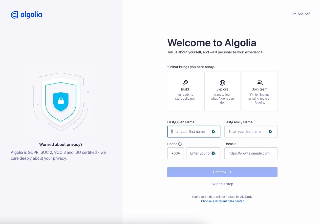
See Algolia for an example onboarding flow that segments by user persona.
Mistake #2: Make your checklist long and daunting
The user onboarding experience is not meant to feel like getting your driver's license renewed at the DMV. Especially if your product is PLG, a lengthy, boring onboarding process is likely to cause new clients to ditch your tool in favor of one that's easier to get set up (even if your tool is more powerful in the long run!). This is a great example of the power of first impressions on the customer journey.
What do you do if your onboarding process requires the user to complete a bunch of complex tasks? Define success and break it up.
What tasks are absolutely essential that a user completes first? These might be items that block other items from being completed, for example. Include those in your checklist, and create other checklists to show off new features and keep the first checklist a seamless experience.
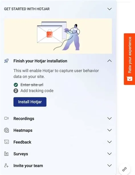
Take inspiration from HotJar - they break up their list into sections of steps, only showing one at a time so users don't get overwhelmed.
Mistake #3: Use your checklist for growth, not onboarding
Once you've turned a new user into a happy customer (or at least set them on the right track to becoming one), there are lots of ways that a happy customer can help your company grow. For example, that customer could refer other users or post on social media about how much they love your tool.
Some companies make the mistake of encouraging users to do these promotional activities within the onboarding checklist itself. This is an amazing way to lose user trust. The point of user onboarding checklists, and an onboarding process in general, is product adoption. That has to come before you leverage that user for your business's growth.
You can possibly leverage other less pushy communication channels like email to encourage these actions that push your growth flywheel. But we encourage you to hold off until onboarding is complete. For example, it would be a bad idea to include a CTA to "Share our app with your friends" in the welcome email you send to new users.
There may be qualifying factors and caveats that cause you to ignore this advice and ask users for growth favors early on in their journey. But if your goal is long-term business growth achieved through a happy and healthy customer base, we recommend against it.
Creating an onboarding checklist that is focused on what creates value for the user -- customer-centric milestones -- is a great focusing exercise to ensure you haven't strayed too far into growth land.
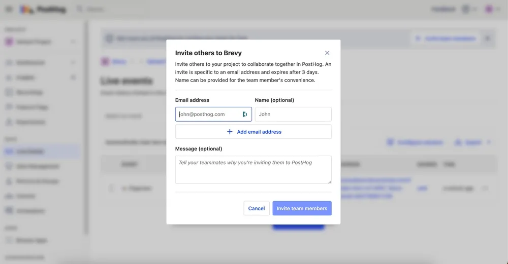
For an example, take a look through PostHog's onboarding, which strikes a good balance between onboarding and growth.
Tip #1: Include different types of activities in the checklist
Not all tasks related to getting started with a product are created equal. Some need more explanation, while others can be completed in a few clicks.
That's why when it comes to an optimal SaaS onboarding checklist, it's important to include different types of activities that match the complexity of the underlying task.
For example, if there's a particularly tricky or critical onboarding step, you might want that checklist item to link out to a help doc walkthrough (to ensure users have a clear guide for how to get it done). If there's a part of your product that is visually confusing, you might want your onboarding item corresponding to it to trigger a video or product tour.
Another benefit of this type of mixed experience helps keep the process fun and interesting. Remember, we don't want this to feel like the DMV.
Tip #2: Include enticing CTAs
The checklist is both a checklist and a launching-off point. You want to make it as easy as possible for a user to progress toward checking off a checklist item, and what's easier than clicking a big honking CTA?
To make your CTAs as enticing as possible, use active, specific language. For example, let's go back to our sales software example. Imagine the following 3 items are included in our app's customer onboarding template:
- Connect Salesforce
- Create your first sales plan
- Make a plan template
Out-of-the-box, the user onboarding tool you're using should (if it doesn't, please call for help) let you attach a CTA to each checklist item. By default, that CTA will say something like "Go" or "Click here". Here are examples of what you could change those to with the checklist items above:
- Click here to connect
- Initialize the plan
- Create template now
These aren't poetry or rocket science, but they indicate to the user that it's easy to get one step closer toward checking off this item and seeing that sweet progress bar inch ever closer to onboarding nirvana and the ensuing confetti typhoon.
Tip #3: Let users decide when they want to start the checklist
Your customer base likely includes a mix of self-starters and users who need more structure and help to find success. To give these different types of customers the best onboarding experience possible, you'll want to think about how you can offer an optional checklist while also making it discoverable and easy to access later on if a user decides they want to revisit it.
If a user skips your checklist, don't resort to pushy tactics like an in-app notification to get them to restart it. This is likely to just annoy the new client and make them think your software will be riddled with similarly annoying experiences.
A better approach is to think about which parts of your product a user might need help with in the future and then make the checklist discoverable in those areas, accompanying them as they explore more features.
For example, if you're building an HR software suite, you can surface the onboarding checklist in each individual feature of the software. This provides users who skipped onboarding the opportunity to go back and complete it later on while they are actually using the product, as opposed to having them start from scratch with a one-off tutorial at the beginning of their journey.