


Let's say it loudly for the people in the back: no more annoying popups!
Don’t scare your users! Guide them.
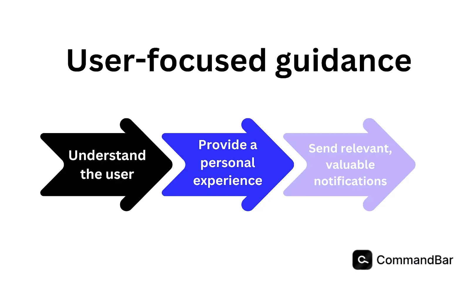
In-app notifications shouldn't serve you or your brand. Notifications need to serve users. That means creating an experience they actually like.
Let's throw out what SaaS platforms think they need to do and instead implement what actually works.
We can only create better in-app notification experiences by understanding why we need them in the first place.
What purpose do in-app notifications serve?
Platforms communicate with their users with in-app notifications. They’re often deployed in timely situations:
- When a user triggers a feature
- When a new user needs help
- When the brand wants to highlight new features
SaaS companies can create a solid in-app messaging strategy by recognizing the key differences between today’s typical notifications and the guidance approach.
The difference between traditional notifications and guidance

You're using a new app. It's for payroll. The platform has promised to solve every frustration you face, and it's at a great price. As a new customer, you can't wait to get started.
As you enter the application, you begin to see options that interest you. You even identify an immediate use case, click the button, and then—bam!
You get interrupted by a popup.
You try to skip past it, but the exit button is small, and it takes a few seconds to find it.
Then another one pops up.
You already found a function you want to test, but you can’t get back to it through all the noise. It totally ruins your experience.
Traditional notifications shout information. Nobody likes that, whether they’re talking to a friend or experiencing a SaaS platform for the first time.
Notifications shouldn't come through a megaphone.
We should see our communication as guidance, which puts users in the driver’s seat.
Guidance is natural. When you learn something new, you look for clues and tips or seek insight to master it. Onboarding tools can serve the same natural customer need.
We walk the new user through the process and support them as they navigate their self-service journey. And the experience and quality should remain the same across any device, whether it’s on an Android or Apple iOS mobile app, or on a desktop.
Let’s dig deeper into how you can use guidance to build trust with your users.
How to guide users with tact
To make guidance feel natural in your app, you must understand user intent and package your messaging accordingly.
James Evans, founder and CEO of CommandBar, stated on the Riding Unicorns podcast:
"Our approach is to get as close as possible to user intent. Often, the most direct way to do that is to ask the user [It could mean putting] a text box in front of a user [like] search, chat, and get them to decide what they are trying to do… from that point onward, you can help in a much more final-grained way (Season 6, Episode 29)."
Using research directly from the user, you create first-party data that informs your personalized strategies. And even if you don't have the perfect solution at that moment, you can apply feedback in a next iteration of your adoption for that type of user.
When users receive in-app messages that actually relate to what they need, you can deliver messages that directly offer value.
To personalize the user experience in your app, start with a quick onboarding survey to better understand the user.
Develop multiple paths that guide them through those adoptions based on their needs, behaviors, and learning styles.
You might also use optional checklists to offer step-by-step directions. It's not forced, and users can still jump around the app, but they have a roadmap to return to and a direction to follow.
Additional features like documentation and AI assistance round out a supportive, non-invasive approach. You can also incorporate a resource hub and customer support access if the user needs more.
In this way, in-app notifications support the experience based on user behavior and the path they choose.
It’s not what you say (it’s how and why you say it)
Another difference between a pleasant in-app notification and an annoying popup is the moment it happens. Timing is key.
Nudges and tooltips might gently offer more information if a user has taken a long time to understand a feature or has repeatedly abandoned it. Your app can also offer links to articles and a video walkthrough.
The timing feels innate and offers value to the user.
Lastly, are your notifications showing up in the right context?
You might be testing out an app for the first time, and you want to export your results into an Excel file. A push notification hijacks your screen right before you click the export button, asking if you've tried a new feature.
It's totally irrelevant (like a door-to-door salesman trying to sell steak knives to a vegetarian), and it's super frustrating.
But let’s improve that same scenario.
Instead, when you click the export button, a gentle notification shows itself. It encourages you to try an integration that can eliminate the need to export the file in the first place.
If users want to master your platform for their personal use case, they can utilize a tool like the HelpHub that gives them access to AI support and resources right in your app.
Once you have a deeper understanding of what information your users need (and when), you can then start identifying different contexts that would call for unique push messages and better serve your customers exactly where they are.
Measuring success (or failure)
On the foundational level, we can look at metrics. Through A/B testing and analytics, you can see how your guiding in-app notifications influence user behavior.
You can measure behavior with adoption metrics like:
- Feature adoption rate
- Feature retention rate
- Onboarding completion rate
- Churn rate
- Usage rate
- Activation rate
- Conversion rates and renewal rates
- Engagement rate
While these KPIs and metrics offer a litmus test of your current state of adoption and provide important insight into your success or failure, they shouldn't be the only source.
Brands need to balance this data with the psychology behind user behavior to make improvements. In-app notification tools should account for this and provide the resources to make tracking and implementation possible.
Choose the right platform for in-app notifications
You need a user assistance platform if you want the best in-app guidance strategy that serves your customers and improves user retention rates—turning the traditional in-app notification on its head.
Users exploring your app can get gentle messages like CommandBar's Nudges that point them in the right direction. When the experience feels helpful and like a necessary asset to the user, you can increase customer engagement and provide a fun adoption experience.
Once you've implemented these techniques, continue to measure your progress and continue to improve for an effective adoption experience.
Brands that execute better listening and notifications find that users can continuously evolve their product as they grow a loyal user base.
Free up your time from chasing down churn rates and get back to your brand’s true goal: providing a solid product that users love.