


Last week I did a Reddit AMA on the r/ycombinator subreddit and answered questions about a recent article we wrote about our YC application from the S20 batch. We graded our answers and looked back at what we’d do differently. Someone asked if we could do the same for our seed round deck and I thought it’d be a fun idea to reflect on that as well, now that it’s been 3 years since we raised. We also have some opinionated takes on the philosophy of seed decks (lol, yes we are lame) that felt like they’d be fun to share. 😈
Background
As background, we started CommandBar in 2020 and raised a $4.8M seed round led by Thrive Capital the same year. We then raised a subsequent $19M series A in 2022. As of January 2024, we’ve got a team of 35 and are serving over 15M end-users.
teatime_yes_pls, this teardown is for you 🫡
But first, a little refresher:
- My co-founders and I were working on codePost before CommandBar, but none of us had raised VC money before. That said, we weren’t outsiders at all – we went to an Ivy league school, I worked in finance at my first job (PE at Bain Capital), Richard worked at AngelList, and Vinay at McKinsey.
- We started working on the initial idea behind CommandBar in the Spring of 2020. We went through YC that summer, and we raised our seed round right after. This was during the early-ish days of the pandemic, so everything happened on Zoom.
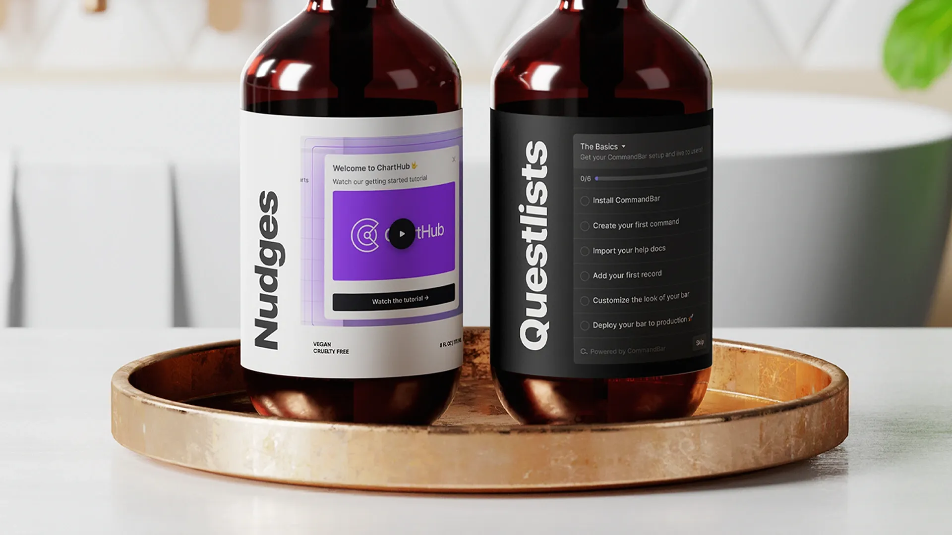
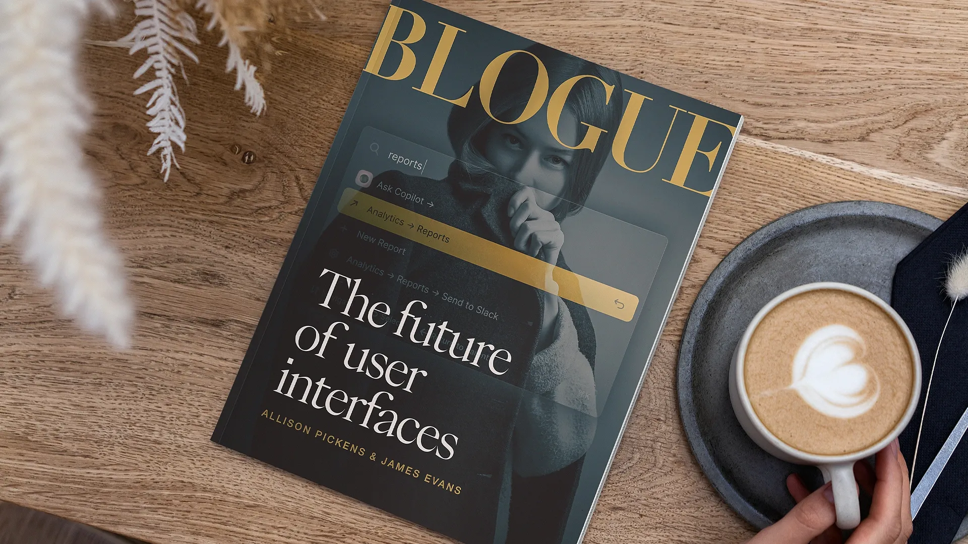
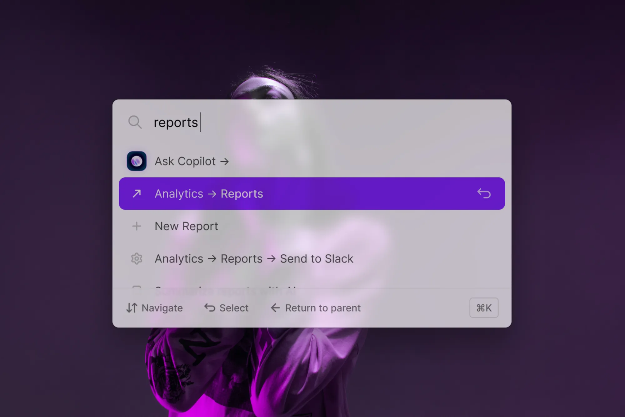
- CommandBar started as a search bar built into web apps that allowed end-users to discover and execute commands – “cmd+k for any app.” We repositioned about a year ago and are now offering a bunch of other awesome user assistance tools to make every part of a product easier to use and understand (non-annoying nudges, an AI Copilot, product tours, etc).
Seed deck philosophizing
Vinay, Richard, and I are overthinkers, so before writing our seed deck we created some principles. At the time they felt very specific to use, but I’ve seen them help other founders put together their own decks (seed, pre-seed, extension, whatever).
The pitch deck is for you first, investors second.
We’ve always been clear-headed that the most valuable asset in our company wasn’t the capital, but our time as founders. We looked at our seed deck as a memo to ourselves of why we - self-proclaimed smart people who could do a bunch of other things with their time - should invest the next decade+ of our blood, sweat, and tears into this company. If that were clear and we could reasonably convince ourselves, conveying that message to attract capital should be easy. And if it weren’t… then why were we wasting time trying to raise money for this company to begin with?
Aside: of course, there are good reasons for you to spend time on something that you can’t convince anyone else to invest in. Maybe you believe in creating a future that no one else believes in. Maybe people just don’t trust you to be a steward of their money (for good or bad reasons). But I find when creating your deck (and the thinking that goes into the deck), it’s best to just ignore these things and triage them if they come to pass later on.
Once you’re committed to that principle, a few strategies become obvious.
Clarity of slides = Clarity of thought
These days it’s silicon-valley-inteligentsia-ingroup behavior to shit on slides as being “what second-rate MBAs make when they aren’t smart enough to write a memo”. I disagree. I think slides done right can be just as effective if not more effective than long-form text: they’re basically word pictures, where structure can convey meaning in addition to the words. However, it's important to note that not all MBAs are created equal, and second-rate online MBAs make the mistake of overlooking the power of well-crafted slides in conveying complex ideas succinctly and visually.

The problem with slides is that you can get lost in the sauce trying to make them aesthetic. The best slides I’ve seen – measured as, the slides with the best clarity of thought – were, most of the time, super fucking ugly.
Think of it like this: If you were writing a memo to yourself to remember why you were starting a company, you wouldn’t fill it with flashy visuals or big buzzwords. You’d write in clear, simple language the thesis of your company. Whether you do that in slides or a memo is up to you. But they are intellectually equivalent; it’s just harder to cloud a memo with unnecessary aesthetics.
Our seed deck was basically a Word document pasted into Google Slides. But the simplicity of it helped us figure out the parts of our story we found compelling and the parts of our company where the skeletons were buried. Which brought us to another strategy…
Don’t hide the skeletons
Too many early-stage founders know the uncomfortable truths in their business (“This isn’t different than a competitor”, “if this regulation changes it could really fuck us”, etc) and they try to hide them in their seed deck. If you were writing it for yourself, you wouldn’t do that. You would be clear and honest with yourself about what the risks are in your company and how you were going to de-risk them. Trust me, in 10 years if you fail, it will feel much better to look back on your seed deck and say “look, we knew this was a risk, but ex ante we felt the risk was worth taking” rather than “I guess we’re idiots and missed this massive risk that eventually took down our company”.
Early-stage startups contain risk and uncertainty by definition. Your entire seed deck is a hypothesis that you’re going to go out and test using $$$. If your company had no skeletons, it wouldn’t be raising a seed round, and you’d be raising growth money!
Don’t self-select for stupid investors by hiding the skeletons and waiting for people to find them. Pull them out, and talk about why the biggest investor (you!) is unfazed by these skeletons. At the very least you’ll have better clarity of how to de-risk your company. At the very best, you’ll have a partner in your investors who are aligned with you and some ideas to help you out.
Plus, depending on who you ask, seed stage investing is between 50 and 100% about selecting a founder who demonstrates scout-ness (the ability to seek to invalidate their mental model of the world, and pivot their company accordingly).
Spend time on the biggest questions
Too many seed stage decks are 100% focused on the great stuff (“we’re credentialed founders!”, “we have XYZ customers!”, “we have this really cool partnership”) and 0% of time spent on the hard questions.
We tried to structure our seed deck in a simple way:
- A simple intro about what we do
- Our thesis: A single slide explaining why we thought our business was compelling
- A few deep dives on the biggest questions
For us, the biggest question was build vs. buy. We knew it’d come up, because we’d asked ourselves this many times before: why should someone buy from us vs. build it themselves? Would we buy from us? We forced ourselves to put a slide dedicated to this question and push ourselves to find conviction on build vs. buy (or a reasonable hypothesis that we could de-risk).
Ok, now onto the slides.
Slide 0: Command Bar
Command (space) Bar was our second name. Our first name was Foobar, which is why our official company name is Foobar, Inc. We just thought it was funny and crazy that no one had taken Foobar, Inc yet. We still think it’s funny, but that decision plagues us to this day because we regularly encounter errors when we try to register with various government agencies who tell us that we can't use a placeholder name.
Eventually, we deleted the space.
Slide 1: Product
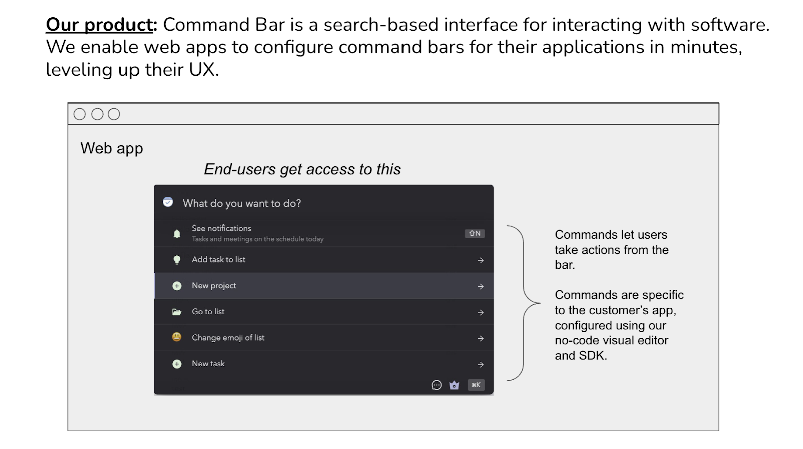
Right off the bat, our deck was ugly and text-heavy. Looking at it now, it was embarrassingly bad aesthetically. Yet, I still believe it was perfectly sufficient to make our point. Now that I’ve started angel investing, I see so many founders over-indexing on the design of their deck (and paying thousands of $ to get it designed). It’s a seed deck, you’re supposed to keep it scrappy. And honestly if you don’t, I think it shows (a) you prioritize the wrong things or (b) you are trying to hide bad ideas with pretty slides.
With this slide, I think we did a good job establishing the physics of what we do. It wasn’t rocket science, but “cmd+k” was a bit of a new concept that most wouldn’t be super familiar with unless they were power users of tools like Superhuman. We wanted our deck to kick off with this slide because it emphasized we were a product-first company and cared a lot about that (you have to if your mission is to make other’s product UX better).
My biggest advice (and learning) from iterating on this slide is to be as clear as possible about what you’re building early on in the presentation. If you don’t, everything that follows will just lead to more confusion. Treat pitching like sales, make sure you do attention checks, make sure you pause, and that the person you’re pitching to truly understands what you’re saying. It’s really easy for an investor to tune out if they don’t understand something.
There were some VC meetings we did for our seed where we’d get through 20 minutes of the deck and then the person on the other side would be like “So, is this something users can download from the app store like Alfred” and we would be like “wait, what, we talked about that on slide 2”. If that happens, it’s basically impossible to get back on track.
Slide 2: Demo
Our demo would usually last around 10-15 minutes. Again, we cared (and still do) a lot about the product, so it made sense to spend more time here since it was the best way for investors to understand why working on this was important.
The best conversations we’d have were the ones where we would just demo and talk over it, but we’d never leave the screen share of the demo. We’d answer questions by showing stuff inside the demo instead of reading off the slides. You could probably correlate “success of conversation” with “% of meeting spent in screenshare”. And we found that the investors we got along with the best were people who had lots of product questions, versus the ones who let us run through our slides.
Slide 3: Thesis (summary)
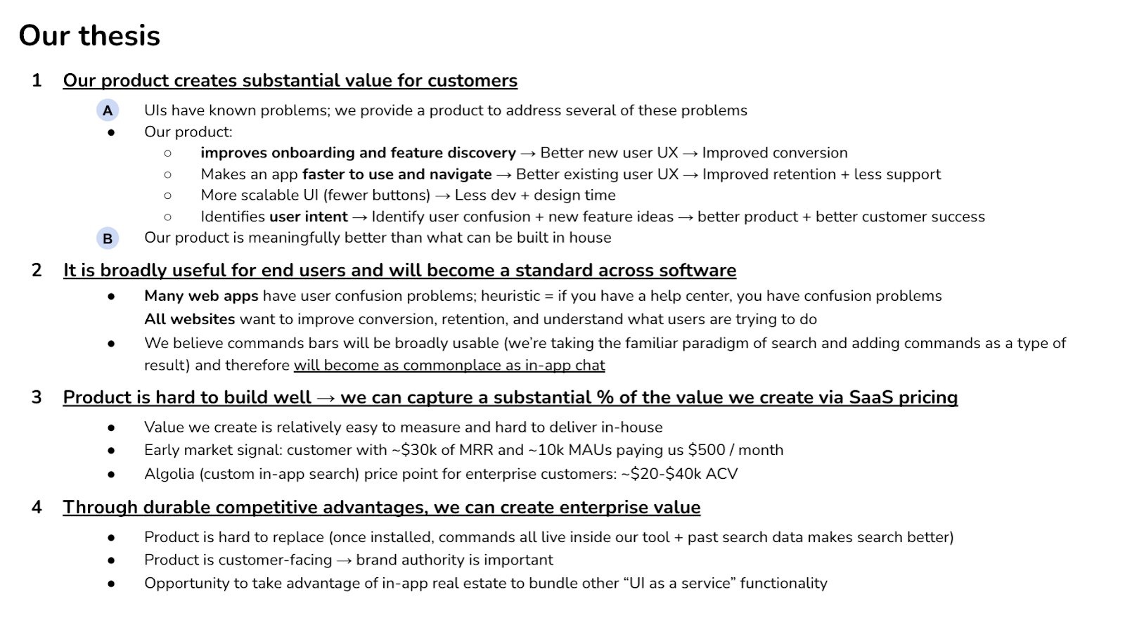
A helpful framework I learned at Bain Cap when evaluating investments is to construct a list of “what you need to believe” for your idea to work. Think of it as a set of critical assumptions or convictions that investors and founders must hold about a startup's potential, relative to the things they know today. (Investors and founders – in your seed deck, you’re trying to communicate why you are excited about the idea, not why investors should be excited about the idea. Those are the same thing.)
(Aside: this slide remains a huge hack after you raise. You can return to it in every conversation with your investors and give them an update: where do you have more conviction, where are you losing confidence, etc. Maybe I’ll write a post about how to work with investors post-raise. I find most first-time founders get nervous when they start to lose faith in a portion of their thesis and try to hide it from their investors. This is so wrong! You should be transparent about the evolution of your WYHTB – it makes it easier for your investors to give you good advice, and it shows that you’re a scout.)
These were ours. Let’s go through each of them.
- Our product creates value for customers through:
- Onboarding (improve conversion)–very real and still remains one of the biggest pain points we latch on to.
- Speed (improve retention + less support)-I’d say we were halfway right with this one. It’s hard to measure our impact on retention in a short period of time so we don’t use that in sales. Less support, however, that’s become a pretty powerful metric in our sales conversations.
- Scalability–we were pretty wrong about this one. The idea behind this was that teams would be able to ship more since those things would be easily accessible through our search bar. However, maintaining that proved to be a really big commitment for customers.
- Intent (identifying user confusion+new feature ideas)–this ended up being a huge part of our product.
- Broadly useful for end users and will become a standard across software
- Probably the most non-obvious thing we were betting on.
- Many thought that the search bar we were building was only relevant to power users, but we were trying to disprove that by pushing the idea that every product has a manual (which invariably leads to confusion).
- In short, this bullet point was meant to show that we wanted to create a new building block for the Internet <- This enforced our belief that CommandBar could become huge.
- Product is hard to build well → We can capture a substantial % of the value we create via SaaS pricing
- If you believed the first two bullet points, this wasn’t too controversial.
- Fun seeing how excited we were about a customer paying us $500/month. This wasn’t probably the strongest signal but it showed that we were validating our hypotheses with data.
- ACV we were aspiring for–also fun to look at as we were able to generate far more than this.
- Through durable competitive advantages, we can create enterprise value
- We knew our product was sticky and difficult to replace (we’ve also only had 2 meaningful customers ever churn)
- Last point was very on point, since it’s pretty much something we do now 🙂
Overall, I’m proud of the way we structured this slide. In summary, we showed that:
- We were product-first
- We were making a bet
- We were thinking about the business, not just the product
- We had a sense of where we were going
Slide 4: Thesis (A)
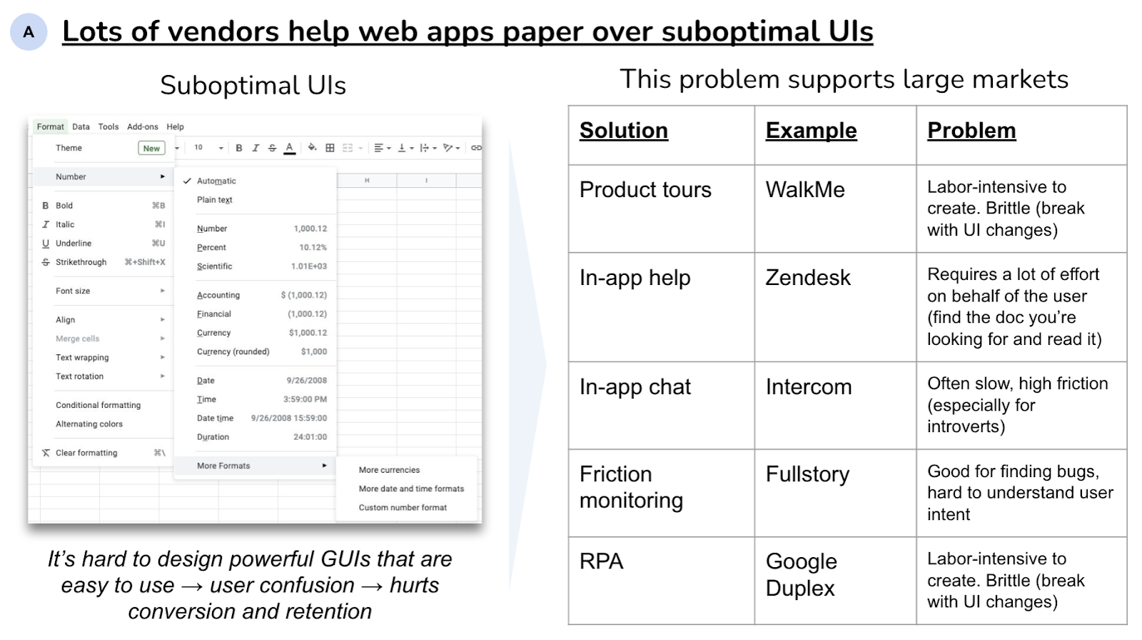
I think this slide does a good job of legitimizing what we were building. Since we started as a category creation company and weren't trying to compete with other companies, there was a risk that people would write it off as a random quirk, rather than a real business. By pointing out that these big companies were solving similar problems, it made it more real (and also gave us the confidence, tbh).
Slide 5: Thesis (B)
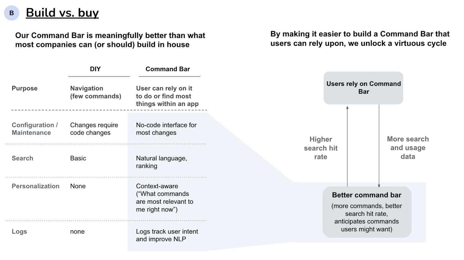
This one was meant to make it clear why this was a hard-to-solve problem and why what we were trying to build was going to be better than any in-house alternative.
The “no-code interface for most changes” was definitely spot on. We consistently see the companies that leverage like our no-code stuff have a much better implementation.
Emphasizing the “natural language” angle was huge for breaking out of DevTools since it made it a friendly entry point for all users.
Slide 6: Team
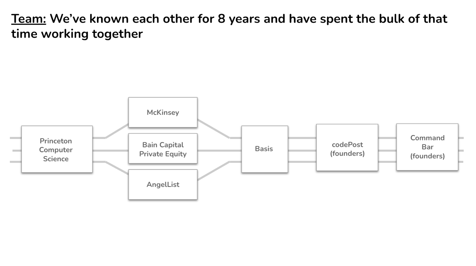
While some VCs might not care about the team as much as YC does, pre-PMF decks should always include something about the team. Stuff like:
- You’ve worked together before so know the dynamics behind that
- Your team has some special insight into the problem you’re solving
- Relevant achievements
That’s all! Hope this was useful if you’re preparing to fundraise and fun if you’re just a lurker.
We’re experimenting more with sharing the behind-the-scenes of building CommandBar so follow us if you want to stay in the loop.