


We recently shared how in just one year we’ve gone from not being on the G2 grid for our category (“Digital Adoption”), to being a leader (🥹). I know this sounds like bragging, and in part, it is. You’re on the CommandBLOGUE, what did you expect?
There’s a bigger story behind this though. A year ago we decided to adjust our positioning from creating a new category to building a differentiated product in an existing one: digital adoption. More on that here.
To do that, we transitioned our product from being focused on a single way to help users use software (the command bar - a natural language searchbar) to providing multiple ways for product, marketing, and customer teams to shape user experience (like non-annoying nudges). Thankfully, it turned out that all the infrastructure we’d built for that one specific search interface made it easier for us to ship all these other UX tools.
Today I wanted to look at all the awesome stuff our team has built to support that vision, with two goals
- (1) To celebrate all the awesome work that went into this year
- (2) To share the “messy middle” of our repositioning and how the pieces eventually fit together
From designing our new marketing site, redesigning, and then redesigning some more, to launching our entire Nudge Suite, adding two products to our Assistance Suite (👀🤖), re-building our new CommandBLOGUE from the ground up, and much, much more.
Repositioning CommandBar
It’s easy to look back on the year and be proud (we are!). But getting here was the process of connecting many projects–some big, some small–together to reposition our company in a year. Some of them were right from launch; others required substantial iteration. You usually only see a snapshot of a company at a point in time – the current marketing site, the current positioning not the evolution of how that company decided on its current approach. So we thought we’d paint a clearer picture of how ours changed over the course of a year, which we hope is especially useful for companies undergoing a similar transition
Why did we reposition in the first place?
We were founded to create a natural language interface for software. That’s a pretty big vision. So, why do more? Also, isn’t the original job not finished?
Yes, and.
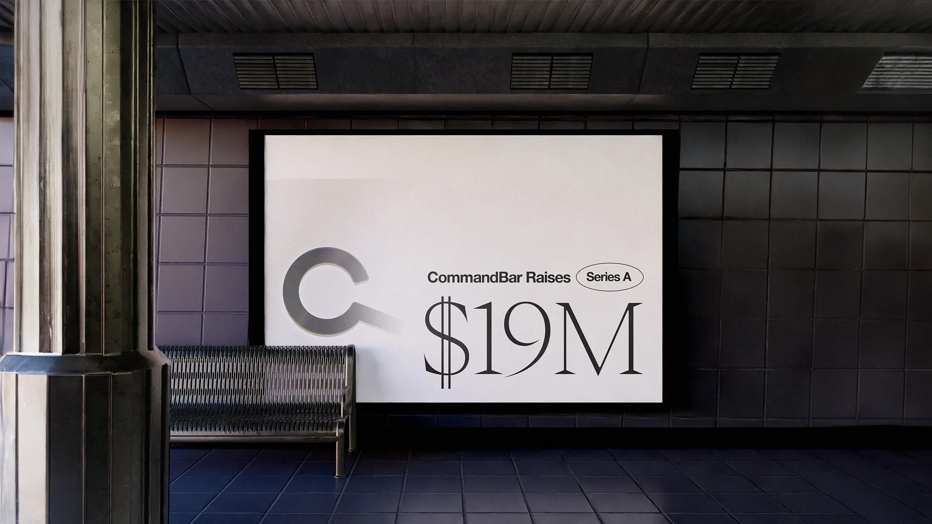
Frankly, our first product took off faster than we expected. And it powered us through two rounds of funding ($24M in total). But two things led us to broaden the product sooner than we thought.
First, we kept on hearing from customers that they wanted more ways to influence users using our software.
We would often hear things like “CommandBar is super helpful for users who have intent, but what happens before a user has intent at all?” We had no way in the product to suggest the user check something out. For example, the original product gave teams tools to configure the Command Bar search bar in multiple ways. Like tweaking the default state for different types of users. Part of that process involved slicing your user base into different audiences according to different attributes – like users who are more or less engaged, users who have used different features, etc. But you could only use those audiences to tweak search results and default states – you couldn’t use it to suggest stuff to users in any other way.
Second, we looked into the status quo for how our customers were solving those problems today, and we were a bit shocked at what we found. The status quo for reaching users in-product was largely interruptive pop-up messages. As users ourselves, we always found these rather annoying and closed them quickly. Turns out, this was increasingly the case for our customers as well – declining engagement rates because of growing user fatigue with pop-ups that they were trained to expect to be unpersonalized and unhelpful
So, we felt like this was a problem worth solving, and we were well-positioned to solve the problem, even if it meant broadening a previously very narrow and specific product.
What follows is our journey of how we got to work doing that. To capture the transition, here’s a look at our marketing site, from December of 2022, to now.
Marketing site
- We made our new positioning clear. We don’t just offer a universal search widget, we help make your product easier to use through things like product tours, surveys, and our AI assistant.
- We highlighted who we’re helping: product, marketing, and customer teams.
- We did a better job at showcasing all the product/UX things we’re writing about.
At the very end of 2022, we took our first step into the DAP space with Nudges and Questlists.
Nudges and Questlists (and eventually Announcements and Surveys)
When we first introduced Nudges, we defined them as a collection of widgets that can be proactively pushed to a user (like modals for new feature announcements, beacons for touring new features, banners for messages, and popovers for showcasing help content or walkthrough videos). Questlists were our take on onboarding checklists. We soon followed with Surveys.
Fast forward to today, after plenty of trial and error, naming, and re-naming, our product is now defined by two suites: Nudge and Assist.
(Aside: this was one of the things we struggled with most. We suddenly had a bunch of different sub-products, and we struggled to communicate the idea behind each of them succinctly. We didn’t want to just throw people a list of widgets. Finally, we landed on two categories that communicate the basic physics of each group. Nudge experiences typically predict user intent, whereas assist experiences capture and react to user intent.)
Nudge Suite
- Product Tours
- Announcements
- Surveys
- Checklists/Questlists
Assist Suite
- Copilot
- HelpHub
- Spotlight
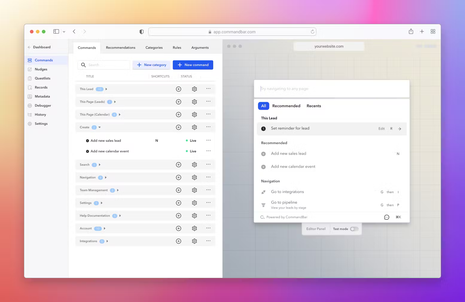
Dashboard rehaul
A lot of our primitives were designed with the expectation that we were a one-product company, so we had to rebuild our information architecture while flying the plane. With that came a recent Dashboard rehaul that makes it easier to navigate between these experiences.
This may feel simple, but one of the non-obvious things about repositioning is that engineering work that wasn’t tech debt before suddenly becomes tech debt. Information architecture, assumptions about how primitives connect, etc. And you have to decide when to pay back this tech debt. If you pay it back too soon, you risk optimizing around positioning that might not be right and require further iteration. If you pay it back too late, your shitty information architecture might prevent your new product from taking off.
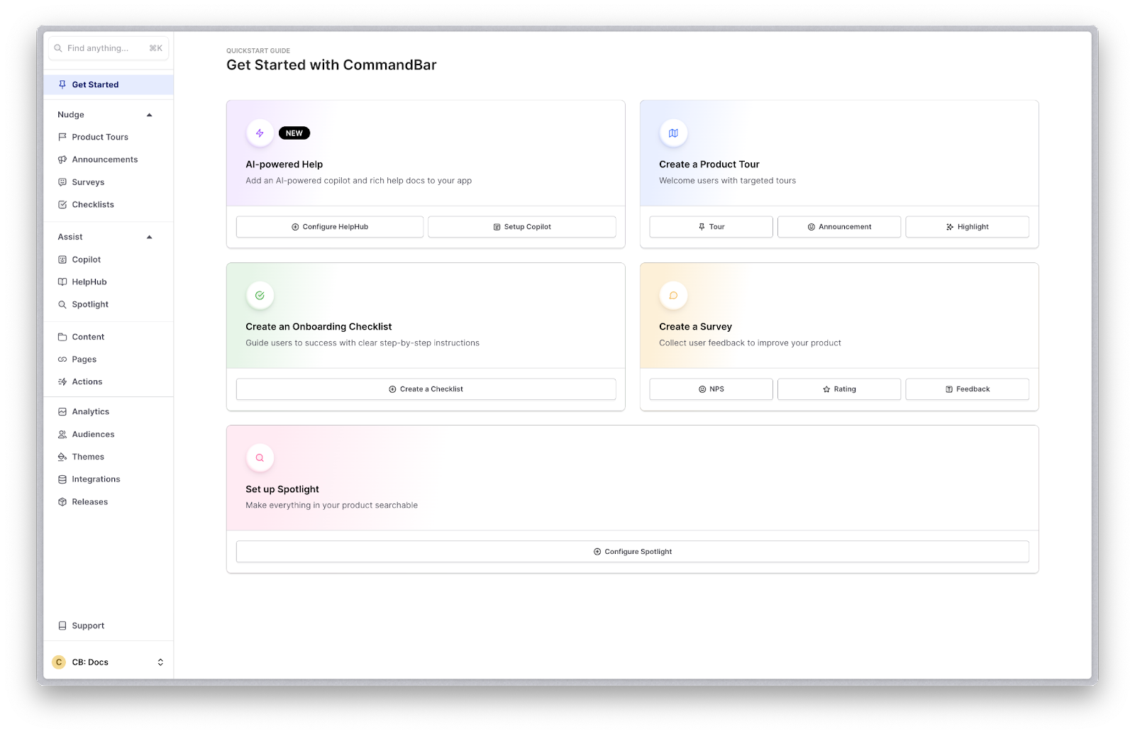
HelpHub
In May, we shipped a new experience in our Assist Suite. The idea behind HelpHub originated from the many help doc integrations we built for what used to be our core product (the search bar). While these integrations became popular quickly, we realized end-users (1) don’t search with the right words always (how are they supposed to know your product’s vocabulary from their first session?) and (2) often want answers to their questions, not entire articles.
HelpHub solves that by combining the best of “mainstream” user help — help docs and human-authored FAQs — with AI chat, to give websites an AI-powered chatbot.
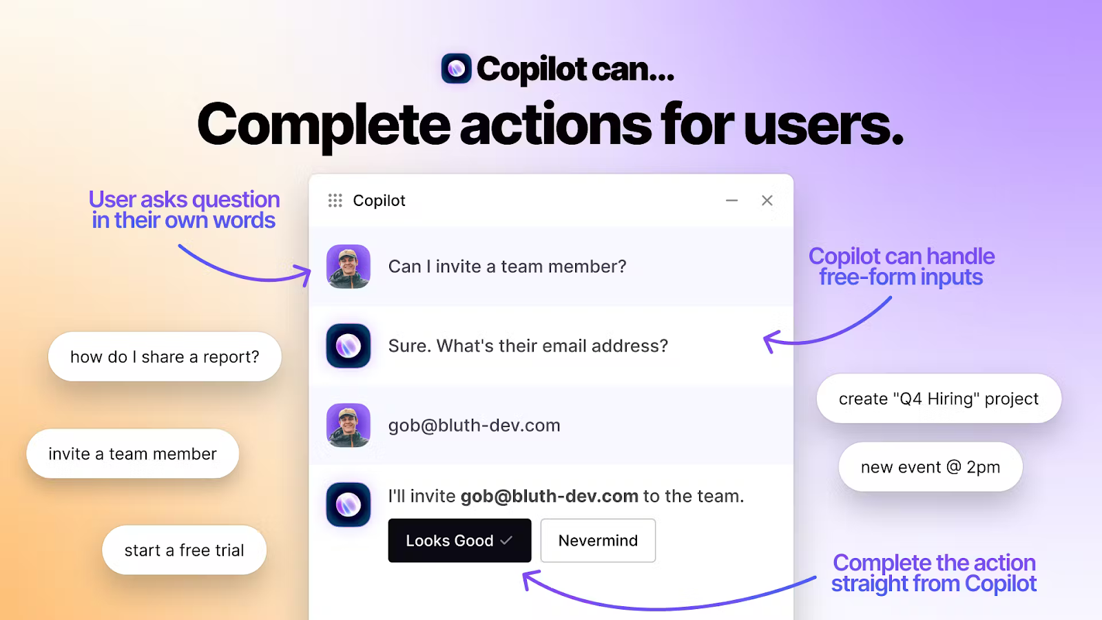
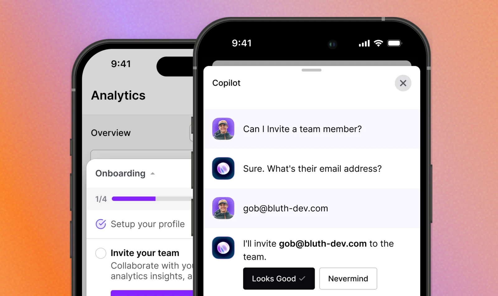
Copilot
HelpHub rocketed to one of our most popular use cases, and many folks were really interested in the AI features (this was the summer of AI, after all). So we decided to double down and ship Copilot.
Copilot is an evolution from a simple chatbot to a personalized in-product assistant. That meant HelpHub was gaining two new abilities:
- Fulfill the user’s intent directly by carrying out actions on their behalf
- Trigger in-product assistance like product tours and questlists
Magic tour links
Over the summer, in support of our make user assistance not annoying mantra, we launched Magic Tour Links.
Magic tour links let anyone on your team, in any role, create personalized in-product tours that you can share with a link, creating red-carpet walkthroughs for sales prospects, confused users, or your most VIP ones.
CommandBar for Mobile
We resisted shipping this for a while. In fact, we might’ve waited too long. Changing our positioning meant we had to stay laser-focused. At least until we had the basics covered. But as it turns out, mobile was one of the basics.
The problems we were trying to solve with our new user assistance products were much more pronounced on mobile devices. The status quo for mobile user assistance is bad — in-app browser horror, big interrupting pop-ups, incessant “rate me” asks.
So we built our core non-annoying experiences (Nudges, Copilot, HelpHub) for mobile at the beginning of November.
CommandBLOGUE
November was an eventful month at CommandBar, as we also unveiled our brand-new blog.
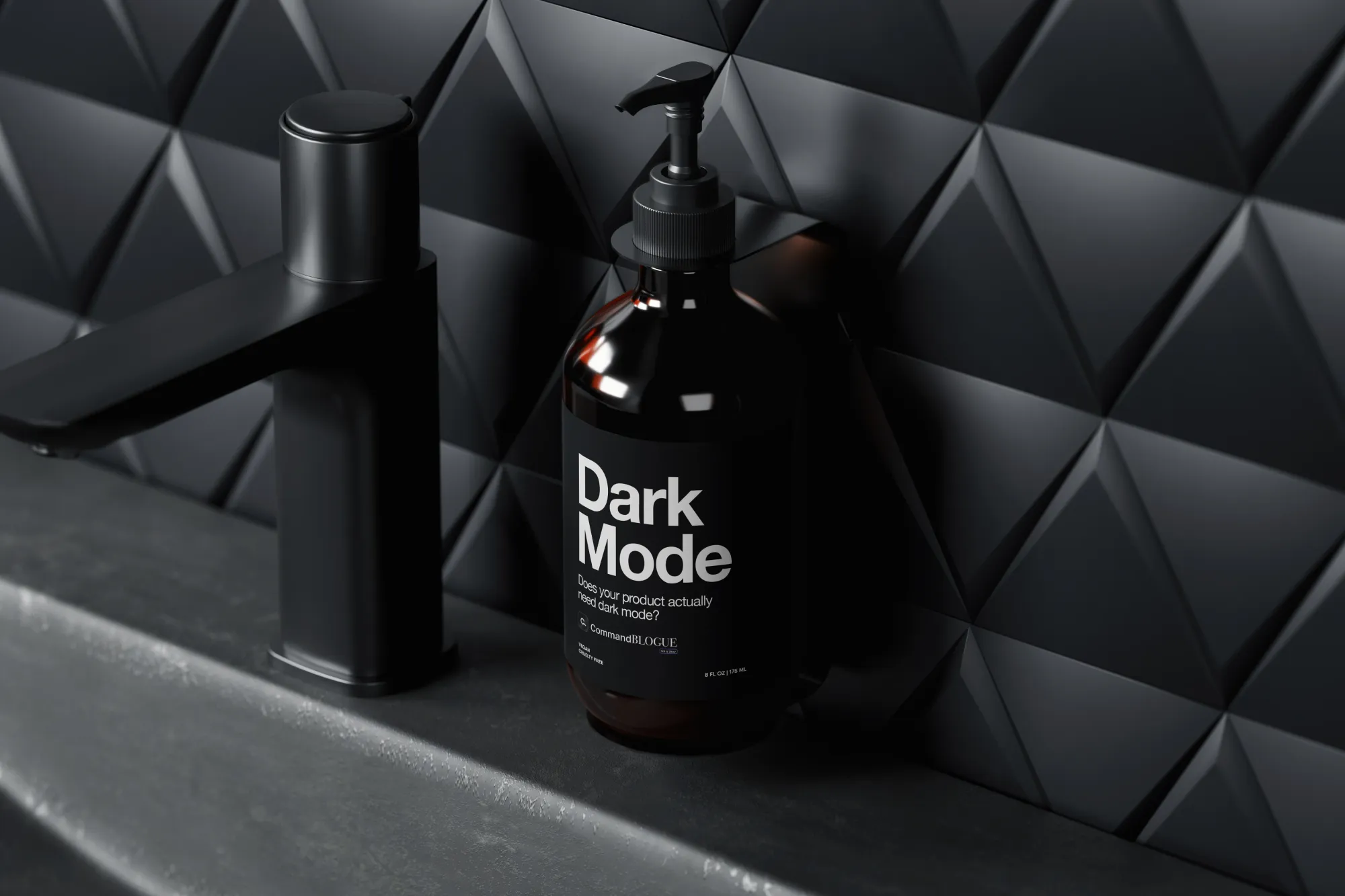
As a B2B SaaS company, it’s SO easy to get lost in the standardized way of doing things. Every sales and marketing campaign, social media, and webinar looks the same. Boring B2B jargon about “transformation” and “revolutionizing” in the “digital age.” Minimalist layouts, vector drawings of abstract people in offices, and bold sans-serif fonts in gradients.
The mediocre design of our old blog didn’t align with our obsession with outstanding products & writing. So we rebuilt it as a publication for product and UX enthusiasts to unashamedly treat software as art. To bathe in the latest trends and read non-soporific, very tactical advice on building stunning products. High-fashion magazine sass meets SaaS.
It’s where you’re reading this right now and we hope it’s worth the hype.
New product docs
Had to make space for our fresh docs in this year’s wrap-up, which were carefully crafted by our very own James, CEO, and docs writer.
We’ve made sure (and are continuing to) that they’re always up to date so that it doesn’t feel like you’re reading a user manual from the 80s. Sprinkled with a dash of unhinged writing pizzazz. Classic CommandBar.

Non-annoying nudge features
Finally, we’re wrapping up the year with five features designed to make our nudges (the experiences that are most at risk of annoying users in the way we originally set out to avoid) even less annoying. Or maybe more accurately, give our customers guardrails that make it hard for them to make nudges annoying.
😴 Snooze: your users can choose to snooze a nudge for a later time so they can still benefit from its contents without letting it get in the way.
⛔️ Rate limits: choose to limit the number of product tours, announcements, and surveys your users will see in a given period.
🤬 Rage clicks: choose to display a nudge whenever your users seem frustrated and are repeatedly clicking an area on your product. This way, you can point them to the right place to get help.
🛤️ Strike tracking: track users who seem annoyed based on how many times they've quickly closed a nudge without having had the chance to read it. You can use this dashboard to experiment with your nudges (customization, triggers, targeting) and improve your strike rate.
✨ Draggable nudges: allow users to move around a nudge until they're ready to interact with it.
Here we are! 🍾
Repositioning is messy and we didn’t get everything right the first time. There are many things we’ve shipped and unshipped that aren’t mentioned in these highlights.
At the risk of sounding cheesy and B2B-y, we are so pumped for what’s to come. There are so many users on the internet today who aren’t taking advantage of the tools available to them because they don’t understand the ins and outs of every interface they have to use. We want to unleash those users and help our customers build more formidable software businesses along the way.
A big thanks to the entire CommandBar team for consistently kicking ass this year, to all of the hundreds of new customers who chose us, and to everyone else watching. 💙
Keep up with our unhinged behind-the-scenes of making products easier to use on LinkedIn.