


Imagine you run into an issue with a SaaS product. With a sigh, you poke around to make it work, swatting away the product tours and hints coming to “help” you. If that fails, you scour the docs for an answer with elevated blood pressure. Can’t find anything? Bring up AI chat, which hallucinates an answer. With your blood boiling, you write a support ticket you’ll only get an answer to in a few hours.
It’s crazy that we consider this experience frustrating. Not too long ago, this bad boy right here would’ve been your only option:

Today, we complain about “annoying” in-app help that any internet user 20 years ago would dream of. Few people know that better than Tonia Sharp. She’s worked with documentation and technical writing for decades, all within the software industry including for on-prem, private cloud, and SaaS applications. With 30 years of documentation and technical writing experience, Tonia is passionate about user-focused content that makes customers’ jobs easier.
I spoke with her about how in-app help has evolved, how user expectations have skyrocketed and the potential future of user assistance.
In-app help: How it started
Today, we can ship product improvements right after writing the code. Need to edit something in a doc? Make the change and hit save.
When Tonia started her career, creating documentation and help was harder:
Help and product were bundled
Today, we link out to documentation without thinking about it. But before ubiquitous high-speed internet, help came with the product.
Using a format called WinHelp, software came with .hlp files which opened as separate windows and looked like this:
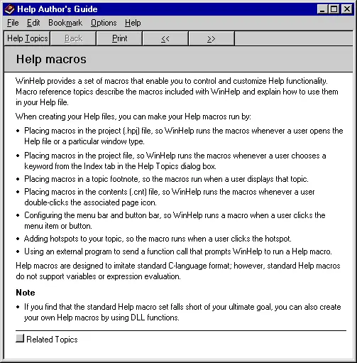
These were hard-coded, Tonia told me, meaning you had to wait for a new product release before you could make any changes. And product releases were more sporadic in those days, when software was still burned onto CD-ROMs.
This made documentation harder:
- You couldn’t refer to elements in the products directly as you can with modern solutions like CommandBar nudges. This increased the chance of users misunderstanding what you meant.
- Documentation had to be perfect because you couldn’t fix mistakes without major costs.
With the advent of the internet, the era of hard-coded in-app help faded.
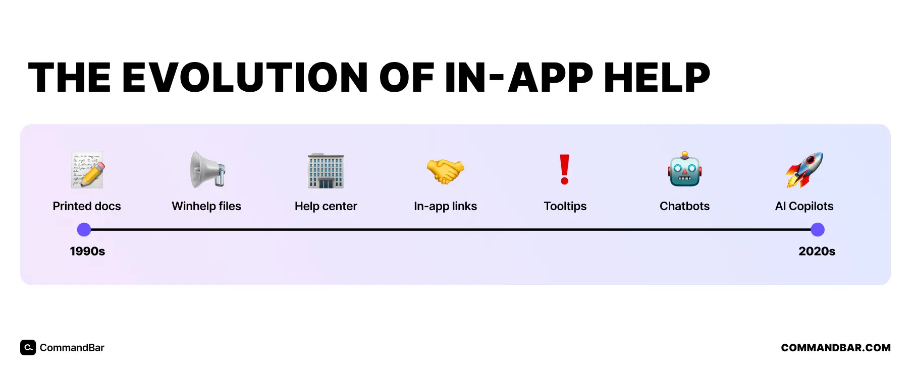
The knowledge base era
Like a lot of things, the internet changed in-product help. As Tonia describes it “Everyone loved […]knowledge bases. Now you had it on a website—it was a lot easier and it wasn’t involved with the app build at all.”
The same way the internet helped blogs ignore the schedule newspapers went to print, documentation became easier to update. Web-hosted help docs made it easier to fix errors, restructure docs or add missing parts.
Tonia shares that this created a new primitive: First, a help button emerged that opened the knowledge base in your browser to its home page. This required no developer input. You could edit the knowledge base to ship updates and users could see that updated knowledge base.
But there was an issue: Users still had to navigate to the relevant parts of the documentation. And if documents aren’t named intuitively or users are too frustrated, the might never realize their intent.
Page-level linking fixed this: You could couple where someone is in your product with a specific help doc. Clicking the “?” button from the design settings directly sent you to the help docs for that setting. This sent users directly where they needed to go—but also put engineers back into the equation: They needed to tie different buttons to different pages in help docs.
This was great, but Tonia described it as brittle. Ultimately, developers still had to maintain the links and keep them current. Automatic redirects helped with this, but it still created more dependencies.
This practice is still in use with many software products. But that doesn’t mean in-app help stopped evolving. Because the internet enabled the cloud, which enabled SaaS:
How SaaS changed in-app help
While SaaS is a business model, we often use the term for any cloud-hosted, browser-run software. And if you no longer need to install your app in the user’s operating system, in-app help changed as well.
Tonia started her next sentence “As we move over to SaaS, or with any product that relies on adoption and feature discovery…”
I’ll share her insights on this in a second, but I want to highlight something important in this half-sentence. Before SaaS made software ubiquitous and cheap(er), adoption and engagement weren’t much of an issue.
First, because it was hard to get data and second, because users didn’t have many options. If you were lucky enough to have an alternative, switching meant paying hundreds of dollars for the program and spend a few hours installing it from 9 DVD-ROMs.
This means worrying about user engagement is a relatively recent phenomenon, which influenced in-product help: “Documentation teams as a whole were getting frustrated with leading people out of the product for documentation answers.”
Tonia remembers then being involved in UX writing and tooltips. This coupled in-app help more directly with what a user does in the product. Instead of writing “find the button that says “submit”, you could now highlight the submit button with a tooltip or emphasize it importance with poignant UX copy.
This improved the user experience. Instead of opening two windows, they saw everything in one window with a more personalized experience, which boosted user engagement. But this better experience also required more work:
“It still wasn’t easy to change, and it still involved really tight integration with engineering.”
She relates a story about help breaking whenever a URL changed, which required developers to fix the problem. Engineering time is one of the scarcer resources in most tech companies—and they’re unlikely to prioritize documentation.
There were better tools for UX, but that didn’t mean UX got better: When a system is great in theory, but breaks when tested, it’s not such a great system.
One of the most important pillars of in-app help is availability. It should be there when the user needs it. Unless that’s guaranteed, the user assistance gets worse.
Why you still need a knowledge base
Improvements in in-app help didn’t make knowledge bases worthless. Tonia told me that knowledge bases and public documentation are now sales tools: They convince developers to buy because they accurately describe the product (sometimes, they’re even funny).
So far, there have been two categories of help: Knowledge bases you link to and in-app help like tooltips. Now, they’re merging.
Where in-app help is now
In 2024, in-app user assistance is in flux yet again: With tools like CommandBar, you can bring what used to be an external knowledge base in-app. Generative AI user assistance tools like HelpHub and Copilot feed off of public help documentation, they can surface the most relevant content inside the app.
Instead of only surfacing the right page, AI can surface the right part of a page, or even combine multiple sources to generate an answer.
Tonia also mentioned that (as is inevitable with new technology), this has created another challenge: You’re no longer writing for users, but you need to make sure the AI needs to pick up what you wrote correctly.
Where in-app help is going
AI has put the software world into upheaval. Having seen so many transformations in in-app help, Tonia is under no illusion that it won’t change again. I asked her where she thought help might evolve in the age of AI.
She believes AI solutions like HelpHub will be mandatory moving forward: After the user inputs a text query, they surface a helpful paragraph, not a maybe-helpful link.
Tonia’s mention of internal testing surprised me: Using LLMs for testing docs—if the AI used the correct docs but spat out an awkward answer, that might require updating the docs.
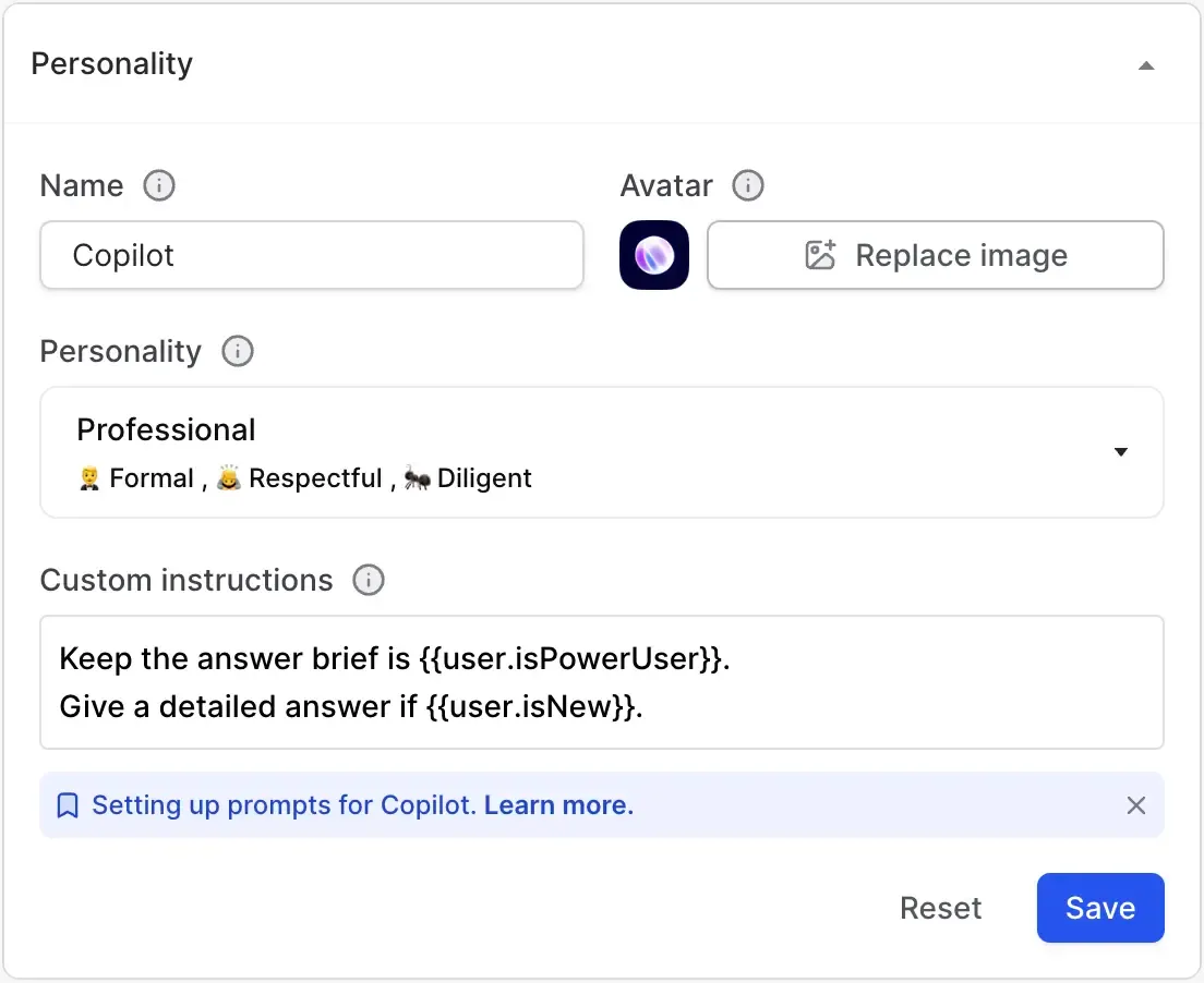
We also briefly jammed about the idea of personalizing in-app help by customizing responses to specific user types. An example of this would be using the same source material, but instructing the AI (based on analytics) to answer differently:
- If the user is a power user (skip the basics and make it short)
- If the user has never used the product (explain everything in detail, use metaphors where necessary)
This feels futuristic, but is possible in CommandBar today by inserting a system prompt based on user properties. That might look something like this:
Those are the exact things we pursue with user assistance: Personalization, better targeting, fewer clicks and, most importantly of all, non-annoyingness.