


One of my favorite memories are seemingly infinite afternoons with my Dad, sifting through seemingly infinite bins of LEGO bricks, hunting down an elusive piece we knew was somewhere. We had all of my Dad’s LEGOs, all of mine and all of my brother’s in those bins.
But the fighter jets, medieval castles and moon bases of my childhood might never have existed if it wasn’t for a corporate pivot: LEGO almost shut down in the early 2000s.
Today, LEGO’s products enthrall people around the world. With toy sets (including collaborations with some of the world’s most valuable IP franchises), collectibles and even a B2B methodology called Serious Play, the Danish company built one of the world’s most valuable toy empires brick by brick—and bags a 28% margin that would make some fashion brands jealous.
Lego’s CEO Jørgen Vig Knudstorp once announced: “We are on a burning platform […]. We’re running out of cash… [and] likely won’t survive”.
But then came the transformation. LEGO started listening to its customers and established new teams. A 2017 Guardian article quotes Anne Flemmert Jensen, senior director of its Global Insights group: “My team spends all our time traveling around the world, talking to kids and their families and participating in their daily lives.”
Listening to the community has been one of the core drivers in turning a dying toy manufacturer into a behemoth of fun.
In the software business, you won’t have to camp with your users, but the right user feedback can transform your company. It can reveal the feature you need to build or inform positioning that sets you apart.
Like anything valuable, great user feedback is hard to get. You’ll know this if you ever dangled Amazon gift cards in front of users to get them to fill out short surveys. Even when it works, one-word answers abound.
In-product surveys help: You’re targeting users already inside your product. But even then, most companies create surveys users see as yet another pop-up.
Let’s make sure that doesn’t happen to you. In this guide, you’ll discover how to create, design and implement surveys that get you great input consistently.
First, we’ll explore the dos and don’ts of great surveys. Then we’ll show you how to build a survey that gets you data to transform your company.
Ready? Let’s dive in!
How NOT to get user feedback
Most surveys fail not because they’re badly designed or ask the wrong questions, but because of 2 simple mistakes. Here’s what to avoid:
1. Don’t get feedback on the survey
Imagine you’re using a software product. You’re tunnel-visioned in flow state as a pop-up disturbs your focus and screams at you: “HOW LIKELY ARE YOU TO RECOMMEND US TO A FRIEND? 👉🏻👈🏻🥹”
You like the product, but roll your eyes, hit 1 and silence the “Oh no, why?” pop-up. This made your experience worse and gave the company useless feedback.
If your surveys are annoying, you’ll get feedback about the survey, not about the product.
There are two ways to avoid this:
- Design: If your survey pop-up looks ugly and covers the entire screen, users will hate it. But a subtle notification in the corner of a screen is less obtrusive.
- Targeting: If you can time your surveys in non-annoying ways—e.g. if someone has just completed something, you’ll get more useful data.
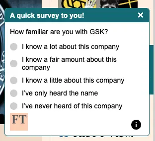
Let’s look at a product survey example. This survey popped up with no context on GSK—and the design, well, speaks for itself.
2. Don’t survey when you want to
Most surveys come from an internal process. You might want to gather data about a feature on your roadmap and blast your email list with a survey.
Unless you specifically want to ask lapsed users, this process guarantees bad outcomes:
- Users misremember: The details aren’t fresh on their mind, you won’t get feedback on how people feel while inside your product.
- Less data: Users aren’t in your product at that time, so the survey is less relevant.
Email-blasting a survey means less and worse data.
Instead, collect feedback inside your product and right after the thing you’re surveying happens.
Now that you won’t make those two mistakes, let’s dive in:
The 7 principles of great in-product surveys
Let’s dive into the core principles of creating surveys users will actually fill out. Here they are:
1. Frequency > Length
Ever regretted opening a form? You thought you’d fill out a short survey, but the “page 1/5” makes you want to close the tab. If you really want your nephew to get his Master’s, you might complete it. But if it’s a random feedback survey, you just quit.
Many companies believe it’s user-friendly to rarely ask for feedback. The intent is good, but it often means compensating by making surveys long.
That’s frustrating. Users are less likely to participate in your survey next time. It’s better to send short surveys more often because it shows users that you value their time.
Look at this product survey example from an airline:
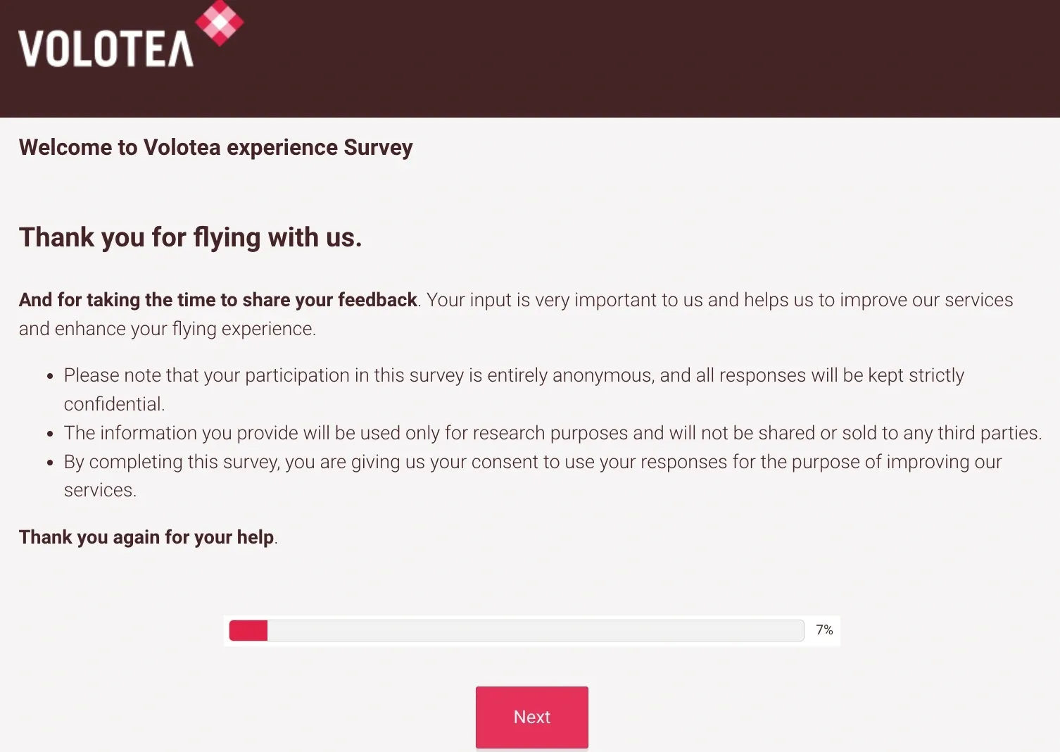
The fact that the first page is 7% of the survey made me close the tab immediately.
2. Focus on natural language
Customer input can transform your competitive positioning, messaging or roadmap. But you don’t get that data if you only ask for ratings.
It’s nice to present a 4.8/5, but natural language inputs are often more useful.
Quantitative feedback tells you how your users feel. Qualitative feedback tells you what to do about it.
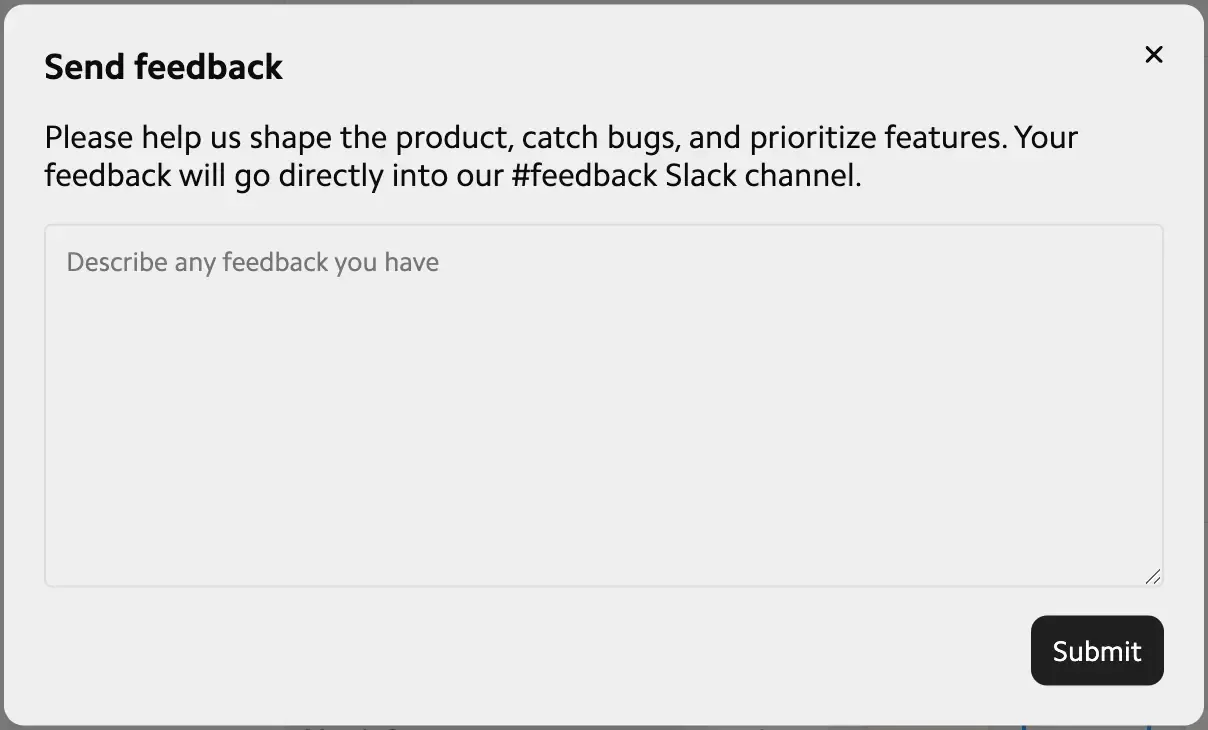
Matter does it well:
3. Survey after user action
Survey users right after sign-in and there’s not much to give feedback on (unless you want feedback on your dashboard).
Instead, offer surveys after the user did something important. You’ll get better feedback on an experience if the user has just completed something (e.g. publishing a blog article) than if you survey them from the dashboard.
That’s also true for negative actions. If a user fails to complete something, that could be a trigger for you to gather feedback.
4. Reward users
Emails asking for feedback often promise Amazon gift cards. In-product surveys rarely incentivize users. Companies seem to think they’ve already won the user.
Few will click “give us some feedback please”. But “get free beta access” is exciting. It’s simple, but few companies do this for in-product surveys.
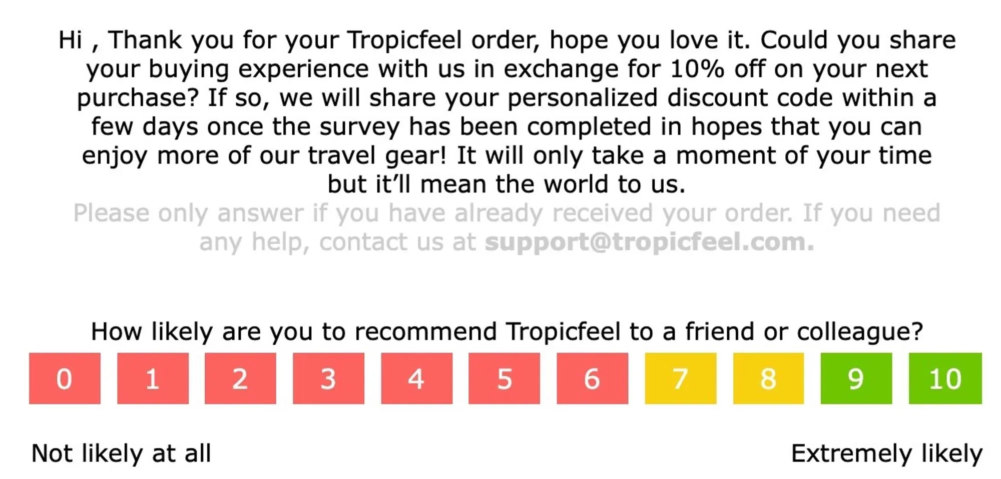
While the design and copy aren’t great, here’s a simple NPS survey example from Tropicfeel in exchange for 10% off:
5. Personalize it
“We need your feedback” is generic. If users don’t feel like you’re talking to them specifically, they’ll skip. But “We’re looking for feedback from users who recently upgraded” bat-signals to a specific group, making it more likely they respond.
6. Survey + other experiences = ❤️
To get more feedback, pair micro-surveys with other user assistance. If your user just took a product tour, append “Did this help you understand our product?”. More users fill this out because it’s one step in an experience, not a full experience.
7. Surface contextually
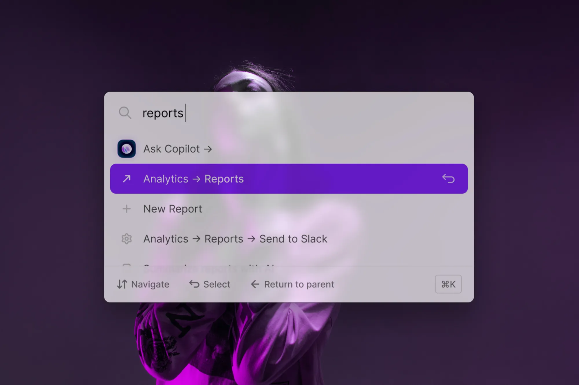
Surveys convert best when they’re relevant. That’s why it’s best to surface them when users show interest in a feature or topic. If you use CommandBar, you could also customize Copilot to surface the survey when a user asks about a specific topic.
How to gather great feedback with CommandBar
Planning your survey
The crucial part of building your survey happens before you build your survey.
Start with why you want feedback. Maybe you need to know what to build next, what users dislike or what features to unship.
Work backwards from your ideal feedback and the decision you need to make, then design the survey to support that.
Building your survey
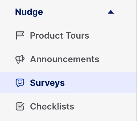
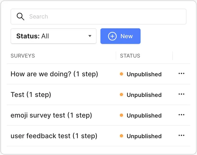
Creating a survey in CommandBar is easy. Under ‘Nudge’ on the left sidebar, hit “Surveys” (creative naming, I know).
After hitting “new”, click the type of survey you want to create.
You’ll see 3 categories:
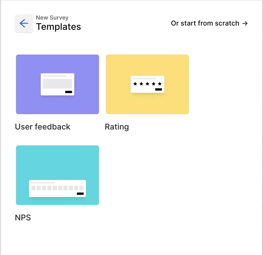
- User feedback: Here, users can input any text they want. This gets you natural language input.
- Rating: Click this to get structured input from your users. This could mean star ratings, 1-10 ratings or emoji ratings. These don’t give you deep contextual feedback, but are great for UX analytics.
- NPS: Net promoter score is one of the most common feedback surveys. Click on NPS to start a preset NPS survey.
You can also start from scratch to build with a blank nudge. In the editor, you can customize button labels and headlines. More advanced settings are behind the switches next to “rating”, where you can change the options and their labels. This is great if you want to measure less common metrics like customer effort score.
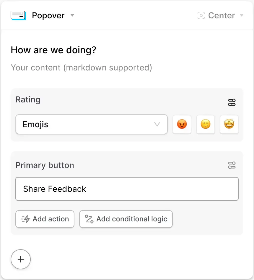
Under the button, you see two options:
- Add action: This lets you change what the button does when clicked. It can open a link, send users to other parts of your product or trigger another CommandBar experience.
- Add conditional logic: This lets you specify an action based on previous input. To enrich negative feedback, you could collect qualitative feedback when someone clicks the angry emoji (or solicit positive feedback after G2 reviews).
Clicking the “+”, lets you add a secondary button and give users an alternative.
You can also add steps, which creates a new nudge that opens after submitting the previous one. This lets you ask multiple open questions in the same survey.
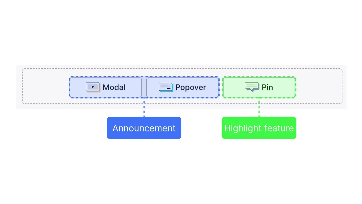
With each step you add, you can decide between pins, modals and popovers:
- Pins highlight specific features or buttons to click.
- Popovers are short messages you can display that aren’t anchored to a specific area of the screen.
- Modals usually block the content they cover. They’re best for options when the user has to do.
Popovers are the default for in-product surveys because they’re less interrupting than modals and allow the user to focus on the whole experience instead of highlighting a specific setting or button.
Making your surveys relevant: Targeting
To stick with the principles above, your survey needs to be relevant. You can do this in a few ways:
- Under who, you can select any audience you’ve already created in CommandBar or create a custom one based on conditions like browser, operating system or sign-up date.
- Under where, you can customize on which URL paths and DOM elements your tour should show up. This lets you create surveys for specific features after they’re completed.
- Under when, you can decide the timing of your survey. This could be immediately, based on specific events or on behavioral triggers like rage click and user confusion.
Publishing your survey
Once you’ve created your survey, you can hit the “play” button to test it. If you’re working in CommandBar with colleagues, you can also click the link icon to share it with them and ask for feedback.
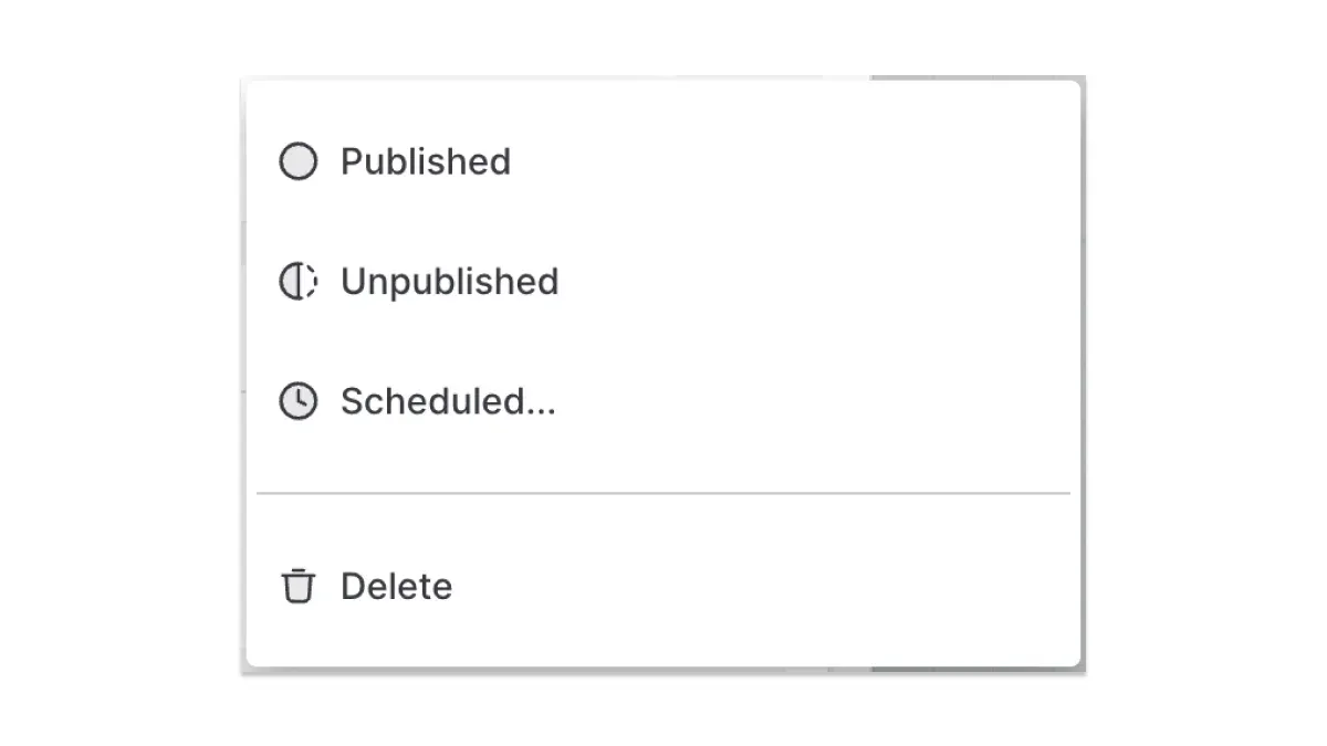
If you click the “unpublished” button, you can publish the survey or schedule it. Scheduling might come in handy if you’re creating a survey about a new feature you’re releasing in a few days.
And just like that, you’ve built a survey that gets you all the data you need to build a product people love.